Basic
Overview
Basic charts provide streamlined interfaces for the most common data visualization needs. These tools offer simplified parameters compared to general-purpose chart generators, making them ideal for quick visualizations without requiring extensive configuration.
Line charts created with LINE are essential for displaying trends over time or continuous relationships between variables. They connect data points in sequence, making them ideal for time series data, progress tracking, and comparing multiple series. The implementation handles axis formatting, grid lines, and legends automatically while producing publication-quality output.
Basic chart tools build on Matplotlib, ensuring compatibility with scientific and engineering workflows while remaining accessible to users who need straightforward visualizations without diving into plotting library details. Output is delivered as base64-encoded PNG images suitable for embedding in spreadsheet cells, documents, or web applications.
AREA
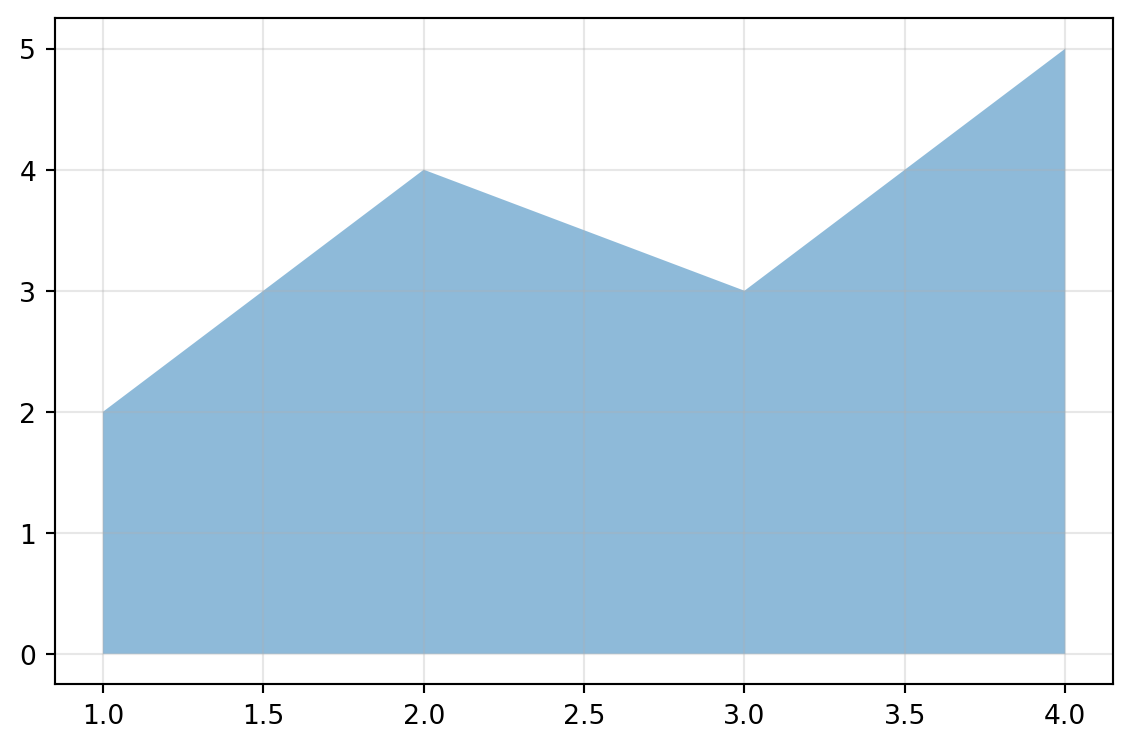
Create a filled area chart from data.
Excel Usage
=AREA(data, title, xlabel, ylabel, area_color, alpha, grid, legend)data(list[list], required): Input data.title(str, optional, default: null): Chart title.xlabel(str, optional, default: null): Label for X-axis.ylabel(str, optional, default: null): Label for Y-axis.area_color(str, optional, default: null): Area color.alpha(float, optional, default: 0.5): Alpha transparency.grid(str, optional, default: “true”): Show grid lines.legend(str, optional, default: “false”): Show legend.
Returns (object): Matplotlib Figure object (standard Python) or base64 encoded PNG string (Pyodide).
Example 1: Basic area chart
Inputs:
| data | |
|---|---|
| 1 | 2 |
| 2 | 4 |
| 3 | 3 |
| 4 | 5 |
Excel formula:
=AREA({1,2;2,4;3,3;4,5})Expected output:
"chart"
Example 2: Area chart with title and axis labels
Inputs:
| data | title | xlabel | ylabel | |
|---|---|---|---|---|
| 1 | 2 | Growth Over Time | Time | Value |
| 2 | 4 | |||
| 3 | 3 |
Excel formula:
=AREA({1,2;2,4;3,3}, "Growth Over Time", "Time", "Value")Expected output:
"chart"
Example 3: Stacked area with multiple series
Inputs:
| data | legend | ||
|---|---|---|---|
| 1 | 2 | 3 | true |
| 2 | 4 | 5 | |
| 3 | 3 | 4 |
Excel formula:
=AREA({1,2,3;2,4,5;3,3,4}, "true")Expected output:
"chart"
Example 4: Custom transparency and color
Inputs:
| data | area_color | alpha | |
|---|---|---|---|
| 1 | 2 | green | 0.7 |
| 2 | 4 | ||
| 3 | 3 |
Excel formula:
=AREA({1,2;2,4;3,3}, "green", 0.7)Expected output:
"chart"
Python Code
Show Code
import sys
import matplotlib
IS_PYODIDE = sys.platform == "emscripten"
if IS_PYODIDE:
    matplotlib.use('Agg')
import matplotlib.pyplot as plt
import io
import base64
import numpy as np

def area(data, title=None, xlabel=None, ylabel=None, area_color=None, alpha=0.5, grid='true', legend='false'):
    """
    Create a filled area chart from data.

    See: https://matplotlib.org/stable/api/_as_gen/matplotlib.pyplot.stackplot.html

    This example function is provided as-is without any representation of accuracy.

    Args:
        data (list[list]): Input data.
        title (str, optional): Chart title. Default is None.
        xlabel (str, optional): Label for X-axis. Default is None.
        ylabel (str, optional): Label for Y-axis. Default is None.
        area_color (str, optional): Area color. Valid options: Blue, Green, Red, Cyan, Magenta, Yellow, Black, White. Default is None.
        alpha (float, optional): Alpha transparency. Default is 0.5.
        grid (str, optional): Show grid lines. Valid options: True, False. Default is 'true'.
        legend (str, optional): Show legend. Valid options: True, False. Default is 'false'.

    Returns:
        object: Matplotlib Figure object (standard Python) or base64 encoded PNG string (Pyodide).
    """
    try:
        if not isinstance(data, list) or not data or not isinstance(data[0], list):
            return "Error: Input data must be a 2D list."

        # Convert to numpy array
        try:
            arr = np.array(data, dtype=float)
        except Exception:
            return "Error: Data must be numeric."

        if arr.ndim != 2 or arr.shape[1] < 2:
            return "Error: Data must have at least 2 columns (X, Y)."

        # Extract X and Y series
        x = arr[:, 0]
        y_series = [arr[:, i] for i in range(1, arr.shape[1])]

        # Create figure
        fig, ax = plt.subplots(figsize=(6, 4))

        # Plot area
        if len(y_series) == 1:
            # Single series - use fill_between
            ax.fill_between(x, 0, y_series[0], alpha=alpha, color=area_color if area_color else None)
        else:
            # Multiple series - use stackplot
            labels = [f"Series {i+1}" for i in range(len(y_series))]
            ax.stackplot(x, *y_series, alpha=alpha, labels=labels)

        # Set labels and title
        if title:
            ax.set_title(title)
        if xlabel:
            ax.set_xlabel(xlabel)
        if ylabel:
            ax.set_ylabel(ylabel)

        # Grid and legend
        if grid == "true":
            ax.grid(True, alpha=0.3)
        if legend == "true" and len(y_series) > 1:
            ax.legend()

        plt.tight_layout()

        if IS_PYODIDE:
            buf = io.BytesIO()
            plt.savefig(buf, format='png')
            plt.close(fig)
            buf.seek(0)
            img_bytes = buf.read()
            img_b64 = base64.b64encode(img_bytes).decode('utf-8')
            return f"data:image/png;base64,{img_b64}"
        else:
            return fig
    except Exception as e:
        return f"Error: {str(e)}"
Online Calculator
Input data.
Chart title.
Label for X-axis.
Label for Y-axis.
Area color.
Alpha transparency.
Show grid lines.
Show legend.
BAR
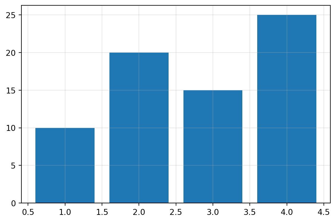
Create a bar chart (vertical or horizontal) from data.
Excel Usage
=BAR(data, title, xlabel, ylabel, bar_color, orient, grid, legend)data(list[list], required): Input data. Supports single column or multiple columns (Labels, Val1, Val2…).title(str, optional, default: null): Chart title.xlabel(str, optional, default: null): Label for X-axis.ylabel(str, optional, default: null): Label for Y-axis.bar_color(str, optional, default: null): Bar color.orient(str, optional, default: “v”): Orientation (‘v’ for vertical, ‘h’ for horizontal).grid(str, optional, default: “true”): Show grid lines.legend(str, optional, default: “false”): Show legend.
Returns (object): Matplotlib Figure object (standard Python) or base64 encoded PNG string (Pyodide).
Example 1: Simple vertical bar chart with labels
Inputs:
| data | |
|---|---|
| 1 | 10 |
| 2 | 20 |
| 3 | 15 |
| 4 | 25 |
Excel formula:
=BAR({1,10;2,20;3,15;4,25})Expected output:
"chart"
Example 2: Horizontal bar chart with title and labels
Inputs:
| data | title | xlabel | ylabel | orient | |
|---|---|---|---|---|---|
| 1 | 10 | Sales Data | Sales | Category | h |
| 2 | 20 | ||||
| 3 | 15 |
Excel formula:
=BAR({1,10;2,20;3,15}, "Sales Data", "Sales", "Category", "h")Expected output:
"chart"
Example 3: Multiple series with legend
Inputs:
| data | legend | ||
|---|---|---|---|
| 1 | 10 | 15 | true |
| 2 | 20 | 25 | |
| 3 | 15 | 30 |
Excel formula:
=BAR({1,10,15;2,20,25;3,15,30}, "true")Expected output:
"chart"
Example 4: Colored bars with grid
Inputs:
| data | bar_color | grid | |
|---|---|---|---|
| 1 | 10 | blue | true |
| 2 | 20 | ||
| 3 | 15 |
Excel formula:
=BAR({1,10;2,20;3,15}, "blue", "true")Expected output:
"chart"
Python Code
Show Code
import sys
import matplotlib
IS_PYODIDE = sys.platform == "emscripten"
if IS_PYODIDE:
    matplotlib.use('Agg')
import matplotlib.pyplot as plt
import io
import base64
import numpy as np

def bar(data, title=None, xlabel=None, ylabel=None, bar_color=None, orient='v', grid='true', legend='false'):
    """
    Create a bar chart (vertical or horizontal) from data.

    See: https://matplotlib.org/stable/api/_as_gen/matplotlib.pyplot.bar.html

    This example function is provided as-is without any representation of accuracy.

    Args:
        data (list[list]): Input data. Supports single column or multiple columns (Labels, Val1, Val2...).
        title (str, optional): Chart title. Default is None.
        xlabel (str, optional): Label for X-axis. Default is None.
        ylabel (str, optional): Label for Y-axis. Default is None.
        bar_color (str, optional): Bar color. Valid options: Blue, Green, Red, Cyan, Magenta, Yellow, Black, White. Default is None.
        orient (str, optional): Orientation ('v' for vertical, 'h' for horizontal). Valid options: Vertical, Horizontal. Default is 'v'.
        grid (str, optional): Show grid lines. Valid options: True, False. Default is 'true'.
        legend (str, optional): Show legend. Valid options: True, False. Default is 'false'.

    Returns:
        object: Matplotlib Figure object (standard Python) or base64 encoded PNG string (Pyodide).
    """
    try:
        if not isinstance(data, list) or not data or not isinstance(data[0], list):
            return "Error: Input data must be a 2D list."

        # Convert to numpy array
        try:
            arr = np.array(data, dtype=float)
        except Exception:
            return "Error: Data must be numeric."

        if arr.ndim != 2:
            return "Error: Data must be 2D."

        # Handle different column patterns
        num_cols = arr.shape[1]

        if num_cols == 1:
            # Single column: values only
            values = arr[:, 0]
            labels = np.arange(len(values))
            series = [values]
            series_names = None
        elif num_cols == 2:
            # Two columns: labels, values
            labels = arr[:, 0]
            values = arr[:, 1]
            series = [values]
            series_names = None
        else:
            # 3+ columns: labels, val1, val2, ...
            labels = arr[:, 0]
            series = [arr[:, i] for i in range(1, num_cols)]
            series_names = [f"Series {i}" for i in range(1, num_cols)]

        # Create figure
        fig, ax = plt.subplots(figsize=(6, 4))

        # Plot bars
        if orient == 'v':
            # Vertical bars
            if len(series) == 1:
                ax.bar(labels, series[0], color=bar_color if bar_color else None)
            else:
                x = np.arange(len(labels))
                for i, s in enumerate(series):
                    ax.bar(x, s, label=series_names[i] if series_names else None)
                ax.set_xticks(x)
                ax.set_xticklabels(labels)
        else:
            # Horizontal bars
            if len(series) == 1:
                ax.barh(labels, series[0], color=bar_color if bar_color else None)
            else:
                y = np.arange(len(labels))
                for i, s in enumerate(series):
                    ax.barh(y, s, label=series_names[i] if series_names else None)
                ax.set_yticks(y)
                ax.set_yticklabels(labels)

        # Set labels and title
        if title:
            ax.set_title(title)
        if xlabel:
            ax.set_xlabel(xlabel)
        if ylabel:
            ax.set_ylabel(ylabel)

        # Grid and legend
        if grid == "true":
            ax.grid(True, alpha=0.3)
        if legend == "true" and series_names:
            ax.legend()

        plt.tight_layout()

        if IS_PYODIDE:
            buf = io.BytesIO()
            plt.savefig(buf, format='png')
            plt.close(fig)
            buf.seek(0)
            img_bytes = buf.read()
            img_b64 = base64.b64encode(img_bytes).decode('utf-8')
            return f"data:image/png;base64,{img_b64}"
        else:
            return fig
    except Exception as e:
        return f"Error: {str(e)}"
Online Calculator
Input data. Supports single column or multiple columns (Labels, Val1, Val2...).
Chart title.
Label for X-axis.
Label for Y-axis.
Bar color.
Orientation ('v' for vertical, 'h' for horizontal).
Show grid lines.
Show legend.
GROUPED_BAR
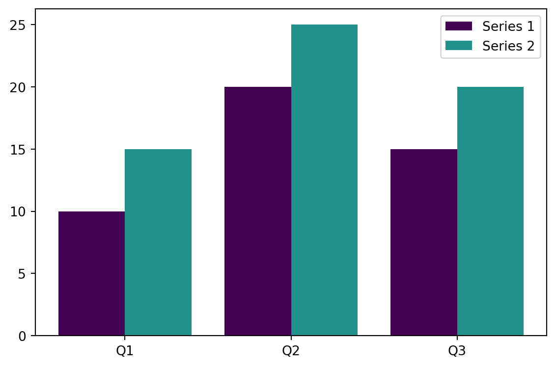
Create a grouped/dodged bar chart from data.
/tmp/ipykernel_2724030/76978371.py:57: MatplotlibDeprecationWarning:

The get_cmap function was deprecated in Matplotlib 3.7 and will be removed in 3.11. Use ``matplotlib.colormaps[name]`` or ``matplotlib.colormaps.get_cmap()`` or ``pyplot.get_cmap()`` instead.
Excel Usage
=GROUPED_BAR(data, title, xlabel, ylabel, grouped_colormap, orient, legend)data(list[list], required): Input data (Labels, Val1, Val2…).title(str, optional, default: null): Chart title.xlabel(str, optional, default: null): Label for X-axis.ylabel(str, optional, default: null): Label for Y-axis.grouped_colormap(str, optional, default: “viridis”): Color map for groups.orient(str, optional, default: “v”): Orientation (‘v’ for vertical, ‘h’ for horizontal).legend(str, optional, default: “true”): Show legend.
Returns (object): Matplotlib Figure object (standard Python) or base64 encoded PNG string (Pyodide).
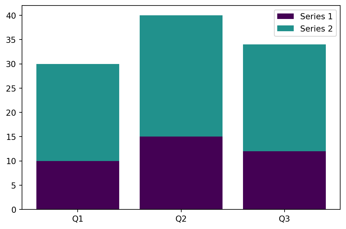
Example 1: Basic grouped vertical bar chart
Inputs:
| data | legend | ||
|---|---|---|---|
| Q1 | 10 | 15 | true |
| Q2 | 20 | 25 | |
| Q3 | 15 | 20 |
Excel formula:
=GROUPED_BAR({"Q1",10,15;"Q2",20,25;"Q3",15,20}, "true")Expected output:
"chart"
Example 2: Grouped horizontal bar chart
Inputs:
| data | orient | legend | ||
|---|---|---|---|---|
| A | 10 | 20 | h | true |
| B | 15 | 25 | ||
| C | 12 | 22 |
Excel formula:
=GROUPED_BAR({"A",10,20;"B",15,25;"C",12,22}, "h", "true")Expected output:
"chart"
Example 3: Grouped bars with title and axis labels
Inputs:
| data | title | xlabel | ylabel | legend | ||
|---|---|---|---|---|---|---|
| 2020 | 100 | 150 | Sales Comparison | Year | Sales | true |
| 2021 | 120 | 180 | ||||
| 2022 | 140 | 200 |
Excel formula:
=GROUPED_BAR({2020,100,150;2021,120,180;2022,140,200}, "Sales Comparison", "Year", "Sales", "true")Expected output:
"chart"
Example 4: Custom color map with multiple series
Inputs:
| data | grouped_colormap | legend | |||
|---|---|---|---|---|---|
| X | 5 | 10 | 15 | magma | true |
| Y | 8 | 12 | 18 | ||
| Z | 6 | 11 | 16 |
Excel formula:
=GROUPED_BAR({"X",5,10,15;"Y",8,12,18;"Z",6,11,16}, "magma", "true")Expected output:
"chart"
Python Code
Show Code
import sys
import matplotlib
IS_PYODIDE = sys.platform == "emscripten"
if IS_PYODIDE:
    matplotlib.use('Agg')
import matplotlib.pyplot as plt
import io
import base64
import numpy as np
import matplotlib.cm as cm

def grouped_bar(data, title=None, xlabel=None, ylabel=None, grouped_colormap='viridis', orient='v', legend='true'):
    """
    Create a grouped/dodged bar chart from data.

    See: https://matplotlib.org/stable/api/_as_gen/matplotlib.pyplot.bar.html

    This example function is provided as-is without any representation of accuracy.

    Args:
        data (list[list]): Input data (Labels, Val1, Val2...).
        title (str, optional): Chart title. Default is None.
        xlabel (str, optional): Label for X-axis. Default is None.
        ylabel (str, optional): Label for Y-axis. Default is None.
        grouped_colormap (str, optional): Color map for groups. Valid options: Viridis, Plasma, Inferno, Magma, Cividis. Default is 'viridis'.
        orient (str, optional): Orientation ('v' for vertical, 'h' for horizontal). Valid options: Vertical, Horizontal. Default is 'v'.
        legend (str, optional): Show legend. Valid options: True, False. Default is 'true'.

    Returns:
        object: Matplotlib Figure object (standard Python) or base64 encoded PNG string (Pyodide).
    """
    try:
        if not isinstance(data, list) or not data or not isinstance(data[0], list):
            return "Error: Input data must be a 2D list."

        if len(data[0]) < 2:
            return "Error: Data must have at least 2 columns (Labels, Values)."

        # Extract labels and series
        labels = [str(row[0]) for row in data]

        try:
            series = []
            for col_idx in range(1, len(data[0])):
                series.append([float(row[col_idx]) for row in data])
        except Exception:
            return "Error: Values must be numeric."

        if not series:
            return "Error: No value columns found."

        # Create figure
        fig, ax = plt.subplots(figsize=(6, 4))

        # Get colors from colormap
        cmap = cm.get_cmap(grouped_colormap)
        colors = [cmap(i / len(series)) for i in range(len(series))]

        # Calculate bar positions
        n_groups = len(labels)
        n_bars = len(series)
        bar_width = 0.8 / n_bars
        x = np.arange(n_groups)

        # Plot grouped bars
        for i, s in enumerate(series):
            offset = (i - n_bars / 2) * bar_width + bar_width / 2
            if orient == 'v':
                ax.bar(x + offset, s, bar_width, label=f"Series {i+1}", color=colors[i])
            else:
                ax.barh(x + offset, s, bar_width, label=f"Series {i+1}", color=colors[i])

        # Set ticks and labels
        if orient == 'v':
            ax.set_xticks(x)
            ax.set_xticklabels(labels)
        else:
            ax.set_yticks(x)
            ax.set_yticklabels(labels)

        # Set labels and title
        if title:
            ax.set_title(title)
        if xlabel:
            ax.set_xlabel(xlabel)
        if ylabel:
            ax.set_ylabel(ylabel)

        # Legend
        if legend == "true":
            ax.legend()

        plt.tight_layout()

        if IS_PYODIDE:
            buf = io.BytesIO()
            plt.savefig(buf, format='png')
            plt.close(fig)
            buf.seek(0)
            img_bytes = buf.read()
            img_b64 = base64.b64encode(img_bytes).decode('utf-8')
            return f"data:image/png;base64,{img_b64}"
        else:
            return fig
    except Exception as e:
        return f"Error: {str(e)}"
Online Calculator
Input data (Labels, Val1, Val2...).
Chart title.
Label for X-axis.
Label for Y-axis.
Color map for groups.
Orientation ('v' for vertical, 'h' for horizontal).
Show legend.
LINE
Create a line chart from data.
<Figure size 672x480 with 0 Axes>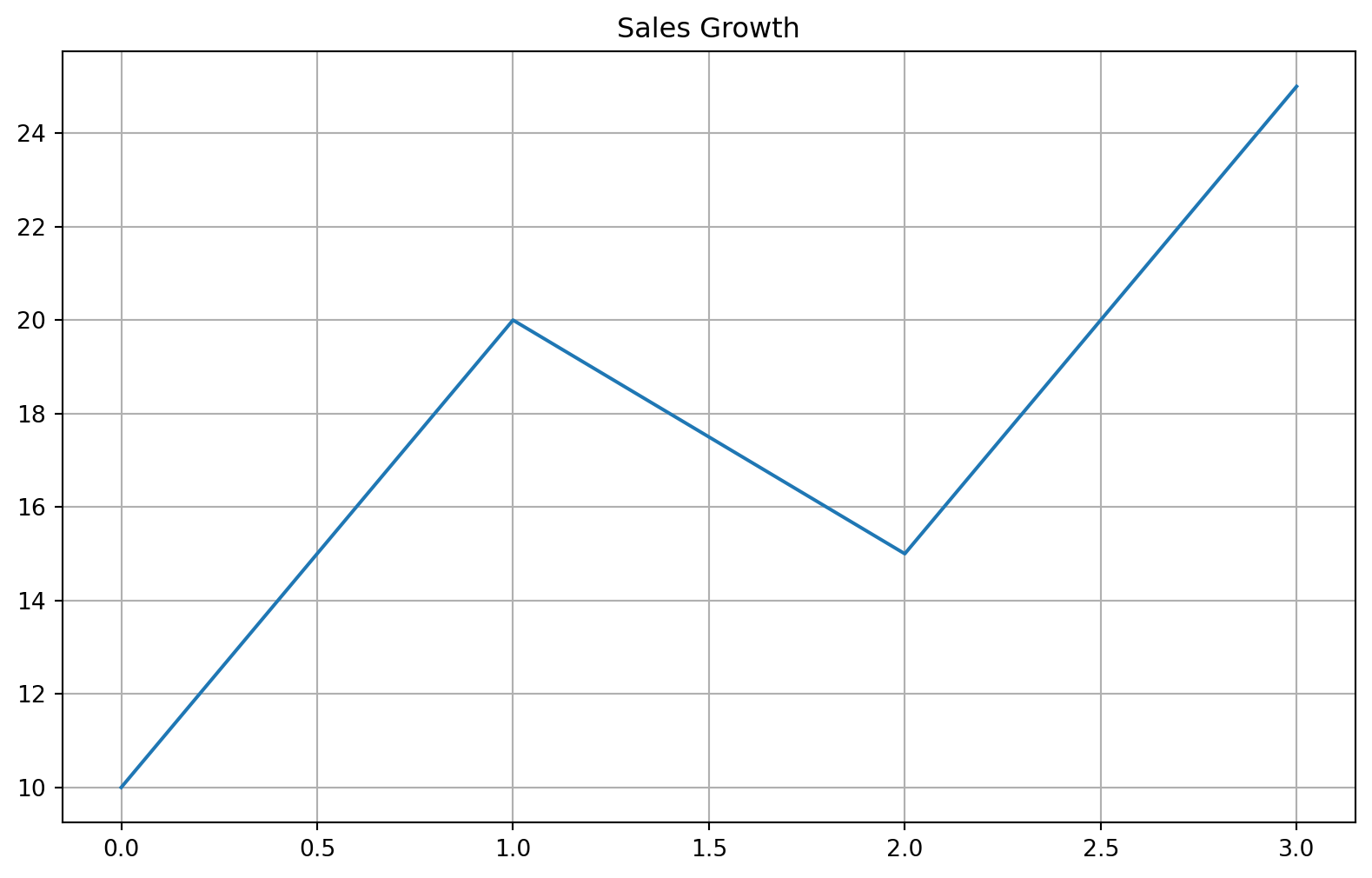
Excel Usage
=LINE(data, title, xlabel, ylabel, plot_color, linestyle, marker, grid, legend)data(list[list], required): Input data (N rows x M columns). Supports single column (Y-only) or multiple columns (X, Y1, Y2…).title(str, optional, default: null): Chart title.xlabel(str, optional, default: null): Label for X-axis.ylabel(str, optional, default: null): Label for Y-axis.plot_color(str, optional, default: null): Line color.linestyle(str, optional, default: “-”): Line style (e.g., ‘-’, ‘–’, ‘:’, ‘-.’).marker(str, optional, default: null): Marker style (e.g., ‘o’, ‘s’, ‘^’).grid(str, optional, default: “true”): Show grid lines.legend(str, optional, default: “false”): Show legend.
Returns (object): Matplotlib Figure object (standard Python) or base64 encoded PNG string (Pyodide).
Example 1: Single column (automatic X)
Inputs:
| data | title |
|---|---|
| 10 | Sales Growth |
| 20 | |
| 15 | |
| 25 |
Excel formula:
=LINE({10;20;15;25}, "Sales Growth")Expected output:
"chart"
Example 2: Two columns (X and Y)
Inputs:
| data | xlabel | ylabel | |
|---|---|---|---|
| 1 | 2 | Day | Value |
| 2 | 4 | ||
| 3 | 8 | ||
| 4 | 16 |
Excel formula:
=LINE({1,2;2,4;3,8;4,16}, "Day", "Value")Expected output:
"chart"
Example 3: Multiple series (X, Y1, Y2)
Inputs:
| data | legend | ||
|---|---|---|---|
| 1 | 10 | 5 | true |
| 2 | 20 | 15 | |
| 3 | 15 | 25 |
Excel formula:
=LINE({1,10,5;2,20,15;3,15,25}, "true")Expected output:
"chart"
Example 4: Styled single series
Inputs:
| data | plot_color | linestyle | marker |
|---|---|---|---|
| 1 | red | – | o |
| 4 | |||
| 9 | |||
| 16 |
Excel formula:
=LINE({1;4;9;16}, "red", "--", "o")Expected output:
"chart"
Python Code
Show Code
import sys
import matplotlib
IS_PYODIDE = sys.platform == "emscripten"
if IS_PYODIDE:
    matplotlib.use('Agg')
import matplotlib.pyplot as plt
import io
import base64
import numpy as np

def line(data, title=None, xlabel=None, ylabel=None, plot_color=None, linestyle='-', marker=None, grid='true', legend='false'):
    """
    Create a line chart from data.

    See: https://matplotlib.org/stable/api/_as_gen/matplotlib.pyplot.plot.html

    This example function is provided as-is without any representation of accuracy.

    Args:
        data (list[list]): Input data (N rows x M columns). Supports single column (Y-only) or multiple columns (X, Y1, Y2...).
        title (str, optional): Chart title. Default is None.
        xlabel (str, optional): Label for X-axis. Default is None.
        ylabel (str, optional): Label for Y-axis. Default is None.
        plot_color (str, optional): Line color. Valid options: Blue, Green, Red, Cyan, Magenta, Yellow, Black, White. Default is None.
        linestyle (str, optional): Line style (e.g., '-', '--', ':', '-.'). Valid options: Solid, Dashed, Dotted, Dash-dot. Default is '-'.
        marker (str, optional): Marker style (e.g., 'o', 's', '^'). Valid options: None, Point, Pixel, Circle, Square, Triangle Down, Triangle Up. Default is None.
        grid (str, optional): Show grid lines. Valid options: True, False. Default is 'true'.
        legend (str, optional): Show legend. Valid options: True, False. Default is 'false'.

    Returns:
        object: Matplotlib Figure object (standard Python) or base64 encoded PNG string (Pyodide).
    """
    try:
        # helper to normalize input to 2D list
        def to2d(x):
            if isinstance(x, list):
                if len(x) > 0 and isinstance(x[0], list):
                    return x
                return [x]
            return [[x]]

        # helper to convert string booleans
        def to_bool(x):
            if isinstance(x, str):
                return x.lower() == 'true'
            return bool(x)

        data = to2d(data)
        grid = to_bool(grid)
        legend = to_bool(legend)

        # Clear previous plots
        plt.clf()
        fig = plt.figure(figsize=(10, 6))
        ax = fig.add_subplot(111)

        # Convert to numpy array for easier column slicing
        # Excel often passes heterogeneous data, so we clean it
        row_count = len(data)
        col_count = len(data[0]) if row_count > 0 else 0

        if row_count == 0 or col_count == 0:
            return "Error: No data provided."

        # Determine X and Y series
        if col_count == 1:
            # Case 1: Single column - use index as X
            y_data = []
            for row in data:
                try:
                    val = float(row[0]) if row[0] is not None and str(row[0]).strip() != "" else np.nan
                    y_data.append(val)
                except:
                    y_data.append(np.nan)
            x = np.arange(len(y_data))
            series_to_plot = [(y_data, "Series 1")]
        else:
            # Case 2+: First column is X, others are Y
            x = []
            for row in data:
                try:
                    val = float(row[0]) if row[0] is not None and str(row[0]).strip() != "" else np.nan
                    x.append(val)
                except:
                    x.append(np.nan)
            x = np.array(x)

            series_to_plot = []
            for j in range(1, col_count):
                y_col = []
                for row in data:
                    try:
                        val = float(row[j]) if row[j] is not None and str(row[j]).strip() != "" else np.nan
                        y_col.append(val)
                    except:
                        y_col.append(np.nan)
                series_to_plot.append((y_col, f"Series {j}"))

        # Plot each series
        for y_vals, label in series_to_plot:
            # Mask NaNs so they aren't plotted as 0 or breaking the line
            y_vals = np.array(y_vals)
            mask = ~np.isnan(y_vals)

            if not any(mask):
                continue

            plot_kwargs = {}
            if plot_color and len(series_to_plot) == 1: # Only apply single color if one series
                plot_kwargs['color'] = plot_color
            if linestyle:
                plot_kwargs['linestyle'] = linestyle
            if marker:
                plot_kwargs['marker'] = marker

            ax.plot(x[mask], y_vals[mask], label=label, **plot_kwargs)

        if title: ax.set_title(title)
        if xlabel: ax.set_xlabel(xlabel)
        if ylabel: ax.set_ylabel(ylabel)
        if grid: ax.grid(True)
        if legend or len(series_to_plot) > 1:
            ax.legend()

        if IS_PYODIDE:
            buf = io.BytesIO()
            plt.savefig(buf, format='png', bbox_inches='tight')
            plt.close(fig)
            buf.seek(0)
            img_str = base64.b64encode(buf.read()).decode('utf-8')
            return f"data:image/png;base64,{img_str}"
        else:
            return fig
    except Exception as e:
        return f"Error: {str(e)}"
Online Calculator
Input data (N rows x M columns). Supports single column (Y-only) or multiple columns (X, Y1, Y2...).
Chart title.
Label for X-axis.
Label for Y-axis.
Line color.
Line style (e.g., '-', '--', ':', '-.').
Marker style (e.g., 'o', 's', '^').
Show grid lines.
Show legend.
PIE
Create a pie chart from data.
/tmp/ipykernel_2724030/1595187725.py:55: MatplotlibDeprecationWarning:

The get_cmap function was deprecated in Matplotlib 3.7 and will be removed in 3.11. Use ``matplotlib.colormaps[name]`` or ``matplotlib.colormaps.get_cmap()`` or ``pyplot.get_cmap()`` instead.
Excel Usage
=PIE(data, title, pie_colormap, explode, legend)data(list[list], required): Input data (Labels, Values).title(str, optional, default: null): Chart title.pie_colormap(str, optional, default: “viridis”): Color map for slices.explode(float, optional, default: 0): Explode value for slices.legend(str, optional, default: “true”): Show legend.
Returns (object): Matplotlib Figure object (standard Python) or base64 encoded PNG string (Pyodide).
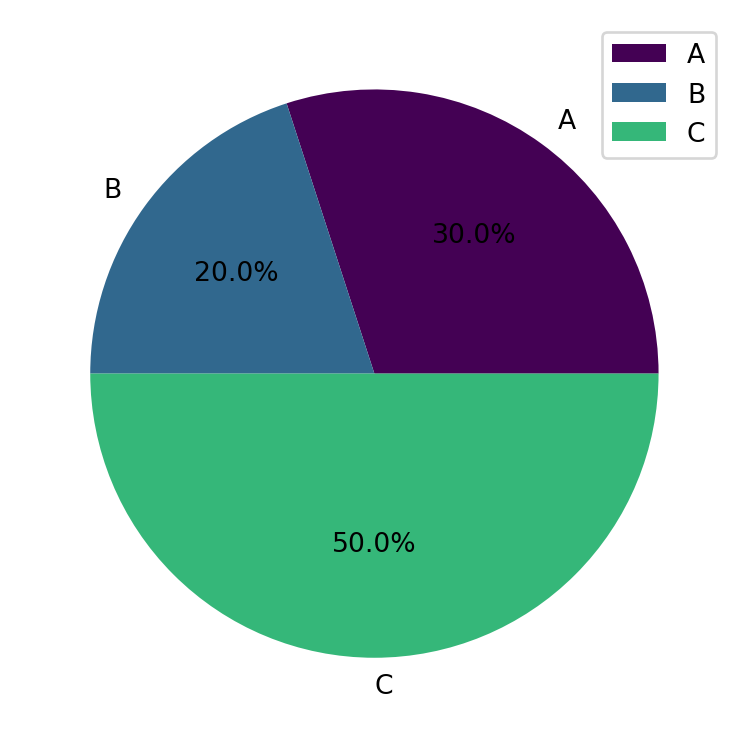
Example 1: Basic pie chart with percentages
Inputs:
| data | |
|---|---|
| A | 30 |
| B | 20 |
| C | 50 |
Excel formula:
=PIE({"A",30;"B",20;"C",50})Expected output:
"chart"
Example 2: Pie chart with title and legend
Inputs:
| data | title | legend | |
|---|---|---|---|
| Q1 | 25 | Quarterly Sales | true |
| Q2 | 30 | ||
| Q3 | 20 | ||
| Q4 | 25 |
Excel formula:
=PIE({"Q1",25;"Q2",30;"Q3",20;"Q4",25}, "Quarterly Sales", "true")Expected output:
"chart"
Example 3: Exploded pie chart
Inputs:
| data | explode | |
|---|---|---|
| A | 40 | 0.1 |
| B | 30 | |
| C | 30 |
Excel formula:
=PIE({"A",40;"B",30;"C",30}, 0.1)Expected output:
"chart"
Example 4: Custom color map
Inputs:
| data | pie_colormap | |
|---|---|---|
| X | 10 | plasma |
| Y | 20 | |
| Z | 30 |
Excel formula:
=PIE({"X",10;"Y",20;"Z",30}, "plasma")Expected output:
"chart"
Python Code
Show Code
import sys
import matplotlib
IS_PYODIDE = sys.platform == "emscripten"
if IS_PYODIDE:
    matplotlib.use('Agg')
import matplotlib.pyplot as plt
import io
import base64
import numpy as np
import matplotlib.cm as cm

def pie(data, title=None, pie_colormap='viridis', explode=0, legend='true'):
    """
    Create a pie chart from data.

    See: https://matplotlib.org/stable/api/_as_gen/matplotlib.pyplot.pie.html

    This example function is provided as-is without any representation of accuracy.

    Args:
        data (list[list]): Input data (Labels, Values).
        title (str, optional): Chart title. Default is None.
        pie_colormap (str, optional): Color map for slices. Valid options: Viridis, Plasma, Inferno, Magma, Cividis. Default is 'viridis'.
        explode (float, optional): Explode value for slices. Default is 0.
        legend (str, optional): Show legend. Valid options: True, False. Default is 'true'.

    Returns:
        object: Matplotlib Figure object (standard Python) or base64 encoded PNG string (Pyodide).
    """
    try:
        if not isinstance(data, list) or not data or not isinstance(data[0], list):
            return "Error: Input data must be a 2D list."

        if len(data[0]) < 2:
            return "Error: Data must have at least 2 columns (Labels, Values)."

        # Extract labels and values
        labels = [str(row[0]) for row in data]
        try:
            values = [float(row[1]) for row in data]
        except Exception:
            return "Error: Values must be numeric."

        if any(v < 0 for v in values):
            return "Error: Pie chart values must be non-negative."

        if sum(values) == 0:
            return "Error: Sum of values must be greater than zero."

        # Create figure
        fig, ax = plt.subplots(figsize=(6, 4))

        # Get colors from colormap
        cmap = cm.get_cmap(pie_colormap)
        colors = [cmap(i / len(values)) for i in range(len(values))]

        # Create explode array if specified
        explode_array = None
        if explode > 0:
            explode_array = [explode] * len(values)

        # Create pie chart
        ax.pie(values, labels=labels, autopct='%1.1f%%', colors=colors, explode=explode_array)

        if title:
            ax.set_title(title)

        if legend == "true":
            ax.legend(labels, loc="best")

        plt.tight_layout()

        if IS_PYODIDE:
            buf = io.BytesIO()
            plt.savefig(buf, format='png')
            plt.close(fig)
            buf.seek(0)
            img_bytes = buf.read()
            img_b64 = base64.b64encode(img_bytes).decode('utf-8')
            return f"data:image/png;base64,{img_b64}"
        else:
            return fig
    except Exception as e:
        return f"Error: {str(e)}"
Online Calculator
Input data (Labels, Values).
Chart title.
Color map for slices.
Explode value for slices.
Show legend.
SCATTER
Create an XY scatter plot from data.
Excel Usage
=SCATTER(data, title, xlabel, ylabel, scatter_color, scatter_marker, point_size, grid, legend)data(list[list], required): Input data. Supports multiple columns (X, Y1, Y2…).title(str, optional, default: null): Chart title.xlabel(str, optional, default: null): Label for X-axis.ylabel(str, optional, default: null): Label for Y-axis.scatter_color(str, optional, default: null): Point color.scatter_marker(str, optional, default: “o”): Marker style.point_size(float, optional, default: 20): Size of points.grid(str, optional, default: “true”): Show grid lines.legend(str, optional, default: “false”): Show legend.
Returns (object): Matplotlib Figure object (standard Python) or base64 encoded PNG string (Pyodide).
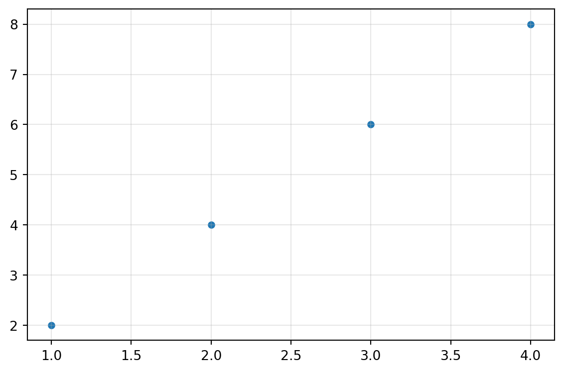
Example 1: Basic XY scatter plot
Inputs:
| data | |
|---|---|
| 1 | 2 |
| 2 | 4 |
| 3 | 6 |
| 4 | 8 |
Excel formula:
=SCATTER({1,2;2,4;3,6;4,8})Expected output:
"chart"
Example 2: Scatter plot with title and axis labels
Inputs:
| data | title | xlabel | ylabel | |
|---|---|---|---|---|
| 1 | 2 | XY Data | X Values | Y Values |
| 2 | 4 | |||
| 3 | 6 |
Excel formula:
=SCATTER({1,2;2,4;3,6}, "XY Data", "X Values", "Y Values")Expected output:
"chart"
Example 3: Multiple Y series with legend
Inputs:
| data | legend | ||
|---|---|---|---|
| 1 | 2 | 3 | true |
| 2 | 4 | 5 | |
| 3 | 6 | 7 |
Excel formula:
=SCATTER({1,2,3;2,4,5;3,6,7}, "true")Expected output:
"chart"
Example 4: Custom marker, color, and size
Inputs:
| data | scatter_marker | scatter_color | point_size | |
|---|---|---|---|---|
| 1 | 2 | s | red | 50 |
| 2 | 4 | |||
| 3 | 6 |
Excel formula:
=SCATTER({1,2;2,4;3,6}, "s", "red", 50)Expected output:
"chart"
Python Code
Show Code
import sys
import matplotlib
IS_PYODIDE = sys.platform == "emscripten"
if IS_PYODIDE:
    matplotlib.use('Agg')
import matplotlib.pyplot as plt
import io
import base64
import numpy as np

def scatter(data, title=None, xlabel=None, ylabel=None, scatter_color=None, scatter_marker='o', point_size=20, grid='true', legend='false'):
    """
    Create an XY scatter plot from data.

    See: https://matplotlib.org/stable/api/_as_gen/matplotlib.pyplot.scatter.html

    This example function is provided as-is without any representation of accuracy.

    Args:
        data (list[list]): Input data. Supports multiple columns (X, Y1, Y2...).
        title (str, optional): Chart title. Default is None.
        xlabel (str, optional): Label for X-axis. Default is None.
        ylabel (str, optional): Label for Y-axis. Default is None.
        scatter_color (str, optional): Point color. Valid options: Blue, Green, Red, Cyan, Magenta, Yellow, Black, White. Default is None.
        scatter_marker (str, optional): Marker style. Valid options: Point, Pixel, Circle, Square, Triangle Down, Triangle Up. Default is 'o'.
        point_size (float, optional): Size of points. Default is 20.
        grid (str, optional): Show grid lines. Valid options: True, False. Default is 'true'.
        legend (str, optional): Show legend. Valid options: True, False. Default is 'false'.

    Returns:
        object: Matplotlib Figure object (standard Python) or base64 encoded PNG string (Pyodide).
    """
    try:
        if not isinstance(data, list) or not data or not isinstance(data[0], list):
            return "Error: Input data must be a 2D list."

        # Convert to numpy array
        try:
            arr = np.array(data, dtype=float)
        except Exception:
            return "Error: Data must be numeric."

        if arr.ndim != 2 or arr.shape[1] < 2:
            return "Error: Data must have at least 2 columns (X, Y)."

        # Extract X and Y series
        x = arr[:, 0]
        y_series = [arr[:, i] for i in range(1, arr.shape[1])]

        # Create figure
        fig, ax = plt.subplots(figsize=(6, 4))

        # Plot scatter points
        if len(y_series) == 1:
            ax.scatter(x, y_series[0], s=point_size, color=scatter_color if scatter_color else None, marker=scatter_marker)
        else:
            for i, y in enumerate(y_series):
                ax.scatter(x, y, s=point_size, marker=scatter_marker, label=f"Series {i+1}")

        # Set labels and title
        if title:
            ax.set_title(title)
        if xlabel:
            ax.set_xlabel(xlabel)
        if ylabel:
            ax.set_ylabel(ylabel)

        # Grid and legend
        if grid == "true":
            ax.grid(True, alpha=0.3)
        if legend == "true" and len(y_series) > 1:
            ax.legend()

        plt.tight_layout()

        if IS_PYODIDE:
            buf = io.BytesIO()
            plt.savefig(buf, format='png')
            plt.close(fig)
            buf.seek(0)
            img_bytes = buf.read()
            img_b64 = base64.b64encode(img_bytes).decode('utf-8')
            return f"data:image/png;base64,{img_b64}"
        else:
            return fig
    except Exception as e:
        return f"Error: {str(e)}"
Online Calculator
Input data. Supports multiple columns (X, Y1, Y2...).
Chart title.
Label for X-axis.
Label for Y-axis.
Point color.
Marker style.
Size of points.
Show grid lines.
Show legend.
STACKED_BAR
Create a stacked bar chart from data.
/tmp/ipykernel_2724030/2584605609.py:57: MatplotlibDeprecationWarning:

The get_cmap function was deprecated in Matplotlib 3.7 and will be removed in 3.11. Use ``matplotlib.colormaps[name]`` or ``matplotlib.colormaps.get_cmap()`` or ``pyplot.get_cmap()`` instead.
Excel Usage
=STACKED_BAR(data, title, xlabel, ylabel, stacked_colormap, orient, legend)data(list[list], required): Input data (Labels, Val1, Val2…).title(str, optional, default: null): Chart title.xlabel(str, optional, default: null): Label for X-axis.ylabel(str, optional, default: null): Label for Y-axis.stacked_colormap(str, optional, default: “viridis”): Color map for series.orient(str, optional, default: “v”): Orientation (‘v’ for vertical, ‘h’ for horizontal).legend(str, optional, default: “true”): Show legend.
Returns (object): Matplotlib Figure object (standard Python) or base64 encoded PNG string (Pyodide).
Example 1: Basic stacked vertical bar chart
Inputs:
| data | legend | ||
|---|---|---|---|
| Q1 | 10 | 20 | true |
| Q2 | 15 | 25 | |
| Q3 | 12 | 22 |
Excel formula:
=STACKED_BAR({"Q1",10,20;"Q2",15,25;"Q3",12,22}, "true")Expected output:
"chart"
Example 2: Stacked horizontal bar chart
Inputs:
| data | orient | legend | ||
|---|---|---|---|---|
| A | 10 | 15 | h | true |
| B | 20 | 25 | ||
| C | 15 | 20 |
Excel formula:
=STACKED_BAR({"A",10,15;"B",20,25;"C",15,20}, "h", "true")Expected output:
"chart"
Example 3: Stacked bars with title and axis labels
Inputs:
| data | title | xlabel | ylabel | legend | ||
|---|---|---|---|---|---|---|
| 2020 | 100 | 150 | Annual Sales | Year | Sales | true |
| 2021 | 120 | 180 | ||||
| 2022 | 140 | 200 |
Excel formula:
=STACKED_BAR({2020,100,150;2021,120,180;2022,140,200}, "Annual Sales", "Year", "Sales", "true")Expected output:
"chart"
Example 4: Custom color map
Inputs:
| data | stacked_colormap | legend | |||
|---|---|---|---|---|---|
| X | 5 | 10 | 15 | inferno | true |
| Y | 8 | 12 | 18 |
Excel formula:
=STACKED_BAR({"X",5,10,15;"Y",8,12,18}, "inferno", "true")Expected output:
"chart"
Python Code
Show Code
import sys
import matplotlib
IS_PYODIDE = sys.platform == "emscripten"
if IS_PYODIDE:
    matplotlib.use('Agg')
import matplotlib.pyplot as plt
import io
import base64
import numpy as np
import matplotlib.cm as cm

def stacked_bar(data, title=None, xlabel=None, ylabel=None, stacked_colormap='viridis', orient='v', legend='true'):
    """
    Create a stacked bar chart from data.

    See: https://matplotlib.org/stable/api/_as_gen/matplotlib.pyplot.bar.html

    This example function is provided as-is without any representation of accuracy.

    Args:
        data (list[list]): Input data (Labels, Val1, Val2...).
        title (str, optional): Chart title. Default is None.
        xlabel (str, optional): Label for X-axis. Default is None.
        ylabel (str, optional): Label for Y-axis. Default is None.
        stacked_colormap (str, optional): Color map for series. Valid options: Viridis, Plasma, Inferno, Magma, Cividis. Default is 'viridis'.
        orient (str, optional): Orientation ('v' for vertical, 'h' for horizontal). Valid options: Vertical, Horizontal. Default is 'v'.
        legend (str, optional): Show legend. Valid options: True, False. Default is 'true'.

    Returns:
        object: Matplotlib Figure object (standard Python) or base64 encoded PNG string (Pyodide).
    """
    try:
        if not isinstance(data, list) or not data or not isinstance(data[0], list):
            return "Error: Input data must be a 2D list."

        if len(data[0]) < 2:
            return "Error: Data must have at least 2 columns (Labels, Values)."

        # Extract labels and series
        labels = [str(row[0]) for row in data]

        try:
            series = []
            for col_idx in range(1, len(data[0])):
                series.append([float(row[col_idx]) for row in data])
        except Exception:
            return "Error: Values must be numeric."

        if not series:
            return "Error: No value columns found."

        # Create figure
        fig, ax = plt.subplots(figsize=(6, 4))

        # Get colors from colormap
        cmap = cm.get_cmap(stacked_colormap)
        colors = [cmap(i / len(series)) for i in range(len(series))]

        # Plot stacked bars
        x = np.arange(len(labels))
        bottom = np.zeros(len(labels))

        for i, s in enumerate(series):
            if orient == 'v':
                ax.bar(x, s, bottom=bottom, label=f"Series {i+1}", color=colors[i])
            else:
                ax.barh(x, s, left=bottom, label=f"Series {i+1}", color=colors[i])
            bottom += np.array(s)

        # Set ticks and labels
        if orient == 'v':
            ax.set_xticks(x)
            ax.set_xticklabels(labels)
        else:
            ax.set_yticks(x)
            ax.set_yticklabels(labels)

        # Set labels and title
        if title:
            ax.set_title(title)
        if xlabel:
            ax.set_xlabel(xlabel)
        if ylabel:
            ax.set_ylabel(ylabel)

        # Legend
        if legend == "true":
            ax.legend()

        plt.tight_layout()

        if IS_PYODIDE:
            buf = io.BytesIO()
            plt.savefig(buf, format='png')
            plt.close(fig)
            buf.seek(0)
            img_bytes = buf.read()
            img_b64 = base64.b64encode(img_bytes).decode('utf-8')
            return f"data:image/png;base64,{img_b64}"
        else:
            return fig
    except Exception as e:
        return f"Error: {str(e)}"
Online Calculator
Input data (Labels, Val1, Val2...).
Chart title.
Label for X-axis.
Label for Y-axis.
Color map for series.
Orientation ('v' for vertical, 'h' for horizontal).
Show legend.
STEP
Create a step plot from data.
Excel Usage
=STEP(data, title, xlabel, ylabel, step_color, where, grid, legend)data(list[list], required): Input data.title(str, optional, default: null): Chart title.xlabel(str, optional, default: null): Label for X-axis.ylabel(str, optional, default: null): Label for Y-axis.step_color(str, optional, default: null): Step color.where(str, optional, default: “pre”): Step location (‘pre’, ‘post’, ‘mid’).grid(str, optional, default: “true”): Show grid lines.legend(str, optional, default: “false”): Show legend.
Returns (object): Matplotlib Figure object (standard Python) or base64 encoded PNG string (Pyodide).
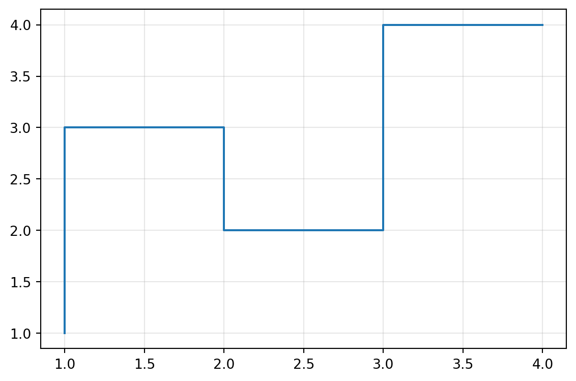
Example 1: Basic step plot
Inputs:
| data | |
|---|---|
| 1 | 1 |
| 2 | 3 |
| 3 | 2 |
| 4 | 4 |
Excel formula:
=STEP({1,1;2,3;3,2;4,4})Expected output:
"chart"
Example 2: Step plot with title and axis labels
Inputs:
| data | title | xlabel | ylabel | |
|---|---|---|---|---|
| 1 | 1 | Step Function | X | Y |
| 2 | 3 | |||
| 3 | 2 |
Excel formula:
=STEP({1,1;2,3;3,2}, "Step Function", "X", "Y")Expected output:
"chart"
Example 3: Multiple step series with legend
Inputs:
| data | legend | ||
|---|---|---|---|
| 1 | 1 | 2 | true |
| 2 | 3 | 4 | |
| 3 | 2 | 3 |
Excel formula:
=STEP({1,1,2;2,3,4;3,2,3}, "true")Expected output:
"chart"
Example 4: Custom step location and color
Inputs:
| data | where | step_color | |
|---|---|---|---|
| 1 | 1 | mid | red |
| 2 | 3 | ||
| 3 | 2 |
Excel formula:
=STEP({1,1;2,3;3,2}, "mid", "red")Expected output:
"chart"
Python Code
Show Code
import sys
import matplotlib
IS_PYODIDE = sys.platform == "emscripten"
if IS_PYODIDE:
    matplotlib.use('Agg')
import matplotlib.pyplot as plt
import io
import base64
import numpy as np

def step(data, title=None, xlabel=None, ylabel=None, step_color=None, where='pre', grid='true', legend='false'):
    """
    Create a step plot from data.

    See: https://matplotlib.org/stable/api/_as_gen/matplotlib.pyplot.step.html

    This example function is provided as-is without any representation of accuracy.

    Args:
        data (list[list]): Input data.
        title (str, optional): Chart title. Default is None.
        xlabel (str, optional): Label for X-axis. Default is None.
        ylabel (str, optional): Label for Y-axis. Default is None.
        step_color (str, optional): Step color. Valid options: Blue, Green, Red, Cyan, Magenta, Yellow, Black, White. Default is None.
        where (str, optional): Step location ('pre', 'post', 'mid'). Valid options: Pre, Mid, Post. Default is 'pre'.
        grid (str, optional): Show grid lines. Valid options: True, False. Default is 'true'.
        legend (str, optional): Show legend. Valid options: True, False. Default is 'false'.

    Returns:
        object: Matplotlib Figure object (standard Python) or base64 encoded PNG string (Pyodide).
    """
    try:
        if not isinstance(data, list) or not data or not isinstance(data[0], list):
            return "Error: Input data must be a 2D list."

        # Convert to numpy array
        try:
            arr = np.array(data, dtype=float)
        except Exception:
            return "Error: Data must be numeric."

        if arr.ndim != 2 or arr.shape[1] < 2:
            return "Error: Data must have at least 2 columns (X, Y)."

        # Extract X and Y series
        x = arr[:, 0]
        y_series = [arr[:, i] for i in range(1, arr.shape[1])]

        # Create figure
        fig, ax = plt.subplots(figsize=(6, 4))

        # Plot step
        if len(y_series) == 1:
            ax.step(x, y_series[0], where=where, color=step_color if step_color else None)
        else:
            for i, y in enumerate(y_series):
                ax.step(x, y, where=where, label=f"Series {i+1}")

        # Set labels and title
        if title:
            ax.set_title(title)
        if xlabel:
            ax.set_xlabel(xlabel)
        if ylabel:
            ax.set_ylabel(ylabel)

        # Grid and legend
        if grid == "true":
            ax.grid(True, alpha=0.3)
        if legend == "true" and len(y_series) > 1:
            ax.legend()

        plt.tight_layout()

        if IS_PYODIDE:
            buf = io.BytesIO()
            plt.savefig(buf, format='png')
            plt.close(fig)
            buf.seek(0)
            img_bytes = buf.read()
            img_b64 = base64.b64encode(img_bytes).decode('utf-8')
            return f"data:image/png;base64,{img_b64}"
        else:
            return fig
    except Exception as e:
        return f"Error: {str(e)}"
Online Calculator
Input data.
Chart title.
Label for X-axis.
Label for Y-axis.
Step color.
Step location ('pre', 'post', 'mid').
Show grid lines.
Show legend.