Specialty
Overview
Specialized charts address communication tasks that standard line, bar, or scatter plots do not handle well. In analytics and engineering workflows, these visuals help encode progress against goals, task schedules, flow conservation, tabular summaries, and high-level text themes in compact, decision-ready formats. The specialty chart family is valuable because it maps specific business and technical questions to chart types designed for those questions instead of forcing a generic plot.
Core Concepts: This category centers on purpose-built encodings. Instead of emphasizing one universal grammar, each tool prioritizes a different analytical intent: benchmarking against thresholds, tracking time windows, visualizing proportional flow, rendering structured tables, or summarizing token frequency in text. Many of these views combine quantitative scale with semantic cues (shape, arrangement, and color zones), so interpretation depends on both values and layout. For target-oriented views, performance can be expressed as a ratio such as \text{attainment} = \frac{\text{measured}}{\text{target}} to distinguish underperformance, on-target outcomes, and exceedance.
Implementation: Most functions in this category are built on Matplotlib, the core Python visualization library used widely in scientific computing and reporting pipelines. Matplotlib provides low-level control over axes, artists, and layout primitives needed for custom chart forms such as gauges, bullet bars, and Sankey flows. The text-visualization capability additionally uses the wordcloud package for spatially arranging terms by weight, with rendering integrated back into Matplotlib-compatible outputs.
Target and KPI Visuals: BULLET and GAUGE both focus on goal tracking, but they emphasize different reading patterns. BULLET supports side-by-side comparison of measured values against targets across multiple labels, often used for departmental scorecards or operational dashboards. GAUGE compresses a single value into a radial indicator with qualitative zones, making it effective for at-a-glance status checks in monitoring interfaces. Together, they provide complementary views for multi-metric and single-metric performance communication.
Scheduling and Flow Structure: GANTT and SANKEY represent relationships where position and direction matter. GANTT maps start times and durations into horizontal task bars, which is useful for project planning, dependency review, and resource coordination. SANKEY encodes magnitude-preserving flows between inputs and outputs, helping analysts inspect allocation, transfer, or loss patterns in systems such as budgets, energy balances, or process streams. Both charts are especially practical when stakeholders need to understand structure rather than only aggregate totals.
Tabular and Text Summaries: TABLE and WORDCLOUD support high-density summary communication for different data modalities. TABLE formats matrix-like values into presentation-ready cells with optional color customization, useful for KPI snapshots, lookup summaries, and report appendices where precise values must remain explicit. WORDCLOUD converts text corpora into frequency-weighted term maps, enabling quick thematic inspection during exploratory text analysis or survey review. Used together, these tools bridge exact numeric reporting and qualitative pattern discovery.
BULLET
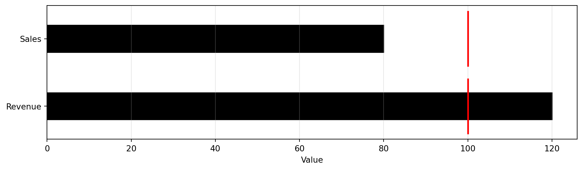
Create a bullet chart for visual comparison against a target.
Excel Usage
=BULLET(data, title, target, color_ranges, color_measure, legend)data(list[list], required): Input data (Labels, Measured).title(str, optional, default: null): Chart title.target(float, optional, default: 0): Target value.color_ranges(str, optional, default: null): Zone colors (comma-separated).color_measure(str, optional, default: “black”): Measured bar color.legend(str, optional, default: “false”): Show legend.
Returns (object): Matplotlib Figure object (standard Python) or base64 encoded PNG string (Pyodide).
Example 1: Basic bullet chart with target
Inputs:
| data | target | |
|---|---|---|
| Sales | 80 | 100 |
| Revenue | 120 |
Excel formula:
=BULLET({"Sales",80;"Revenue",120}, 100)Expected output:
"chart"
Example 2: Bullet chart with title
Inputs:
| data | target | title | |
|---|---|---|---|
| Q1 | 90 | 100 | Quarterly Performance |
| Q2 | 110 |
Excel formula:
=BULLET({"Q1",90;"Q2",110}, 100, "Quarterly Performance")Expected output:
"chart"
Example 3: Bullet chart with colored zones
Inputs:
| data | target | color_ranges | |
|---|---|---|---|
| Metric A | 75 | 100 | lightgray,yellow,lightgreen |
Excel formula:
=BULLET({"Metric A",75}, 100, "lightgray,yellow,lightgreen")Expected output:
"chart"
Example 4: Bullet chart with legend
Inputs:
| data | target | legend | |
|---|---|---|---|
| Score | 85 | 90 | true |
Excel formula:
=BULLET({"Score",85}, 90, "true")Expected output:
"chart"
Python Code
Show Code
import sys
import matplotlib
IS_PYODIDE = sys.platform == "emscripten"
if IS_PYODIDE:
    matplotlib.use('Agg')
import matplotlib.pyplot as plt
import io
import base64
import numpy as np

def bullet(data, title=None, target=0, color_ranges=None, color_measure='black', legend='false'):
    """
    Create a bullet chart for visual comparison against a target.

    See: https://matplotlib.org/stable/gallery/lines_bars_and_markers/barh.html

    This example function is provided as-is without any representation of accuracy.

    Args:
        data (list[list]): Input data (Labels, Measured).
        title (str, optional): Chart title. Default is None.
        target (float, optional): Target value. Default is 0.
        color_ranges (str, optional): Zone colors (comma-separated). Default is None.
        color_measure (str, optional): Measured bar color. Default is 'black'.
        legend (str, optional): Show legend. Valid options: True, False. Default is 'false'.

    Returns:
        object: Matplotlib Figure object (standard Python) or base64 encoded PNG string (Pyodide).
    """
    def to2d(x):
        return [[x]] if not isinstance(x, list) else x

    try:
        data = to2d(data)

        if not isinstance(data, list) or len(data) == 0:
            return "Error: Data must be a non-empty 2D list"

        # Extract labels and measured values
        labels = []
        measured = []

        for row in data:
            if not isinstance(row, list) or len(row) < 2:
                continue

            try:
                label = str(row[0]) if row[0] else "Item"
                value = float(row[1])

                labels.append(label)
                measured.append(value)
            except (TypeError, ValueError):
                continue

        if len(labels) == 0:
            return "Error: No valid data found"

        # Create the figure
        fig, ax = plt.subplots(figsize=(10, max(3, len(labels) * 0.8)))

        y_pos = np.arange(len(labels))

        # Determine the maximum value for scaling
        max_value = max(max(measured), target if target > 0 else 0)

        # Parse color ranges for background zones
        if color_ranges:
            colors = [c.strip() for c in str(color_ranges).split(',')]
            # Draw background zones
            zone_width = max_value / len(colors)
            for i, color in enumerate(colors):
                ax.barh(y_pos, zone_width, left=i * zone_width,
                       color=color, alpha=0.3, height=0.8)

        # Draw measured bars
        ax.barh(y_pos, measured, height=0.4, color=color_measure,
               edgecolor='black', linewidth=1, label='Measured' if legend == "true" else None)

        # Draw target line if specified
        if target > 0:
            for i in y_pos:
                ax.plot([target, target], [i - 0.4, i + 0.4],
                       color='red', linewidth=2, label='Target' if i == 0 and legend == "true" else None)

        ax.set_yticks(y_pos)
        ax.set_yticklabels(labels)
        ax.invert_yaxis()
        ax.set_xlabel('Value')

        if title:
            ax.set_title(str(title))

        if legend == "true":
            handles, labels_legend = ax.get_legend_handles_labels()
            # Remove duplicate labels
            by_label = dict(zip(labels_legend, handles))
            ax.legend(by_label.values(), by_label.keys(), loc='best')

        ax.grid(True, axis='x', alpha=0.3)
        plt.tight_layout()

        if IS_PYODIDE:
            buf = io.BytesIO()
            plt.savefig(buf, format='png', dpi=100, bbox_inches='tight')
            buf.seek(0)
            img_base64 = base64.b64encode(buf.read()).decode('utf-8')
            plt.close(fig)
            return f"data:image/png;base64,{img_base64}"
        else:
            return fig
    except Exception as e:
        return f"Error: {str(e)}"
Online Calculator
Input data (Labels, Measured).
Chart title.
Target value.
Zone colors (comma-separated).
Measured bar color.
Show legend.
GANTT
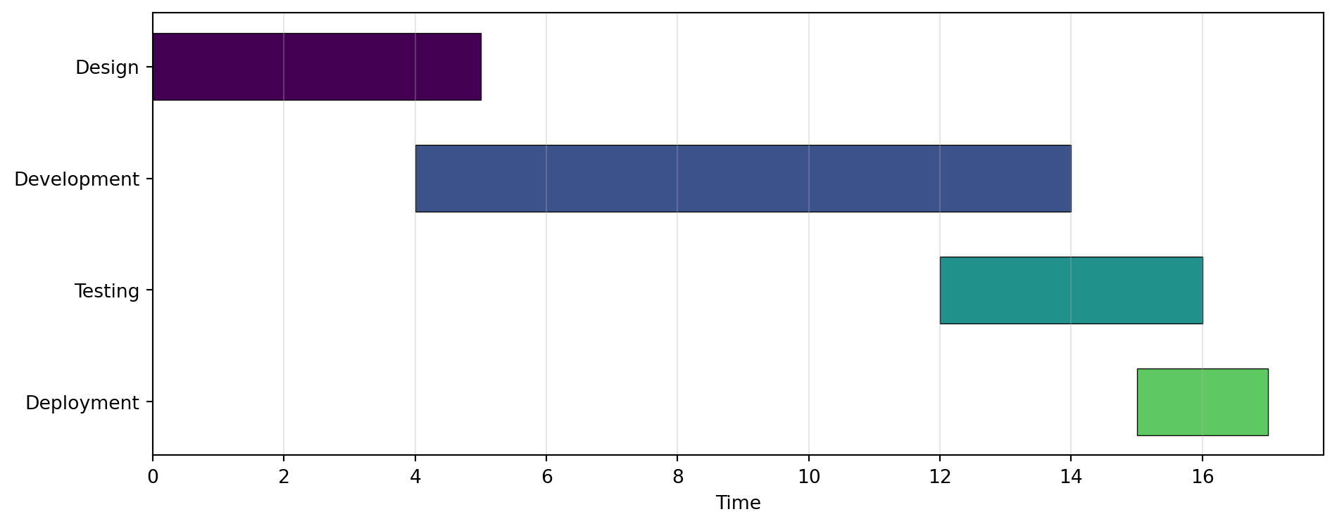
Create a Gantt chart (timeline of tasks).
Excel Usage
=GANTT(data, title, xlabel, ylabel, color_map, legend)data(list[list], required): Input data (Labels, Start, Duration).title(str, optional, default: null): Chart title.xlabel(str, optional, default: null): Label for X-axis.ylabel(str, optional, default: null): Label for Y-axis.color_map(str, optional, default: “viridis”): Color map for tasks.legend(str, optional, default: “false”): Show legend.
Returns (object): Matplotlib Figure object (standard Python) or base64 encoded PNG string (Pyodide).
Example 1: Project timeline with multiple tasks
Inputs:
| data | ||
|---|---|---|
| Design | 0 | 5 |
| Development | 4 | 10 |
| Testing | 12 | 4 |
| Deployment | 15 | 2 |
Excel formula:
=GANTT({"Design",0,5;"Development",4,10;"Testing",12,4;"Deployment",15,2})Expected output:
"chart"
Example 2: Gantt with custom axis labels and title
Inputs:
| data | title | xlabel | ylabel | ||
|---|---|---|---|---|---|
| Phase 1 | 0 | 3 | Project Schedule | Days | Tasks |
| Phase 2 | 2 | 4 |
Excel formula:
=GANTT({"Phase 1",0,3;"Phase 2",2,4}, "Project Schedule", "Days", "Tasks")Expected output:
"chart"
Example 3: Gantt with legend
Inputs:
| data | legend | ||
|---|---|---|---|
| Task A | 0 | 5 | true |
| Task B | 3 | 6 |
Excel formula:
=GANTT({"Task A",0,5;"Task B",3,6}, "true")Expected output:
"chart"
Example 4: Custom color map
Inputs:
| data | color_map | ||
|---|---|---|---|
| Sprint 1 | 0 | 14 | plasma |
| Sprint 2 | 14 | 14 | |
| Sprint 3 | 28 | 14 |
Excel formula:
=GANTT({"Sprint 1",0,14;"Sprint 2",14,14;"Sprint 3",28,14}, "plasma")Expected output:
"chart"
Python Code
Show Code
import sys
import matplotlib
IS_PYODIDE = sys.platform == "emscripten"
if IS_PYODIDE:
    matplotlib.use('Agg')
import matplotlib.pyplot as plt
import io
import base64
import numpy as np

def gantt(data, title=None, xlabel=None, ylabel=None, color_map='viridis', legend='false'):
    """
    Create a Gantt chart (timeline of tasks).

    See: https://matplotlib.org/stable/api/_as_gen/matplotlib.axes.Axes.broken_barh.html

    This example function is provided as-is without any representation of accuracy.

    Args:
        data (list[list]): Input data (Labels, Start, Duration).
        title (str, optional): Chart title. Default is None.
        xlabel (str, optional): Label for X-axis. Default is None.
        ylabel (str, optional): Label for Y-axis. Default is None.
        color_map (str, optional): Color map for tasks. Valid options: Viridis, Plasma, Inferno, Magma, Cividis. Default is 'viridis'.
        legend (str, optional): Show legend. Valid options: True, False. Default is 'false'.

    Returns:
        object: Matplotlib Figure object (standard Python) or base64 encoded PNG string (Pyodide).
    """
    def to2d(x):
        return [[x]] if not isinstance(x, list) else x

    try:
        data = to2d(data)

        if not isinstance(data, list) or len(data) == 0:
            return "Error: Data must be a non-empty 2D list"

        # Extract labels, starts, and durations
        labels = []
        starts = []
        durations = []

        for row in data:
            if not isinstance(row, list) or len(row) < 3:
                continue

            try:
                label = str(row[0]) if row[0] else "Task"
                start = float(row[1])
                duration = float(row[2])

                if duration <= 0:
                    continue

                labels.append(label)
                starts.append(start)
                durations.append(duration)
            except (TypeError, ValueError):
                continue

        if len(labels) == 0:
            return "Error: No valid task data found"

        # Create the figure
        fig, ax = plt.subplots(figsize=(10, max(4, len(labels) * 0.6)))

        # Get colormap
        try:
            cmap = plt.get_cmap(color_map)
            colors = [cmap(i / len(labels)) for i in range(len(labels))]
        except:
            colors = ['steelblue'] * len(labels)

        # Create Gantt chart using horizontal bars
        y_pos = np.arange(len(labels))

        for i, (start, duration, color, label) in enumerate(zip(starts, durations, colors, labels)):
            ax.barh(i, duration, left=start, height=0.6, color=color,
                    edgecolor='black', linewidth=0.5, label=label if legend == "true" else None)

        ax.set_yticks(y_pos)
        ax.set_yticklabels(labels)
        ax.invert_yaxis()

        if xlabel:
            ax.set_xlabel(str(xlabel))
        else:
            ax.set_xlabel('Time')

        if ylabel:
            ax.set_ylabel(str(ylabel))

        if title:
            ax.set_title(str(title))

        if legend == "true":
            ax.legend(loc='best', fontsize='small')

        ax.grid(True, axis='x', alpha=0.3)
        plt.tight_layout()

        if IS_PYODIDE:
            buf = io.BytesIO()
            plt.savefig(buf, format='png', dpi=100, bbox_inches='tight')
            buf.seek(0)
            img_base64 = base64.b64encode(buf.read()).decode('utf-8')
            plt.close(fig)
            return f"data:image/png;base64,{img_base64}"
        else:
            return fig
    except Exception as e:
        return f"Error: {str(e)}"
Online Calculator
Input data (Labels, Start, Duration).
Chart title.
Label for X-axis.
Label for Y-axis.
Color map for tasks.
Show legend.
GAUGE
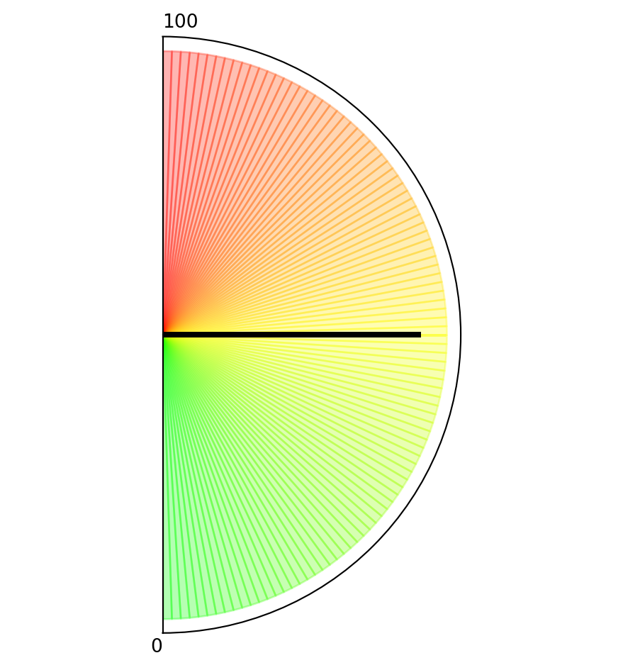
Create a speedometer/gauge style chart.
Excel Usage
=GAUGE(value, title, min_val, max_val, color_ranges)value(float, required): Current reading.title(str, optional, default: null): Gauge title.min_val(float, optional, default: 0): Minimum value.max_val(float, optional, default: 100): Maximum value.color_ranges(list[list], optional, default: null): Range color zones.
Returns (object): Matplotlib Figure object (standard Python) or base64 encoded PNG string (Pyodide).
Example 1: Gauge showing mid-range value
Inputs:
| value |
|---|
| 50 |
Excel formula:
=GAUGE(50)Expected output:
"chart"
Example 2: Gauge with custom title
Inputs:
| value | title |
|---|---|
| 75 | Speed (mph) |
Excel formula:
=GAUGE(75, "Speed (mph)")Expected output:
"chart"
Example 3: Custom min/max range
Inputs:
| value | min_val | max_val |
|---|---|---|
| 150 | 0 | 200 |
Excel formula:
=GAUGE(150, 0, 200)Expected output:
"chart"
Example 4: Gauge with color zones
Inputs:
| value | color_ranges | ||
|---|---|---|---|
| 85 | 0 | 50 | green |
| 50 | 75 | yellow | |
| 75 | 100 | red |
Excel formula:
=GAUGE(85, {0,50,"green";50,75,"yellow";75,100,"red"})Expected output:
"chart"
Python Code
Show Code
import sys
import matplotlib
IS_PYODIDE = sys.platform == "emscripten"
if IS_PYODIDE:
    matplotlib.use('Agg')
import matplotlib.pyplot as plt
import io
import base64
import numpy as np
import matplotlib.patches as mpatches

def gauge(value, title=None, min_val=0, max_val=100, color_ranges=None):
    """
    Create a speedometer/gauge style chart.

    See: https://matplotlib.org/stable/gallery/pie_and_polar_charts/pie_and_donut_labels.html

    This example function is provided as-is without any representation of accuracy.

    Args:
        value (float): Current reading.
        title (str, optional): Gauge title. Default is None.
        min_val (float, optional): Minimum value. Default is 0.
        max_val (float, optional): Maximum value. Default is 100.
        color_ranges (list[list], optional): Range color zones. Default is None.

    Returns:
        object: Matplotlib Figure object (standard Python) or base64 encoded PNG string (Pyodide).
    """
    try:
        # Validate value
        try:
            val = float(value)
        except (TypeError, ValueError):
            return "Error: Value must be a number"

        # Validate min/max
        if min_val >= max_val:
            return "Error: min_val must be less than max_val"

        # Clamp value to range
        val = max(min_val, min(max_val, val))

        # Create the figure
        fig, ax = plt.subplots(figsize=(8, 5), subplot_kw={'projection': 'polar'})

        # Set up the gauge (semicircle from pi to 2*pi, or 180 to 360 degrees)
        ax.set_theta_zero_location('S')
        ax.set_theta_direction(1)
        ax.set_thetamin(0)
        ax.set_thetamax(180)

        # Remove radial labels
        ax.set_yticks([])
        ax.set_xticks([])

        # Parse color ranges if provided
        if color_ranges:
            def to2d(x):
                return [[x]] if not isinstance(x, list) else x

            ranges = to2d(color_ranges)

            # Draw colored zones
            for range_def in ranges:
                if not isinstance(range_def, list) or len(range_def) < 3:
                    continue

                try:
                    r_min = float(range_def[0])
                    r_max = float(range_def[1])
                    r_color = str(range_def[2])

                    # Convert value range to angle (0 to 180 degrees = 0 to pi radians)
                    theta_min = np.pi * (r_min - min_val) / (max_val - min_val)
                    theta_max = np.pi * (r_max - min_val) / (max_val - min_val)

                    theta = np.linspace(theta_min, theta_max, 100)
                    r = np.ones_like(theta)

                    ax.fill_between(theta, 0, r, color=r_color, alpha=0.3)
                except (TypeError, ValueError):
                    continue
        else:
            # Default gradient from green to yellow to red
            n_segments = 100
            for i in range(n_segments):
                theta_start = np.pi * i / n_segments
                theta_end = np.pi * (i + 1) / n_segments

                # Color gradient: green -> yellow -> red
                ratio = i / n_segments
                if ratio < 0.5:
                    color = (ratio * 2, 1, 0)  # green to yellow
                else:
                    color = (1, 2 * (1 - ratio), 0)  # yellow to red

                theta = np.linspace(theta_start, theta_end, 10)
                r = np.ones_like(theta)
                ax.fill_between(theta, 0, r, color=color, alpha=0.3)

        # Draw the needle
        needle_angle = np.pi * (val - min_val) / (max_val - min_val)
        ax.plot([needle_angle, needle_angle], [0, 0.9], color='black', linewidth=3)

        # Add value text
        ax.text(np.pi / 2, -0.2, f'{val:.1f}',
                ha='center', va='center', fontsize=20, weight='bold',
                transform=ax.transData)

        # Add min/max labels
        ax.text(0, 1.1, f'{min_val:.0f}', ha='right', va='center', fontsize=10)
        ax.text(np.pi, 1.1, f'{max_val:.0f}', ha='left', va='center', fontsize=10)

        if title:
            plt.title(str(title), pad=20, fontsize=14, weight='bold')

        plt.tight_layout()

        if IS_PYODIDE:
            buf = io.BytesIO()
            plt.savefig(buf, format='png', dpi=100, bbox_inches='tight')
            buf.seek(0)
            img_base64 = base64.b64encode(buf.read()).decode('utf-8')
            plt.close(fig)
            return f"data:image/png;base64,{img_base64}"
        else:
            return fig
    except Exception as e:
        return f"Error: {str(e)}"
Online Calculator
Current reading.
Gauge title.
Minimum value.
Maximum value.
Range color zones.
SANKEY
Create a Sankey flow diagram.
Ignoring fixed x limits to fulfill fixed data aspect with adjustable data limits.
Ignoring fixed x limits to fulfill fixed data aspect with adjustable data limits.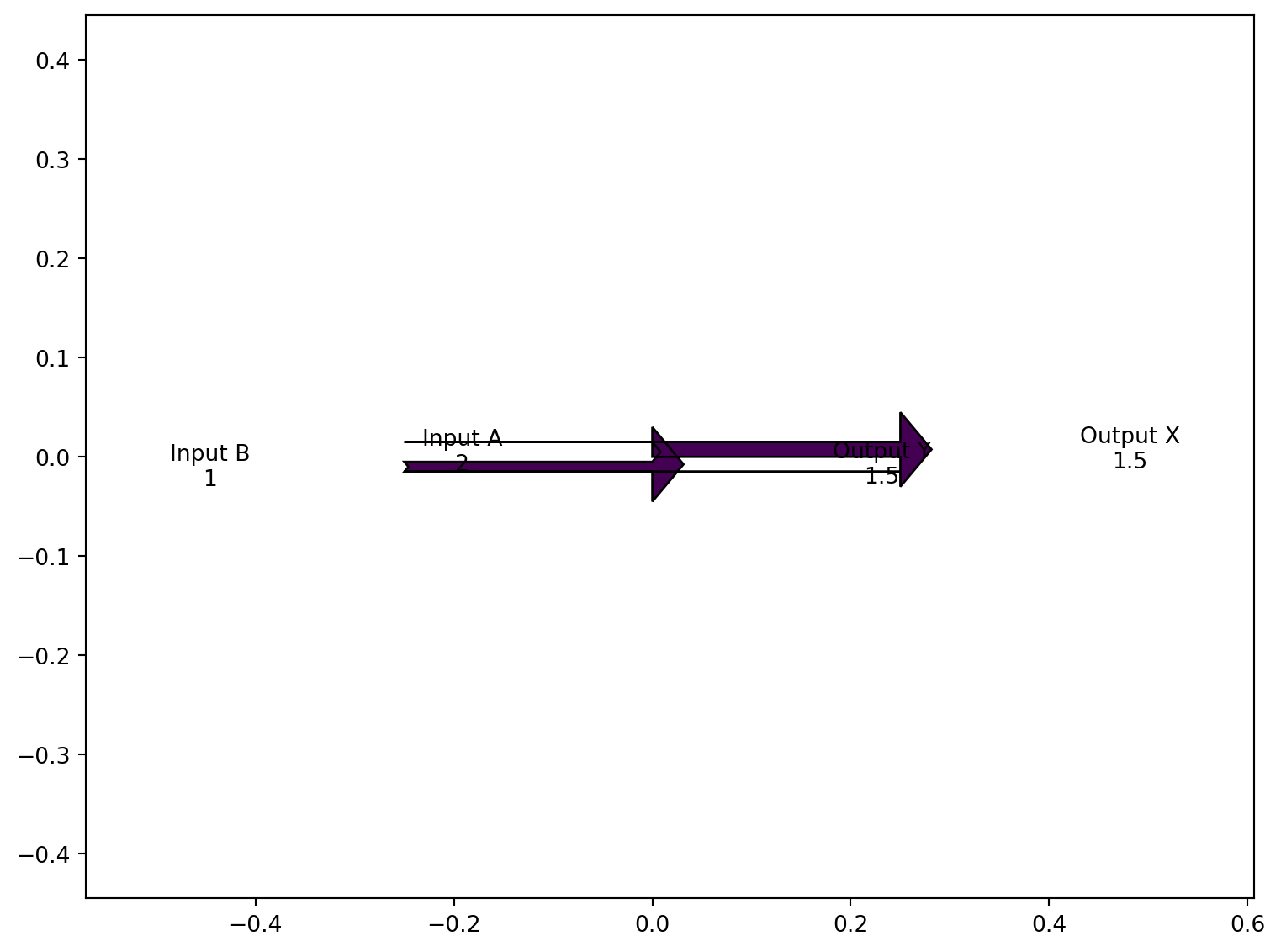
Excel Usage
=SANKEY(data, title, color_map)data(list[list], required): Input data (Flows, Labels).title(str, optional, default: null): Chart title.color_map(str, optional, default: “viridis”): Color map for flows.
Returns (object): Matplotlib Figure object (standard Python) or base64 encoded PNG string (Pyodide).
Example 1: Energy flow with balanced inputs and outputs
Inputs:
| data | |
|---|---|
| 2 | Input A |
| 1 | Input B |
| -1.5 | Output X |
| -1.5 | Output Y |
Excel formula:
=SANKEY({2,"Input A";1,"Input B";-1.5,"Output X";-1.5,"Output Y"})Expected output:
"chart"
Example 2: Simple two-flow balance
Inputs:
| data | |
|---|---|
| 1 | In |
| -1 | Out |
Excel formula:
=SANKEY({1,"In";-1,"Out"})Expected output:
"chart"
Example 3: Sankey with title
Inputs:
| data | title | |
|---|---|---|
| 5 | Source | Energy Distribution |
| -3 | Use A | |
| -2 | Use B |
Excel formula:
=SANKEY({5,"Source";-3,"Use A";-2,"Use B"}, "Energy Distribution")Expected output:
"chart"
Example 4: Custom color map
Inputs:
| data | color_map | |
|---|---|---|
| 10 | Revenue | plasma |
| -6 | Costs | |
| -4 | Profit |
Excel formula:
=SANKEY({10,"Revenue";-6,"Costs";-4,"Profit"}, "plasma")Expected output:
"chart"
Python Code
Show Code
import sys
import matplotlib
IS_PYODIDE = sys.platform == "emscripten"
if IS_PYODIDE:
    matplotlib.use('Agg')
import matplotlib.pyplot as plt
from matplotlib.sankey import Sankey
import io
import base64
import numpy as np

def sankey(data, title=None, color_map='viridis'):
    """
    Create a Sankey flow diagram.

    See: https://matplotlib.org/stable/api/sankey_api.html

    This example function is provided as-is without any representation of accuracy.

    Args:
        data (list[list]): Input data (Flows, Labels).
        title (str, optional): Chart title. Default is None.
        color_map (str, optional): Color map for flows. Valid options: Viridis, Plasma, Inferno, Magma, Cividis. Default is 'viridis'.

    Returns:
        object: Matplotlib Figure object (standard Python) or base64 encoded PNG string (Pyodide).
    """
    def to2d(x):
        return [[x]] if not isinstance(x, list) else x

    try:
        data = to2d(data)

        if not isinstance(data, list) or len(data) == 0:
            return "Error: Data must be a non-empty 2D list"

        # Extract flows and labels
        flows = []
        labels = []

        for row in data:
            if not isinstance(row, list) or len(row) < 1:
                continue

            try:
                flow = float(row[0])
                flows.append(flow)

                if len(row) > 1 and row[1]:
                    labels.append(str(row[1]))
                else:
                    labels.append("")
            except (TypeError, ValueError):
                continue

        if len(flows) == 0:
            return "Error: No valid flow data found"

        # Check if flows balance (sum should be close to zero)
        if abs(sum(flows)) > 1e-6:
            return "Error: Flows must balance (sum of inflows must equal sum of outflows)"

        # Create the figure
        fig = plt.figure(figsize=(8, 6))
        ax = fig.add_subplot(1, 1, 1)

        # Create Sankey diagram
        sankey = Sankey(ax=ax, scale=0.01, offset=0.2)

        # Get colormap
        try:
            cmap = plt.get_cmap(color_map)
            colors = [cmap(i / len(flows)) for i in range(len(flows))]
        except:
            colors = None

        sankey.add(flows=flows, labels=labels, orientations=[0]*len(flows),
                   facecolor=colors[0] if colors else None)
        diagrams = sankey.finish()

        if title:
            plt.title(str(title))

        plt.tight_layout()

        if IS_PYODIDE:
            buf = io.BytesIO()
            plt.savefig(buf, format='png', dpi=100, bbox_inches='tight')
            buf.seek(0)
            img_base64 = base64.b64encode(buf.read()).decode('utf-8')
            plt.close(fig)
            return f"data:image/png;base64,{img_base64}"
        else:
            return fig
    except Exception as e:
        return f"Error: {str(e)}"
Online Calculator
Input data (Flows, Labels).
Chart title.
Color map for flows.
TABLE
Render data as a graphical table image.
Excel Usage
=TABLE(data, title, col_colors, cell_colors)data(list[list], required): Input data.title(str, optional, default: null): Table title.col_colors(str, optional, default: null): Header colors (comma-separated or single color).cell_colors(str, optional, default: null): Cell colors (comma-separated or single color).
Returns (object): Matplotlib Figure object (standard Python) or base64 encoded PNG string (Pyodide).
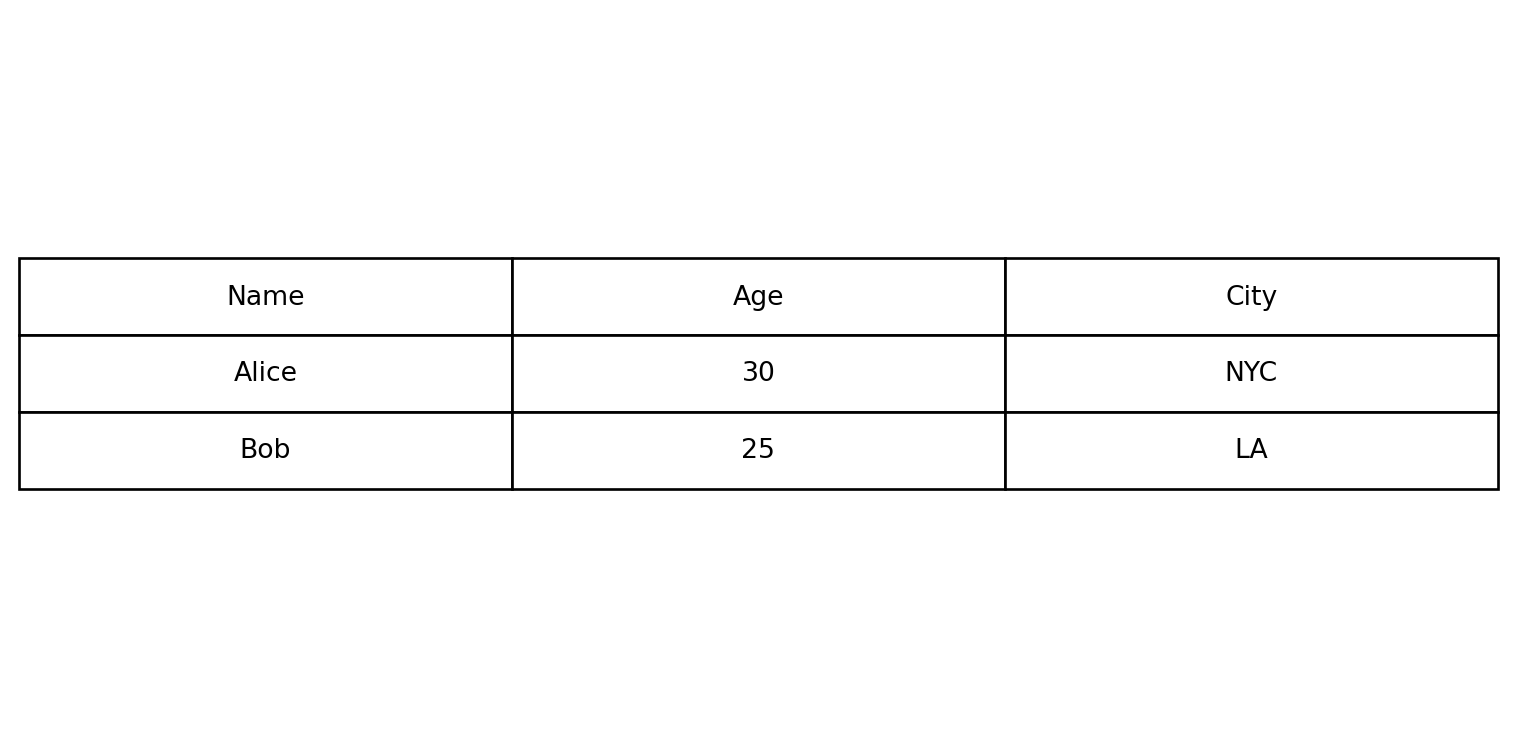
Example 1: Basic 3x3 table
Inputs:
| data | ||
|---|---|---|
| Name | Age | City |
| Alice | 30 | NYC |
| Bob | 25 | LA |
Excel formula:
=TABLE({"Name","Age","City";"Alice",30,"NYC";"Bob",25,"LA"})Expected output:
"chart"
Example 2: Table with title
Inputs:
| data | title | ||
|---|---|---|---|
| Product | Price | Stock | Inventory |
| Widget | 9.99 | 100 | |
| Gadget | 19.99 | 50 |
Excel formula:
=TABLE({"Product","Price","Stock";"Widget",9.99,100;"Gadget",19.99,50}, "Inventory")Expected output:
"chart"
Example 3: Colored column headers
Inputs:
| data | col_colors | |||
|---|---|---|---|---|
| Q1 | Q2 | Q3 | Q4 | lightblue |
| 100 | 150 | 200 | 250 |
Excel formula:
=TABLE({"Q1","Q2","Q3","Q4";100,150,200,250}, "lightblue")Expected output:
"chart"
Example 4: Colored cells with alternating colors
Inputs:
| data | cell_colors | |
|---|---|---|
| A | B | lightgray,white |
| 1 | 2 | |
| 3 | 4 |
Excel formula:
=TABLE({"A","B";1,2;3,4}, "lightgray,white")Expected output:
"chart"
Python Code
Show Code
import sys
import matplotlib
IS_PYODIDE = sys.platform == "emscripten"
if IS_PYODIDE:
    matplotlib.use('Agg')
import matplotlib.pyplot as plt
import io
import base64
import numpy as np

def table(data, title=None, col_colors=None, cell_colors=None):
    """
    Render data as a graphical table image.

    See: https://matplotlib.org/stable/api/_as_gen/matplotlib.pyplot.table.html

    This example function is provided as-is without any representation of accuracy.

    Args:
        data (list[list]): Input data.
        title (str, optional): Table title. Default is None.
        col_colors (str, optional): Header colors (comma-separated or single color). Default is None.
        cell_colors (str, optional): Cell colors (comma-separated or single color). Default is None.

    Returns:
        object: Matplotlib Figure object (standard Python) or base64 encoded PNG string (Pyodide).
    """
    def to2d(x):
        return [[x]] if not isinstance(x, list) else x

    try:
        data = to2d(data)

        if not isinstance(data, list) or len(data) == 0:
            return "Error: Data must be a non-empty 2D list"

        # Convert data to strings for display
        table_data = []
        for row in data:
            if isinstance(row, list):
                table_data.append([str(cell) if cell is not None else "" for cell in row])
            else:
                table_data.append([str(row)])

        if len(table_data) == 0:
            return "Error: No valid data found"

        # Determine dimensions
        max_cols = max(len(row) for row in table_data)

        # Pad rows to have equal length
        for row in table_data:
            while len(row) < max_cols:
                row.append("")

        # Create the figure
        fig, ax = plt.subplots(figsize=(max(8, max_cols * 1.5), max(4, len(table_data) * 0.5)))
        ax.axis('tight')
        ax.axis('off')

        # Parse column colors
        col_color_list = None
        if col_colors:
            colors = [c.strip() for c in str(col_colors).split(',')]
            if len(colors) == 1:
                col_color_list = [colors[0]] * max_cols
            else:
                col_color_list = colors[:max_cols]
                while len(col_color_list) < max_cols:
                    col_color_list.append(col_color_list[-1] if col_color_list else 'lightgray')

        # Parse cell colors
        cell_color_list = None
        if cell_colors:
            colors = [c.strip() for c in str(cell_colors).split(',')]
            if len(colors) == 1:
                cell_color_list = [[colors[0]] * max_cols for _ in table_data]
            else:
                # Apply colors row by row
                cell_color_list = []
                for i in range(len(table_data)):
                    row_colors = []
                    for j in range(max_cols):
                        idx = (i * max_cols + j) % len(colors)
                        row_colors.append(colors[idx])
                    cell_color_list.append(row_colors)

        # Create table
        table = ax.table(cellText=table_data, loc='center',
                        colColours=col_color_list,
                        cellColours=cell_color_list,
                        cellLoc='center')

        table.auto_set_font_size(False)
        table.set_fontsize(10)
        table.scale(1, 2)

        if title:
            plt.title(str(title), pad=20, fontsize=14, weight='bold')

        plt.tight_layout()

        if IS_PYODIDE:
            buf = io.BytesIO()
            plt.savefig(buf, format='png', dpi=100, bbox_inches='tight')
            buf.seek(0)
            img_base64 = base64.b64encode(buf.read()).decode('utf-8')
            plt.close(fig)
            return f"data:image/png;base64,{img_base64}"
        else:
            return fig
    except Exception as e:
        return f"Error: {str(e)}"
Online Calculator
Input data.
Table title.
Header colors (comma-separated or single color).
Cell colors (comma-separated or single color).
WORDCLOUD
Generates a word cloud image from provided text data and returns a PNG image as a base64 string.

Excel Usage
=WORDCLOUD(text, max_words, background_color, colormap)text(list[list], required): 2D list of text strings to generate the word cloud frommax_words(int, optional, default: null): Maximum number of words to display in the cloudbackground_color(str, optional, default: null): Background color name (e.g., “white”, “black”)colormap(str, optional, default: null): Matplotlib colormap name for word colors (e.g., “viridis”, “plasma”)
Returns (object): Matplotlib Figure object (standard Python) or PNG image as base64 string (Pyodide).
Example 1: Demo case 1
Inputs:
| text | max_words | background_color | colormap |
|---|---|---|---|
| Great service | 10 | white | viridis |
| Fast delivery | |||
| Excellent support |
Excel formula:
=WORDCLOUD({"Great service";"Fast delivery";"Excellent support"}, 10, "white", "viridis")Expected output:
"chart"
Example 2: Demo case 2
Inputs:
| text | max_words | background_color | colormap |
|---|---|---|---|
| Easy to use | 8 | black | plasma |
| User friendly interface | |||
| Easy to use |
Excel formula:
=WORDCLOUD({"Easy to use";"User friendly interface";"Easy to use"}, 8, "black", "plasma")Expected output:
"chart"
Example 3: Demo case 3
Inputs:
| text | max_words |
|---|---|
| Simple | 5 |
Excel formula:
=WORDCLOUD({"Simple"}, 5)Expected output:
"chart"
Example 4: Demo case 4
Inputs:
| text | max_words | background_color | colormap |
|---|---|---|---|
| A B C D E F G H I J | 10 | white | inferno |
Excel formula:
=WORDCLOUD({"A B C D E F G H I J"}, 10, "white", "inferno")Expected output:
"chart"
Python Code
Show Code
import sys
import matplotlib
IS_PYODIDE = sys.platform == "emscripten"
if IS_PYODIDE:
    matplotlib.use('Agg')
import base64
from io import BytesIO
from wordcloud import WordCloud
import matplotlib.pyplot as plt

def wordcloud(text, max_words=None, background_color=None, colormap=None):
    """
    Generates a word cloud image from provided text data and returns a PNG image as a base64 string.

    This example function is provided as-is without any representation of accuracy.

    Args:
        text (list[list]): 2D list of text strings to generate the word cloud from
        max_words (int, optional): Maximum number of words to display in the cloud Default is None.
        background_color (str, optional): Background color name (e.g., "white", "black") Default is None.
        colormap (str, optional): Matplotlib colormap name for word colors (e.g., "viridis", "plasma") Default is None.

    Returns:
        object: Matplotlib Figure object (standard Python) or PNG image as base64 string (Pyodide).
    """
    def to2d(x):
        return [[x]] if not isinstance(x, list) else x

    text = to2d(text)
    if not isinstance(text, list) or not all(isinstance(row, list) for row in text):
        return "Invalid input: text must be a 2D list of strings."
    flat_text = []
    for row in text:
        for cell in row:
            if not isinstance(cell, str):
                return "Invalid input: all elements in text must be strings."
            flat_text.append(cell)
    joined_text = " ".join(flat_text)
    if not joined_text.strip():
        return "Invalid input: text is empty."
    if max_words is None:
        max_words = 100
    else:
        try:
            max_words = int(max_words)
        except Exception:
            return "Invalid input: max_words must be a number."
    if background_color is None:
        background_color = "white"
    if colormap is None:
        colormap = "viridis"
    try:
        wc = WordCloud(width=800, height=400, max_words=max_words, background_color=background_color, colormap=colormap)
        wc.generate(joined_text)
        fig, ax = plt.subplots(figsize=(8, 4))
        ax.imshow(wc, interpolation='bilinear')
        ax.axis('off')
        plt.tight_layout()

        if IS_PYODIDE:
            buf = BytesIO()
            plt.savefig(buf, format='png', bbox_inches='tight', pad_inches=0)
            plt.close(fig)
            buf.seek(0)
            img_base64 = base64.b64encode(buf.read()).decode('utf-8')
            return f"data:image/png;base64,{img_base64}"
        else:
            return fig
    except Exception as e:
        return f"Error: {str(e)}"
Online Calculator
2D list of text strings to generate the word cloud from
Maximum number of words to display in the cloud
Background color name (e.g., "white", "black")
Matplotlib colormap name for word colors (e.g., "viridis", "plasma")