Statistical
Overview
Statistical visualization turns raw samples into interpretable structure by showing center, spread, skewness, tails, and relationships between variables. These plots are often the first pass of exploratory data analysis because they reveal quality issues, outliers, and model assumptions. The core ideas are closely tied to descriptive statistics and empirical distributions, as summarized in statistical graphics. For analytics and engineering workflows, this category provides ways to inspect one-dimensional and two-dimensional distributions.
The unifying concepts are distribution shape, quantiles, density estimation, and uncertainty representation. For a sample x_1,\dots,x_n, the empirical cumulative distribution function is \hat F_n(x)=\frac{1}{n}\sum_{i=1}^n \mathbf{1}\{x_i\le x\}, which links histogram-style counting, smooth density views, and rank-based summaries. Binned views trade detail for robustness, while smooth views trade robustness for continuity; both are useful depending on sample size and noise. Together, these functions support both univariate diagnostics and bivariate structure discovery.
Implementation is built primarily on Matplotlib, the foundational Python plotting library for publication-quality static charts, with selected clustering and density routines from SciPy. This combination is common in scientific Python stacks because Matplotlib controls rendering and styling, while SciPy contributes statistical and hierarchical algorithms.
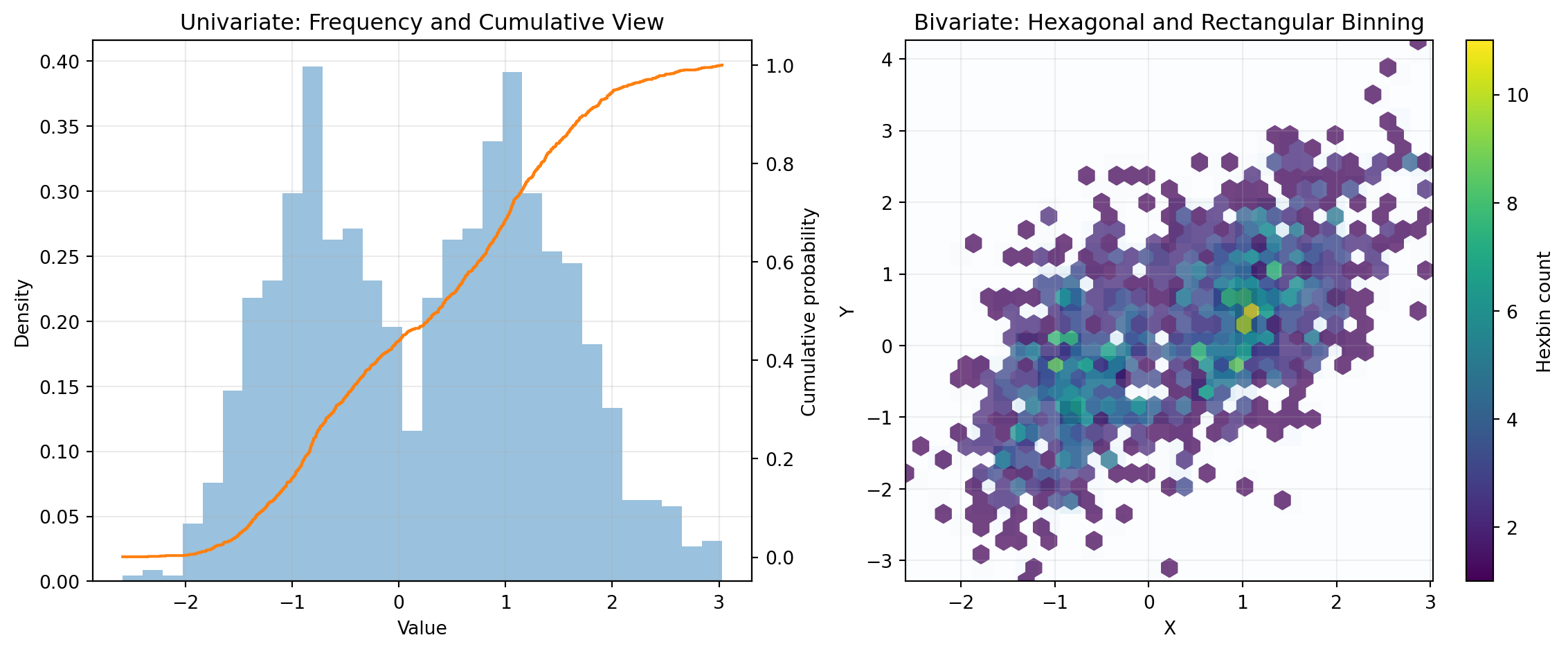
HISTOGRAM, DENSITY, and ECDF form a complementary univariate toolkit. HISTOGRAM estimates frequency or density by bins and can also show cumulative behavior, making it useful for quick shape checks and threshold counts. DENSITY provides a smoothed kernel density estimate that highlights modality and tail behavior when raw bins appear jagged. ECDF gives the exact sample-based cumulative profile, which is ideal for percentile reading and direct distribution comparisons across groups.
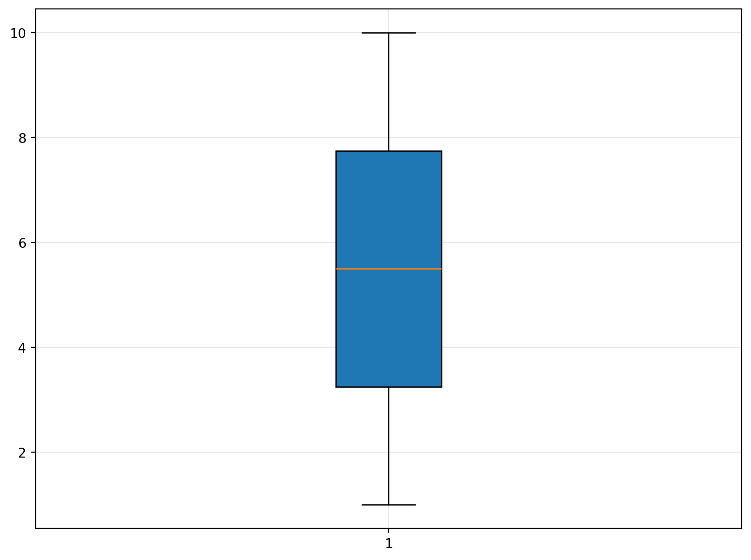
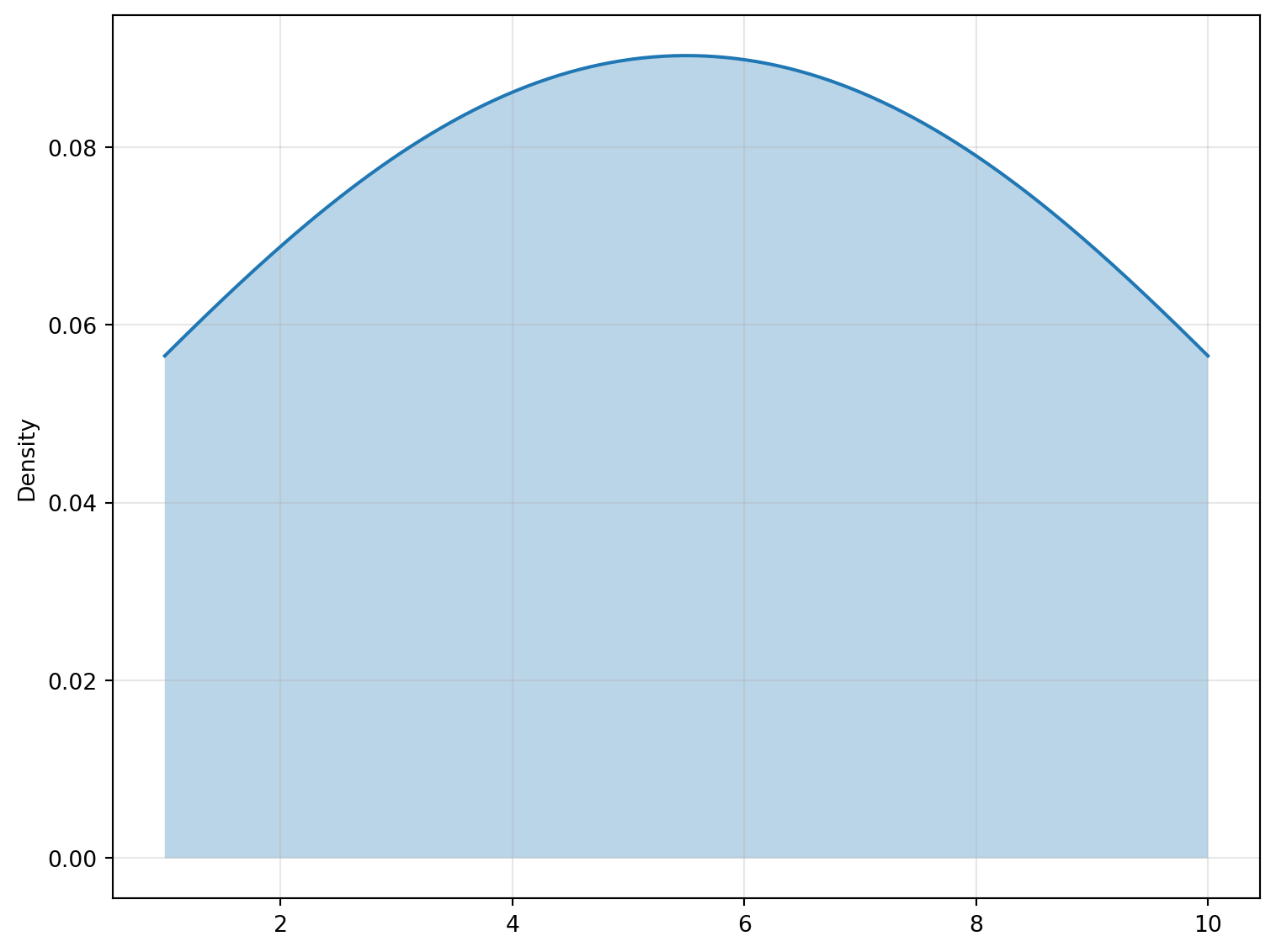
BOXPLOT and VIOLIN summarize distributions across one or more groups with different tradeoffs. BOXPLOT emphasizes quartiles, median, whiskers, and potential outliers, supporting fast robust comparisons in experiments, A/B tests, and process monitoring. VIOLIN augments summary statistics with mirrored density shape, helping reveal multimodality that a box alone can hide. Used together, they provide both compact summaries and richer distribution context for grouped data.
HEXBIN and HIST2D address dense bivariate data where scatter plots overplot. HEXBIN aggregates points into hexagonal cells that reduce directional bias and make local concentration patterns easier to read. HIST2D performs rectangular binning that is straightforward to parameterize and interpret in gridded workflows. Both are practical for exploring correlation structure, heteroskedasticity, and cluster candidates in large datasets.
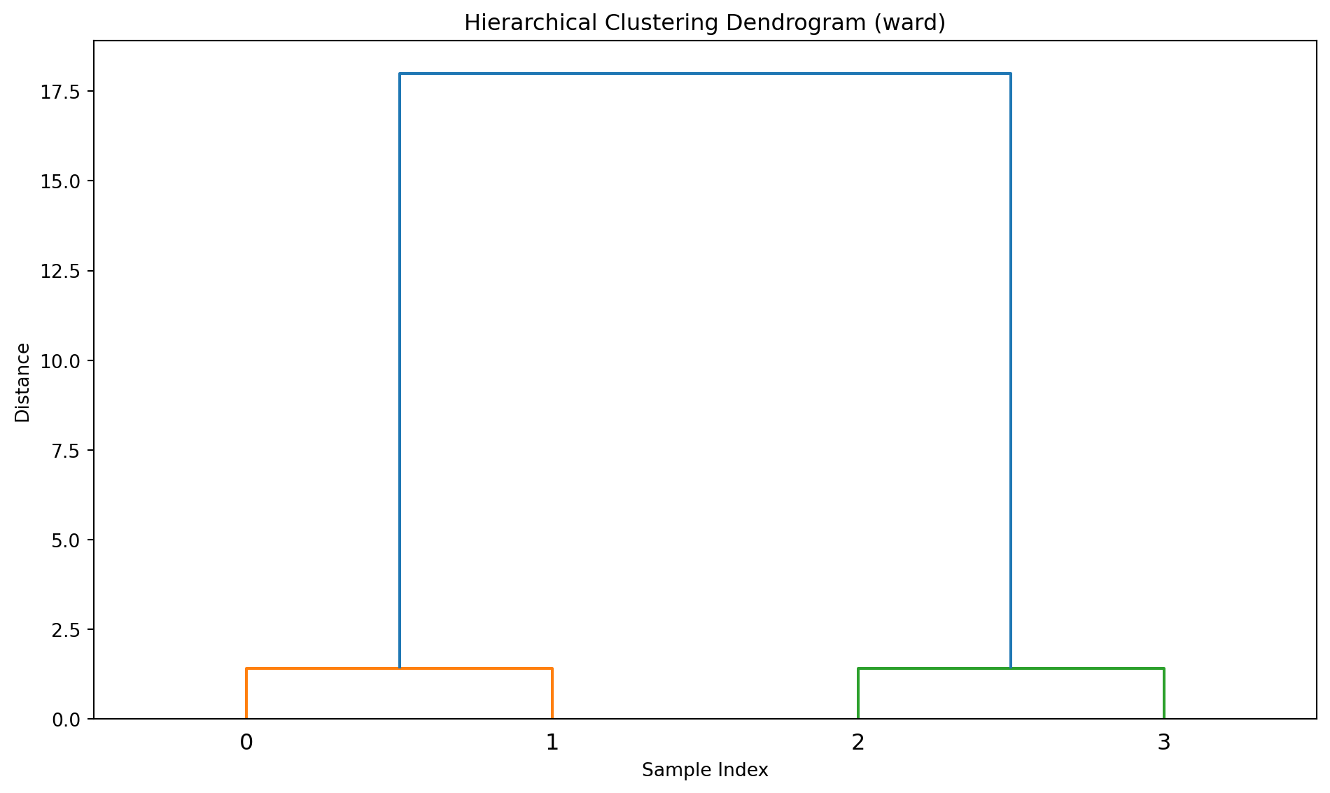
ERRORBAR, EVENTPLOT, and DENDROGRAM cover uncertainty, timing-like event structure, and hierarchical relationships. ERRORBAR overlays measurement variability or confidence intervals on XY values, supporting communication of precision and repeatability. EVENTPLOT displays occurrence positions as spikes, which is useful for raster-style timelines and repeated event sequences. DENDROGRAM visualizes agglomerative clustering merges to show nested similarity structure and inform cut-level selection for segmentation.
BOXPLOT
Create a box-and-whisker plot from data.
Excel Usage
=BOXPLOT(data, title, xlabel, ylabel, stat_color, vert, outliers, grid)data(list[list], required): Input data.title(str, optional, default: null): Chart title.xlabel(str, optional, default: null): Label for X-axis.ylabel(str, optional, default: null): Label for Y-axis.stat_color(str, optional, default: null): Box color.vert(str, optional, default: “true”): Orientation (‘true’ for vertical, ‘false’ for horizontal).outliers(str, optional, default: “true”): Show outliers.grid(str, optional, default: “true”): Show grid lines.
Returns (object): Matplotlib Figure object (standard Python) or base64 encoded PNG string (Pyodide).
Example 1: Boxplot with single group
Inputs:
| data |
|---|
| 1 |
| 2 |
| 3 |
| 4 |
| 5 |
| 6 |
| 7 |
| 8 |
| 9 |
| 10 |
Excel formula:
=BOXPLOT({1;2;3;4;5;6;7;8;9;10})Expected output:
"chart"
Example 2: Boxplot with multiple groups
Inputs:
| data | ||
|---|---|---|
| 1 | 10 | 100 |
| 2 | 20 | 200 |
| 3 | 30 | 300 |
| 4 | 40 | 400 |
| 5 | 50 | 500 |
Excel formula:
=BOXPLOT({1,10,100;2,20,200;3,30,300;4,40,400;5,50,500})Expected output:
"chart"
Example 3: Horizontal boxplot with labels
Inputs:
| data | vert | title | xlabel | ylabel |
|---|---|---|---|---|
| 1 | false | Test Boxplot | Value | Group |
| 2 | ||||
| 3 | ||||
| 4 | ||||
| 5 | ||||
| 6 | ||||
| 7 |
Excel formula:
=BOXPLOT({1;2;3;4;5;6;7}, "false", "Test Boxplot", "Value", "Group")Expected output:
"chart"
Example 4: Boxplot without outliers
Inputs:
| data | outliers |
|---|---|
| 1 | false |
| 2 | |
| 3 | |
| 100 | |
| 200 |
Excel formula:
=BOXPLOT({1;2;3;100;200}, "false")Expected output:
"chart"
Python Code
Show Code
import sys
import matplotlib
IS_PYODIDE = sys.platform == "emscripten"
if IS_PYODIDE:
    matplotlib.use('Agg')
import matplotlib.pyplot as plt
import io
import base64
import numpy as np

def boxplot(data, title=None, xlabel=None, ylabel=None, stat_color=None, vert='true', outliers='true', grid='true'):
    """
    Create a box-and-whisker plot from data.

    See: https://matplotlib.org/stable/api/_as_gen/matplotlib.pyplot.boxplot.html

    This example function is provided as-is without any representation of accuracy.

    Args:
        data (list[list]): Input data.
        title (str, optional): Chart title. Default is None.
        xlabel (str, optional): Label for X-axis. Default is None.
        ylabel (str, optional): Label for Y-axis. Default is None.
        stat_color (str, optional): Box color. Valid options: Blue, Green, Red, Cyan, Magenta, Yellow, Black, White. Default is None.
        vert (str, optional): Orientation ('true' for vertical, 'false' for horizontal). Valid options: True, False. Default is 'true'.
        outliers (str, optional): Show outliers. Valid options: True, False. Default is 'true'.
        grid (str, optional): Show grid lines. Valid options: True, False. Default is 'true'.

    Returns:
        object: Matplotlib Figure object (standard Python) or base64 encoded PNG string (Pyodide).
    """
    def to2d(x):
        return [[x]] if not isinstance(x, list) else x

    def str_to_bool(s):
        return s.lower() == "true" if isinstance(s, str) else bool(s)

    try:
        data = to2d(data)

        if not isinstance(data, list) or not all(isinstance(row, list) for row in data):
            return "Error: Invalid input - data must be a 2D list"

        # Extract numeric columns
        cols = []
        max_rows = max(len(row) for row in data) if data else 0

        for col_idx in range(max_rows):
            col_data = []
            for row in data:
                if col_idx < len(row):
                    val = row[col_idx]
                    try:
                        col_data.append(float(val))
                    except (TypeError, ValueError):
                        continue
            if col_data:
                cols.append(col_data)

        if not cols:
            return "Error: No valid numeric data found"

        # Create plot
        fig, ax = plt.subplots(figsize=(8, 6))

        # Plot boxplot
        bp = ax.boxplot(cols, vert=str_to_bool(vert),
                        showfliers=str_to_bool(outliers),
                        patch_artist=True)

        # Set color
        if stat_color:
            for patch in bp['boxes']:
                patch.set_facecolor(stat_color)

        if title:
            ax.set_title(title)
        if xlabel:
            ax.set_xlabel(xlabel)
        if ylabel:
            ax.set_ylabel(ylabel)

        if str_to_bool(grid):
            ax.grid(True, alpha=0.3)

        plt.tight_layout()

        # Return based on platform
        if IS_PYODIDE:
            buf = io.BytesIO()
            plt.savefig(buf, format='png', dpi=100, bbox_inches='tight')
            buf.seek(0)
            img_base64 = base64.b64encode(buf.read()).decode('utf-8')
            plt.close(fig)
            return f"data:image/png;base64,{img_base64}"
        else:
            return fig
    except Exception as e:
        return f"Error: {str(e)}"
Online Calculator
Input data.
Chart title.
Label for X-axis.
Label for Y-axis.
Box color.
Orientation ('true' for vertical, 'false' for horizontal).
Show outliers.
Show grid lines.
DENDROGRAM
Performs hierarchical (agglomerative) clustering and returns a dendrogram as an image.
Excel Usage
=DENDROGRAM(data, dendrogram_method, metric, dendro_orient, title, xlabel, ylabel)data(list[list], required): Numeric data for clustering. Rows are observations, columns are variables.dendrogram_method(str, optional, default: “ward”): Linkage method for clustering.metric(str, optional, default: “euclidean”): Distance metric to use.dendro_orient(str, optional, default: “top”): Orientation of the dendrogram.title(str, optional, default: ““): Chart title.xlabel(str, optional, default: ““): Label for X-axis.ylabel(str, optional, default: ““): Label for Y-axis.
Returns (object): Matplotlib Figure object (standard Python) or base64 encoded PNG string (Pyodide).
Example 1: Basic dendrogram with 2D data
Inputs:
| data | |
|---|---|
| 1 | 2 |
| 2 | 3 |
| 10 | 11 |
| 11 | 12 |
Excel formula:
=DENDROGRAM({1,2;2,3;10,11;11,12})Expected output:
"chart"
Example 2: Dendrogram with complete linkage
Inputs:
| data | dendrogram_method | |
|---|---|---|
| 1 | 2 | complete |
| 2 | 3 | |
| 10 | 11 | |
| 11 | 12 |
Excel formula:
=DENDROGRAM({1,2;2,3;10,11;11,12}, "complete")Expected output:
"chart"
Example 3: Horizontal dendrogram (left)
Inputs:
| data | dendro_orient | title | |
|---|---|---|---|
| 1 | 2 | left | Horizontal Dendrogram |
| 2 | 3 | ||
| 5 | 5 | ||
| 10 | 11 | ||
| 11 | 12 |
Excel formula:
=DENDROGRAM({1,2;2,3;5,5;10,11;11,12}, "left", "Horizontal Dendrogram")Expected output:
"chart"
Example 4: Dendrogram with cityblock metric
Inputs:
| data | dendrogram_method | metric | |
|---|---|---|---|
| 1 | 2 | average | cityblock |
| 2 | 3 | ||
| 10 | 11 | ||
| 11 | 12 |
Excel formula:
=DENDROGRAM({1,2;2,3;10,11;11,12}, "average", "cityblock")Expected output:
"chart"
Python Code
Show Code
import sys
import matplotlib
IS_PYODIDE = sys.platform == "emscripten"
if IS_PYODIDE:
    matplotlib.use('Agg')
import matplotlib.pyplot as plt
import io
import base64
import numpy as np
from scipy.cluster.hierarchy import dendrogram as hierarchy_dendrogram
from scipy.cluster.hierarchy import linkage

def dendrogram(data, dendrogram_method='ward', metric='euclidean', dendro_orient='top', title='', xlabel='', ylabel=''):
    """
    Performs hierarchical (agglomerative) clustering and returns a dendrogram as an image.

    See: https://docs.scipy.org/doc/scipy/reference/generated/scipy.cluster.hierarchy.dendrogram.html

    This example function is provided as-is without any representation of accuracy.

    Args:
        data (list[list]): Numeric data for clustering. Rows are observations, columns are variables.
        dendrogram_method (str, optional): Linkage method for clustering. Valid options: Ward, Single, Complete, Average, Weighted, Centroid, Median. Default is 'ward'.
        metric (str, optional): Distance metric to use. Valid options: Euclidean, Cityblock, Cosine, Correlation, Chebychev, Canberra, Braycurtis, Mahalanobis. Default is 'euclidean'.
        dendro_orient (str, optional): Orientation of the dendrogram. Valid options: Top, Bottom, Left, Right. Default is 'top'.
        title (str, optional): Chart title. Default is ''.
        xlabel (str, optional): Label for X-axis. Default is ''.
        ylabel (str, optional): Label for Y-axis. Default is ''.

    Returns:
        object: Matplotlib Figure object (standard Python) or base64 encoded PNG string (Pyodide).
    """
    def to2d(x):
        return [[x]] if not isinstance(x, list) else x

    try:
        data = to2d(data)

        if not isinstance(data, list) or not all(isinstance(row, list) for row in data):
            return "Error: Invalid input - data must be a 2D list"

        # Extract numeric data, ignoring non-numeric rows
        arr_clean = []
        for row in data:
            try:
                arr_clean.append([float(x) for x in row if x is not None])
            except (TypeError, ValueError):
                continue

        if not arr_clean:
            return "Error: No valid numeric data found"

        # Ensure rectangular array
        max_cols = max(len(row) for row in arr_clean)
        arr = np.array([row + [0.0] * (max_cols - len(row)) for row in arr_clean])

        if arr.shape[0] < 2:
            return "Error: At least two data points are required for clustering"

        # Perform hierarchical clustering
        try:
            linkage_matrix = linkage(arr, method=dendrogram_method, metric=metric)
        except Exception as e:
            return f"Error during clustering: {str(e)}"

        # Create plot
        fig, ax = plt.subplots(figsize=(10, 6))

        # Plot dendrogram
        hierarchy_dendrogram(linkage_matrix, orientation=dendro_orient, ax=ax)

        chart_title = title if title else f"Hierarchical Clustering Dendrogram ({dendrogram_method})"
        ax.set_title(chart_title)

        if xlabel:
            ax.set_xlabel(xlabel)
        elif dendro_orient in ['top', 'bottom']:
            ax.set_xlabel("Sample Index")
        else:
            ax.set_xlabel("Distance")

        if ylabel:
            ax.set_ylabel(ylabel)
        elif dendro_orient in ['top', 'bottom']:
            ax.set_ylabel("Distance")
        else:
            ax.set_ylabel("Sample Index")

        plt.tight_layout()

        # Return based on platform
        if IS_PYODIDE:
            buf = io.BytesIO()
            plt.savefig(buf, format='png', dpi=100, bbox_inches='tight')
            buf.seek(0)
            img_base64 = base64.b64encode(buf.read()).decode('utf-8')
            plt.close(fig)
            return f"data:image/png;base64,{img_base64}"
        else:
            return fig
    except Exception as e:
        return f"Error: {str(e)}"
Online Calculator
Numeric data for clustering. Rows are observations, columns are variables.
Linkage method for clustering.
Distance metric to use.
Orientation of the dendrogram.
Chart title.
Label for X-axis.
Label for Y-axis.
DENSITY
Create a Kernel Density Estimate (KDE) plot.
Excel Usage
=DENSITY(data, title, xlabel, ylabel, stat_color, bandwidth, grid, legend)data(list[list], required): Input data.title(str, optional, default: null): Chart title.xlabel(str, optional, default: null): Label for X-axis.ylabel(str, optional, default: null): Label for Y-axis.stat_color(str, optional, default: null): Line color.bandwidth(float, optional, default: 1): Smoothing bandwidth.grid(str, optional, default: “true”): Show grid lines.legend(str, optional, default: “false”): Show legend.
Returns (object): Matplotlib Figure object (standard Python) or base64 encoded PNG string (Pyodide).
Example 1: KDE with single distribution
Inputs:
| data |
|---|
| 1 |
| 2 |
| 3 |
| 4 |
| 5 |
| 6 |
| 7 |
| 8 |
| 9 |
| 10 |
Excel formula:
=DENSITY({1;2;3;4;5;6;7;8;9;10})Expected output:
"chart"
Example 2: KDE with multiple distributions
Inputs:
| data | |
|---|---|
| 1 | 10 |
| 2 | 20 |
| 3 | 30 |
| 4 | 40 |
| 5 | 50 |
Excel formula:
=DENSITY({1,10;2,20;3,30;4,40;5,50})Expected output:
"chart"
Example 3: KDE with custom labels and bandwidth
Inputs:
| data | title | xlabel | ylabel | bandwidth |
|---|---|---|---|---|
| 1.5 | Test KDE | Value | Probability Density | 0.5 |
| 2.3 | ||||
| 3.1 | ||||
| 4.8 | ||||
| 5.2 | ||||
| 6.7 | ||||
| 7.1 |
Excel formula:
=DENSITY({1.5;2.3;3.1;4.8;5.2;6.7;7.1}, "Test KDE", "Value", "Probability Density", 0.5)Expected output:
"chart"
Example 4: KDE with narrow bandwidth
Inputs:
| data | bandwidth |
|---|---|
| 1 | 0.2 |
| 2 | |
| 3 | |
| 4 | |
| 5 | |
| 6 | |
| 7 | |
| 8 | |
| 9 | |
| 10 |
Excel formula:
=DENSITY({1;2;3;4;5;6;7;8;9;10}, 0.2)Expected output:
"chart"
Python Code
Show Code
import sys
import matplotlib
IS_PYODIDE = sys.platform == "emscripten"
if IS_PYODIDE:
    matplotlib.use('Agg')
import matplotlib.pyplot as plt
import io
import base64
import numpy as np
from scipy.stats import gaussian_kde

def density(data, title=None, xlabel=None, ylabel=None, stat_color=None, bandwidth=1, grid='true', legend='false'):
    """
    Create a Kernel Density Estimate (KDE) plot.

    See: https://matplotlib.org/stable/api/_as_gen/matplotlib.axes.Axes.plot.html

    This example function is provided as-is without any representation of accuracy.

    Args:
        data (list[list]): Input data.
        title (str, optional): Chart title. Default is None.
        xlabel (str, optional): Label for X-axis. Default is None.
        ylabel (str, optional): Label for Y-axis. Default is None.
        stat_color (str, optional): Line color. Valid options: Blue, Green, Red, Cyan, Magenta, Yellow, Black, White. Default is None.
        bandwidth (float, optional): Smoothing bandwidth. Default is 1.
        grid (str, optional): Show grid lines. Valid options: True, False. Default is 'true'.
        legend (str, optional): Show legend. Valid options: True, False. Default is 'false'.

    Returns:
        object: Matplotlib Figure object (standard Python) or base64 encoded PNG string (Pyodide).
    """
    def to2d(x):
        return [[x]] if not isinstance(x, list) else x

    def str_to_bool(s):
        return s.lower() == "true" if isinstance(s, str) else bool(s)

    try:
        data = to2d(data)

        if not isinstance(data, list) or not all(isinstance(row, list) for row in data):
            return "Error: Invalid input - data must be a 2D list"

        # Extract numeric columns
        cols = []
        max_rows = max(len(row) for row in data) if data else 0

        for col_idx in range(max_rows):
            col_data = []
            for row in data:
                if col_idx < len(row):
                    val = row[col_idx]
                    try:
                        col_data.append(float(val))
                    except (TypeError, ValueError):
                        continue
            if col_data:
                cols.append(col_data)

        if not cols:
            return "Error: No valid numeric data found"

        # Create plot
        fig, ax = plt.subplots(figsize=(8, 6))

        # Plot KDE for each column
        for i, col in enumerate(cols):
            if len(col) < 2:
                continue

            kde = gaussian_kde(col, bw_method=bandwidth)
            x_range = np.linspace(min(col), max(col), 200)
            density_vals = kde(x_range)

            color = stat_color if stat_color else None
            ax.plot(x_range, density_vals, color=color,
                   label=f'Column {i+1}' if len(cols) > 1 else None)
            ax.fill_between(x_range, density_vals, alpha=0.3, color=color)

        if title:
            ax.set_title(title)
        if xlabel:
            ax.set_xlabel(xlabel)
        if ylabel:
            ax.set_ylabel(ylabel)
        else:
            ax.set_ylabel('Density')

        if str_to_bool(grid):
            ax.grid(True, alpha=0.3)

        if str_to_bool(legend) and len(cols) > 1:
            ax.legend()

        plt.tight_layout()

        # Return based on platform
        if IS_PYODIDE:
            buf = io.BytesIO()
            plt.savefig(buf, format='png', dpi=100, bbox_inches='tight')
            buf.seek(0)
            img_base64 = base64.b64encode(buf.read()).decode('utf-8')
            plt.close(fig)
            return f"data:image/png;base64,{img_base64}"
        else:
            return fig
    except Exception as e:
        return f"Error: {str(e)}"
Online Calculator
Input data.
Chart title.
Label for X-axis.
Label for Y-axis.
Line color.
Smoothing bandwidth.
Show grid lines.
Show legend.
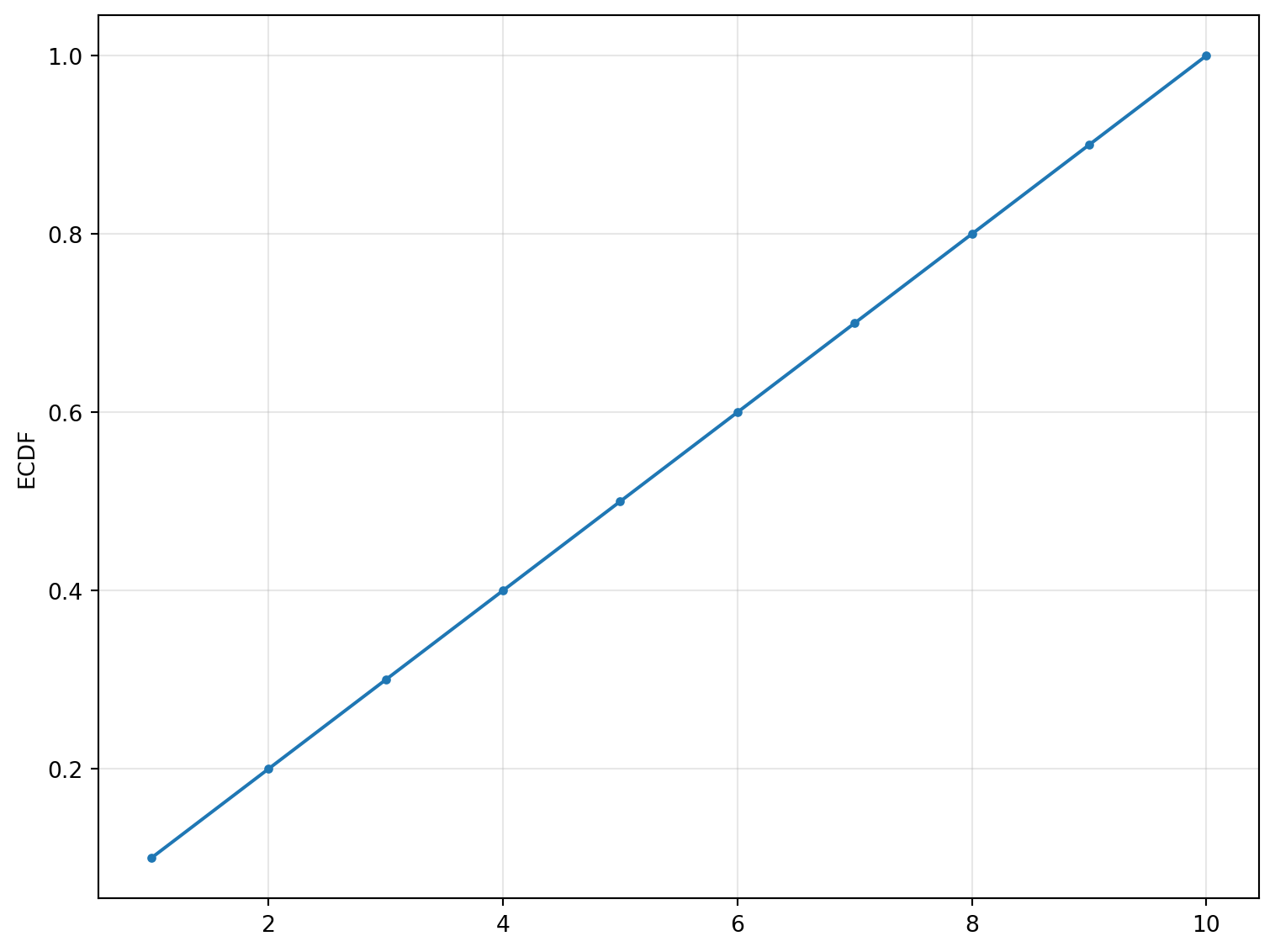
ECDF
Create an Empirical Cumulative Distribution Function plot.
Excel Usage
=ECDF(data, title, xlabel, ylabel, stat_color, grid, legend)data(list[list], required): Input data.title(str, optional, default: null): Chart title.xlabel(str, optional, default: null): Label for X-axis.ylabel(str, optional, default: null): Label for Y-axis.stat_color(str, optional, default: null): Line color.grid(str, optional, default: “true”): Show grid lines.legend(str, optional, default: “false”): Show legend.
Returns (object): Matplotlib Figure object (standard Python) or base64 encoded PNG string (Pyodide).
Example 1: ECDF with single distribution
Inputs:
| data |
|---|
| 1 |
| 2 |
| 3 |
| 4 |
| 5 |
| 6 |
| 7 |
| 8 |
| 9 |
| 10 |
Excel formula:
=ECDF({1;2;3;4;5;6;7;8;9;10})Expected output:
"chart"
Example 2: ECDF with multiple distributions
Inputs:
| data | |
|---|---|
| 1 | 10 |
| 2 | 20 |
| 3 | 30 |
| 4 | 40 |
| 5 | 50 |
Excel formula:
=ECDF({1,10;2,20;3,30;4,40;5,50})Expected output:
"chart"
Example 3: ECDF with custom labels
Inputs:
| data | title | xlabel | ylabel |
|---|---|---|---|
| 1.5 | Test ECDF | Value | Cumulative Probability |
| 2.3 | |||
| 3.1 | |||
| 4.8 | |||
| 5.2 |
Excel formula:
=ECDF({1.5;2.3;3.1;4.8;5.2}, "Test ECDF", "Value", "Cumulative Probability")Expected output:
"chart"
Example 4: ECDF with unsorted data
Inputs:
| data |
|---|
| 5 |
| 2 |
| 8 |
| 1 |
| 9 |
| 3 |
| 7 |
| 4 |
| 6 |
| 10 |
Excel formula:
=ECDF({5;2;8;1;9;3;7;4;6;10})Expected output:
"chart"
Python Code
Show Code
import sys
import matplotlib
IS_PYODIDE = sys.platform == "emscripten"
if IS_PYODIDE:
    matplotlib.use('Agg')
import matplotlib.pyplot as plt
import io
import base64
import numpy as np

def ecdf(data, title=None, xlabel=None, ylabel=None, stat_color=None, grid='true', legend='false'):
    """
    Create an Empirical Cumulative Distribution Function plot.

    See: https://matplotlib.org/stable/api/_as_gen/matplotlib.pyplot.ecdf.html

    This example function is provided as-is without any representation of accuracy.

    Args:
        data (list[list]): Input data.
        title (str, optional): Chart title. Default is None.
        xlabel (str, optional): Label for X-axis. Default is None.
        ylabel (str, optional): Label for Y-axis. Default is None.
        stat_color (str, optional): Line color. Valid options: Blue, Green, Red, Cyan, Magenta, Yellow, Black, White. Default is None.
        grid (str, optional): Show grid lines. Valid options: True, False. Default is 'true'.
        legend (str, optional): Show legend. Valid options: True, False. Default is 'false'.

    Returns:
        object: Matplotlib Figure object (standard Python) or base64 encoded PNG string (Pyodide).
    """
    def to2d(x):
        return [[x]] if not isinstance(x, list) else x

    def str_to_bool(s):
        return s.lower() == "true" if isinstance(s, str) else bool(s)

    try:
        data = to2d(data)

        if not isinstance(data, list) or not all(isinstance(row, list) for row in data):
            return "Error: Invalid input - data must be a 2D list"

        # Extract numeric columns
        cols = []
        max_rows = max(len(row) for row in data) if data else 0

        for col_idx in range(max_rows):
            col_data = []
            for row in data:
                if col_idx < len(row):
                    val = row[col_idx]
                    try:
                        col_data.append(float(val))
                    except (TypeError, ValueError):
                        continue
            if col_data:
                cols.append(col_data)

        if not cols:
            return "Error: No valid numeric data found"

        # Create plot
        fig, ax = plt.subplots(figsize=(8, 6))

        # Plot ECDF for each column
        for i, col in enumerate(cols):
            sorted_data = np.sort(col)
            y = np.arange(1, len(sorted_data) + 1) / len(sorted_data)
            color = stat_color if stat_color else None
            ax.plot(sorted_data, y, marker='.', linestyle='-',
                   color=color, label=f'Column {i+1}' if len(cols) > 1 else None)

        if title:
            ax.set_title(title)
        if xlabel:
            ax.set_xlabel(xlabel)
        if ylabel:
            ax.set_ylabel(ylabel)
        else:
            ax.set_ylabel('ECDF')

        if str_to_bool(grid):
            ax.grid(True, alpha=0.3)

        if str_to_bool(legend) and len(cols) > 1:
            ax.legend()

        plt.tight_layout()

        # Return based on platform
        if IS_PYODIDE:
            buf = io.BytesIO()
            plt.savefig(buf, format='png', dpi=100, bbox_inches='tight')
            buf.seek(0)
            img_base64 = base64.b64encode(buf.read()).decode('utf-8')
            plt.close(fig)
            return f"data:image/png;base64,{img_base64}"
        else:
            return fig
    except Exception as e:
        return f"Error: {str(e)}"
Online Calculator
Input data.
Chart title.
Label for X-axis.
Label for Y-axis.
Line color.
Show grid lines.
Show legend.
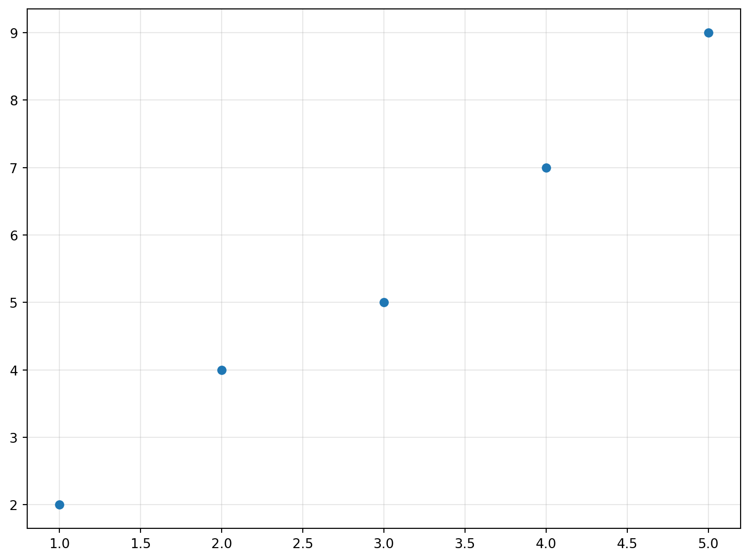
ERRORBAR
Create an XY plot with error bars.
Excel Usage
=ERRORBAR(data, title, xlabel, ylabel, stat_color, fmt, capsize, grid, legend)data(list[list], required): Input data.title(str, optional, default: null): Chart title.xlabel(str, optional, default: null): Label for X-axis.ylabel(str, optional, default: null): Label for Y-axis.stat_color(str, optional, default: null): Color for lines and markers.fmt(str, optional, default: “o”): Format string (e.g., ‘o’ for points, ‘-’ for lines).capsize(float, optional, default: 3): Size of error bar caps.grid(str, optional, default: “true”): Show grid lines.legend(str, optional, default: “false”): Show legend.
Returns (object): Matplotlib Figure object (standard Python) or base64 encoded PNG string (Pyodide).
Example 1: Error bar plot with X and Y data only
Inputs:
| data | |
|---|---|
| 1 | 2 |
| 2 | 4 |
| 3 | 5 |
| 4 | 7 |
| 5 | 9 |
Excel formula:
=ERRORBAR({1,2;2,4;3,5;4,7;5,9})Expected output:
"chart"
Example 2: Error bar plot with Y error values
Inputs:
| data | ||
|---|---|---|
| 1 | 2 | 0.5 |
| 2 | 4 | 0.3 |
| 3 | 5 | 0.4 |
| 4 | 7 | 0.6 |
| 5 | 9 | 0.2 |
Excel formula:
=ERRORBAR({1,2,0.5;2,4,0.3;3,5,0.4;4,7,0.6;5,9,0.2})Expected output:
"chart"
Example 3: Error bar plot with custom labels and format
Inputs:
| data | title | xlabel | ylabel | fmt | ||
|---|---|---|---|---|---|---|
| 1 | 2 | 0.5 | Test Error Bar | X | Y | -s |
| 2 | 4 | 0.3 | ||||
| 3 | 5 | 0.4 |
Excel formula:
=ERRORBAR({1,2,0.5;2,4,0.3;3,5,0.4}, "Test Error Bar", "X", "Y", "-s")Expected output:
"chart"
Example 4: Error bar plot with larger cap size
Inputs:
| data | capsize | ||
|---|---|---|---|
| 1 | 2 | 0.5 | 10 |
| 2 | 4 | 0.3 | |
| 3 | 5 | 0.4 |
Excel formula:
=ERRORBAR({1,2,0.5;2,4,0.3;3,5,0.4}, 10)Expected output:
"chart"
Python Code
Show Code
import sys
import matplotlib
IS_PYODIDE = sys.platform == "emscripten"
if IS_PYODIDE:
    matplotlib.use('Agg')
import matplotlib.pyplot as plt
import io
import base64
import numpy as np

def errorbar(data, title=None, xlabel=None, ylabel=None, stat_color=None, fmt='o', capsize=3, grid='true', legend='false'):
    """
    Create an XY plot with error bars.

    See: https://matplotlib.org/stable/api/_as_gen/matplotlib.pyplot.errorbar.html

    This example function is provided as-is without any representation of accuracy.

    Args:
        data (list[list]): Input data.
        title (str, optional): Chart title. Default is None.
        xlabel (str, optional): Label for X-axis. Default is None.
        ylabel (str, optional): Label for Y-axis. Default is None.
        stat_color (str, optional): Color for lines and markers. Valid options: Blue, Green, Red, Cyan, Magenta, Yellow, Black, White. Default is None.
        fmt (str, optional): Format string (e.g., 'o' for points, '-' for lines). Default is 'o'.
        capsize (float, optional): Size of error bar caps. Default is 3.
        grid (str, optional): Show grid lines. Valid options: True, False. Default is 'true'.
        legend (str, optional): Show legend. Valid options: True, False. Default is 'false'.

    Returns:
        object: Matplotlib Figure object (standard Python) or base64 encoded PNG string (Pyodide).
    """
    def to2d(x):
        return [[x]] if not isinstance(x, list) else x

    def str_to_bool(s):
        return s.lower() == "true" if isinstance(s, str) else bool(s)

    try:
        data = to2d(data)

        if not isinstance(data, list) or not all(isinstance(row, list) for row in data):
            return "Error: Invalid input - data must be a 2D list"

        # Extract columns
        max_rows = max(len(row) for row in data) if data else 0

        if max_rows < 2:
            return "Error: Data must have at least 2 columns (X and Y)"

        x_data = []
        y_data = []
        yerr_data = []

        for row in data:
            if len(row) >= 2:
                try:
                    x_data.append(float(row[0]))
                    y_data.append(float(row[1]))
                    if len(row) >= 3:
                        yerr_data.append(float(row[2]))
                except (TypeError, ValueError):
                    continue

        if not x_data or not y_data:
            return "Error: No valid numeric data found in X and Y columns"

        # Create plot
        fig, ax = plt.subplots(figsize=(8, 6))

        # Plot errorbar
        yerr = yerr_data if yerr_data else None
        color = stat_color if stat_color else None

        ax.errorbar(x_data, y_data, yerr=yerr, fmt=fmt,
                   color=color, capsize=capsize, label='Data' if str_to_bool(legend) else None)

        if title:
            ax.set_title(title)
        if xlabel:
            ax.set_xlabel(xlabel)
        if ylabel:
            ax.set_ylabel(ylabel)

        if str_to_bool(grid):
            ax.grid(True, alpha=0.3)

        if str_to_bool(legend):
            ax.legend()

        plt.tight_layout()

        # Return based on platform
        if IS_PYODIDE:
            buf = io.BytesIO()
            plt.savefig(buf, format='png', dpi=100, bbox_inches='tight')
            buf.seek(0)
            img_base64 = base64.b64encode(buf.read()).decode('utf-8')
            plt.close(fig)
            return f"data:image/png;base64,{img_base64}"
        else:
            return fig
    except Exception as e:
        return f"Error: {str(e)}"
Online Calculator
Input data.
Chart title.
Label for X-axis.
Label for Y-axis.
Color for lines and markers.
Format string (e.g., 'o' for points, '-' for lines).
Size of error bar caps.
Show grid lines.
Show legend.
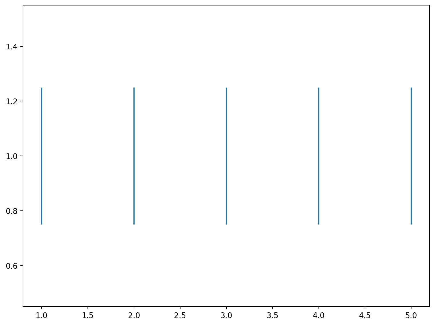
EVENTPLOT
Create a spike raster or event plot from data.
Excel Usage
=EVENTPLOT(data, title, xlabel, ylabel, stat_color, event_orientation, legend)data(list[list], required): Input data.title(str, optional, default: null): Chart title.xlabel(str, optional, default: null): Label for X-axis.ylabel(str, optional, default: null): Label for Y-axis.stat_color(str, optional, default: null): Event color.event_orientation(str, optional, default: “horizontal”): Orientation (‘horizontal’ or ‘vertical’).legend(str, optional, default: “false”): Show legend.
Returns (object): Matplotlib Figure object (standard Python) or base64 encoded PNG string (Pyodide).
Example 1: Event plot with single sequence
Inputs:
| data |
|---|
| 1 |
| 2 |
| 3 |
| 4 |
| 5 |
Excel formula:
=EVENTPLOT({1;2;3;4;5})Expected output:
"chart"
Example 2: Event plot with multiple sequences
Inputs:
| data | ||
|---|---|---|
| 1 | 1.5 | 2 |
| 2 | 2.5 | 3 |
| 3 | 3.5 | 4 |
| 4 | 4.5 | 5 |
Excel formula:
=EVENTPLOT({1,1.5,2;2,2.5,3;3,3.5,4;4,4.5,5})Expected output:
"chart"
Example 3: Vertical event plot with labels
Inputs:
| data | event_orientation | title | xlabel | ylabel |
|---|---|---|---|---|
| 1 | vertical | Test Event Plot | Time | Events |
| 2 | ||||
| 3 | ||||
| 4 | ||||
| 5 |
Excel formula:
=EVENTPLOT({1;2;3;4;5}, "vertical", "Test Event Plot", "Time", "Events")Expected output:
"chart"
Example 4: Event plot with custom color
Inputs:
| data | stat_color | |
|---|---|---|
| 1 | 1.5 | red |
| 2 | 2.5 | |
| 3 | 3.5 |
Excel formula:
=EVENTPLOT({1,1.5;2,2.5;3,3.5}, "red")Expected output:
"chart"
Python Code
Show Code
import sys
import matplotlib
IS_PYODIDE = sys.platform == "emscripten"
if IS_PYODIDE:
    matplotlib.use('Agg')
import matplotlib.pyplot as plt
import io
import base64
import numpy as np

def eventplot(data, title=None, xlabel=None, ylabel=None, stat_color=None, event_orientation='horizontal', legend='false'):
    """
    Create a spike raster or event plot from data.

    See: https://matplotlib.org/stable/api/_as_gen/matplotlib.pyplot.eventplot.html

    This example function is provided as-is without any representation of accuracy.

    Args:
        data (list[list]): Input data.
        title (str, optional): Chart title. Default is None.
        xlabel (str, optional): Label for X-axis. Default is None.
        ylabel (str, optional): Label for Y-axis. Default is None.
        stat_color (str, optional): Event color. Valid options: Blue, Green, Red, Cyan, Magenta, Yellow, Black, White. Default is None.
        event_orientation (str, optional): Orientation ('horizontal' or 'vertical'). Valid options: Horizontal, Vertical. Default is 'horizontal'.
        legend (str, optional): Show legend. Valid options: True, False. Default is 'false'.

    Returns:
        object: Matplotlib Figure object (standard Python) or base64 encoded PNG string (Pyodide).
    """
    def to2d(x):
        return [[x]] if not isinstance(x, list) else x

    def str_to_bool(s):
        return s.lower() == "true" if isinstance(s, str) else bool(s)

    try:
        data = to2d(data)

        if not isinstance(data, list) or not all(isinstance(row, list) for row in data):
            return "Error: Invalid input - data must be a 2D list"

        # Extract numeric columns
        cols = []
        max_rows = max(len(row) for row in data) if data else 0

        for col_idx in range(max_rows):
            col_data = []
            for row in data:
                if col_idx < len(row):
                    val = row[col_idx]
                    try:
                        col_data.append(float(val))
                    except (TypeError, ValueError):
                        continue
            if col_data:
                cols.append(col_data)

        if not cols:
            return "Error: No valid numeric data found"

        # Create plot
        fig, ax = plt.subplots(figsize=(8, 6))

        # Plot eventplot
        color = stat_color if stat_color else None
        colors = [color] * len(cols) if color else None

        # Map orientation values
        orient_map = {'horizontal': 'horizontal', 'vertical': 'vertical'}
        plot_orientation = orient_map.get(event_orientation, 'horizontal')

        ax.eventplot(cols, orientation=plot_orientation, colors=colors,
                    lineoffsets=np.arange(1, len(cols) + 1),
                    linelengths=0.5)

        if title:
            ax.set_title(title)
        if xlabel:
            ax.set_xlabel(xlabel)
        if ylabel:
            ax.set_ylabel(ylabel)

        if str_to_bool(legend) and len(cols) > 1:
            ax.legend([f'Sequence {i+1}' for i in range(len(cols))])

        plt.tight_layout()

        # Return based on platform
        if IS_PYODIDE:
            buf = io.BytesIO()
            plt.savefig(buf, format='png', dpi=100, bbox_inches='tight')
            buf.seek(0)
            img_base64 = base64.b64encode(buf.read()).decode('utf-8')
            plt.close(fig)
            return f"data:image/png;base64,{img_base64}"
        else:
            return fig
    except Exception as e:
        return f"Error: {str(e)}"
Online Calculator
Input data.
Chart title.
Label for X-axis.
Label for Y-axis.
Event color.
Orientation ('horizontal' or 'vertical').
Show legend.
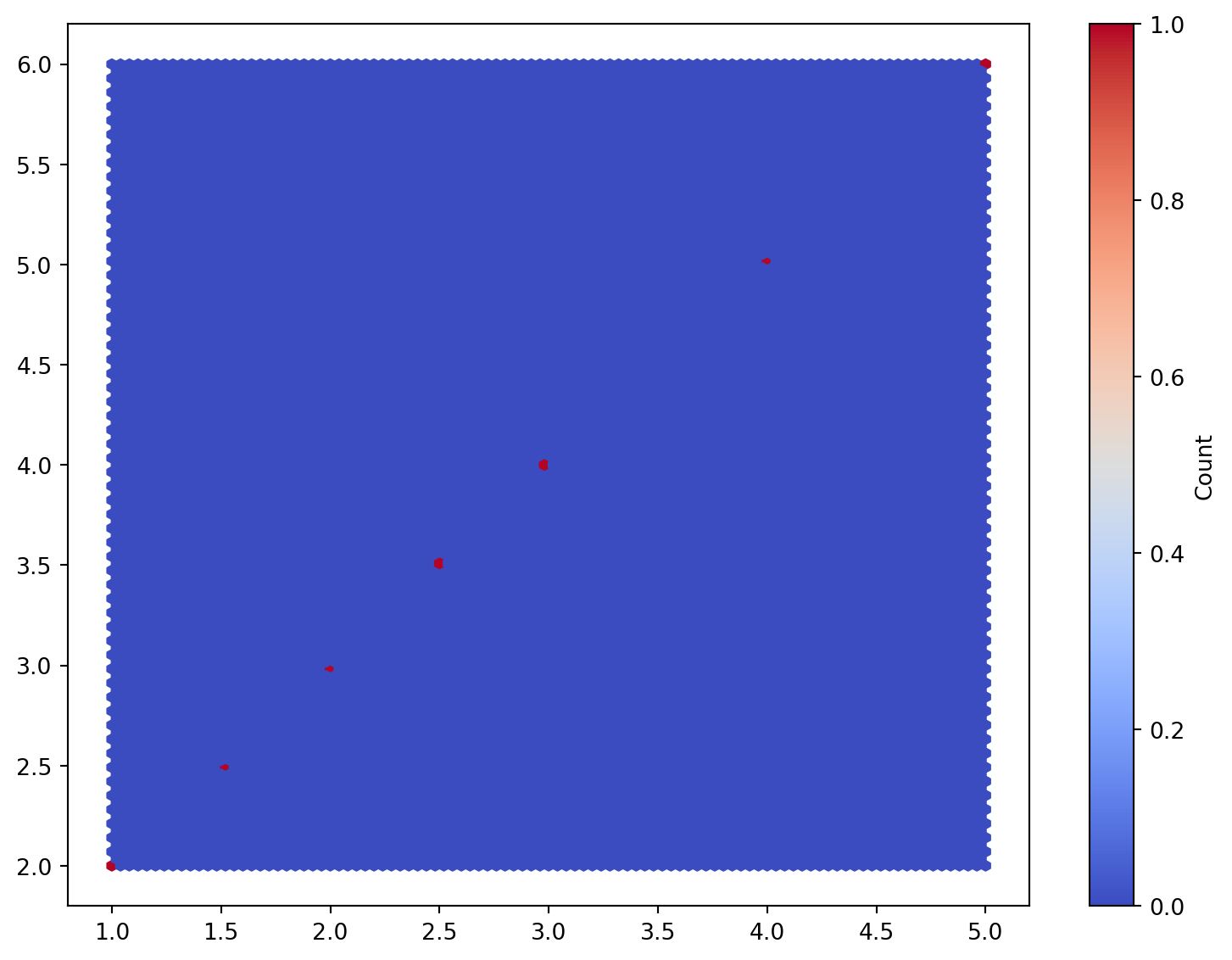
HEXBIN
Create a hexagonal binning plot from data.
Excel Usage
=HEXBIN(data, title, xlabel, ylabel, hexbin_cmap, gridsize, colorbar)data(list[list], required): Input data (X, Y).title(str, optional, default: null): Chart title.xlabel(str, optional, default: null): Label for X-axis.ylabel(str, optional, default: null): Label for Y-axis.hexbin_cmap(str, optional, default: “coolwarm”): Color map for bins.gridsize(int, optional, default: 100): Number of hexagons in X-direction.colorbar(str, optional, default: “true”): Show colorbar.
Returns (object): Matplotlib Figure object (standard Python) or base64 encoded PNG string (Pyodide).
Example 1: Basic hexbin plot
Inputs:
| data | |
|---|---|
| 1 | 2 |
| 2 | 3 |
| 3 | 4 |
| 4 | 5 |
| 5 | 6 |
| 1.5 | 2.5 |
| 2.5 | 3.5 |
Excel formula:
=HEXBIN({1,2;2,3;3,4;4,5;5,6;1.5,2.5;2.5,3.5})Expected output:
"chart"
Example 2: Hexbin with custom labels and Blues colormap
Inputs:
| data | title | xlabel | ylabel | hexbin_cmap | |
|---|---|---|---|---|---|
| 1 | 2 | Test Hexbin | X | Y | Blues |
| 2 | 3 | ||||
| 3 | 4 | ||||
| 4 | 5 | ||||
| 5 | 6 |
Excel formula:
=HEXBIN({1,2;2,3;3,4;4,5;5,6}, "Test Hexbin", "X", "Y", "Blues")Expected output:
"chart"
Example 3: Hexbin with smaller grid size
Inputs:
| data | gridsize | |
|---|---|---|
| 1 | 2 | 5 |
| 2 | 3 | |
| 3 | 4 | |
| 4 | 5 | |
| 5 | 6 | |
| 1.5 | 2.5 | |
| 2.5 | 3.5 | |
| 3.5 | 4.5 |
Excel formula:
=HEXBIN({1,2;2,3;3,4;4,5;5,6;1.5,2.5;2.5,3.5;3.5,4.5}, 5)Expected output:
"chart"
Example 4: Hexbin without colorbar
Inputs:
| data | colorbar | |
|---|---|---|
| 1 | 2 | false |
| 2 | 3 | |
| 3 | 4 | |
| 4 | 5 | |
| 5 | 6 |
Excel formula:
=HEXBIN({1,2;2,3;3,4;4,5;5,6}, "false")Expected output:
"chart"
Python Code
Show Code
import sys
import matplotlib
IS_PYODIDE = sys.platform == "emscripten"
if IS_PYODIDE:
    matplotlib.use('Agg')
import matplotlib.pyplot as plt
import io
import base64
import numpy as np

def hexbin(data, title=None, xlabel=None, ylabel=None, hexbin_cmap='coolwarm', gridsize=100, colorbar='true'):
    """
    Create a hexagonal binning plot from data.

    See: https://matplotlib.org/stable/api/_as_gen/matplotlib.pyplot.hexbin.html

    This example function is provided as-is without any representation of accuracy.

    Args:
        data (list[list]): Input data (X, Y).
        title (str, optional): Chart title. Default is None.
        xlabel (str, optional): Label for X-axis. Default is None.
        ylabel (str, optional): Label for Y-axis. Default is None.
        hexbin_cmap (str, optional): Color map for bins. Valid options: Coolwarm, Viridis, Blues, Reds. Default is 'coolwarm'.
        gridsize (int, optional): Number of hexagons in X-direction. Default is 100.
        colorbar (str, optional): Show colorbar. Valid options: True, False. Default is 'true'.

    Returns:
        object: Matplotlib Figure object (standard Python) or base64 encoded PNG string (Pyodide).
    """
    def to2d(x):
        return [[x]] if not isinstance(x, list) else x

    def str_to_bool(s):
        return s.lower() == "true" if isinstance(s, str) else bool(s)

    try:
        data = to2d(data)

        if not isinstance(data, list) or not all(isinstance(row, list) for row in data):
            return "Error: Invalid input - data must be a 2D list"

        # Extract X and Y columns
        x_data = []
        y_data = []

        for row in data:
            if len(row) >= 2:
                try:
                    x_data.append(float(row[0]))
                    y_data.append(float(row[1]))
                except (TypeError, ValueError):
                    continue

        if not x_data or not y_data:
            return "Error: Data must have at least 2 columns with numeric values"

        # Create plot
        fig, ax = plt.subplots(figsize=(8, 6))

        # Plot hexbin
        hb = ax.hexbin(x_data, y_data, gridsize=gridsize, cmap=hexbin_cmap)

        if str_to_bool(colorbar):
            plt.colorbar(hb, ax=ax, label='Count')

        if title:
            ax.set_title(title)
        if xlabel:
            ax.set_xlabel(xlabel)
        if ylabel:
            ax.set_ylabel(ylabel)

        plt.tight_layout()

        # Return based on platform
        if IS_PYODIDE:
            buf = io.BytesIO()
            plt.savefig(buf, format='png', dpi=100, bbox_inches='tight')
            buf.seek(0)
            img_base64 = base64.b64encode(buf.read()).decode('utf-8')
            plt.close(fig)
            return f"data:image/png;base64,{img_base64}"
        else:
            return fig
    except Exception as e:
        return f"Error: {str(e)}"
Online Calculator
Input data (X, Y).
Chart title.
Label for X-axis.
Label for Y-axis.
Color map for bins.
Number of hexagons in X-direction.
Show colorbar.
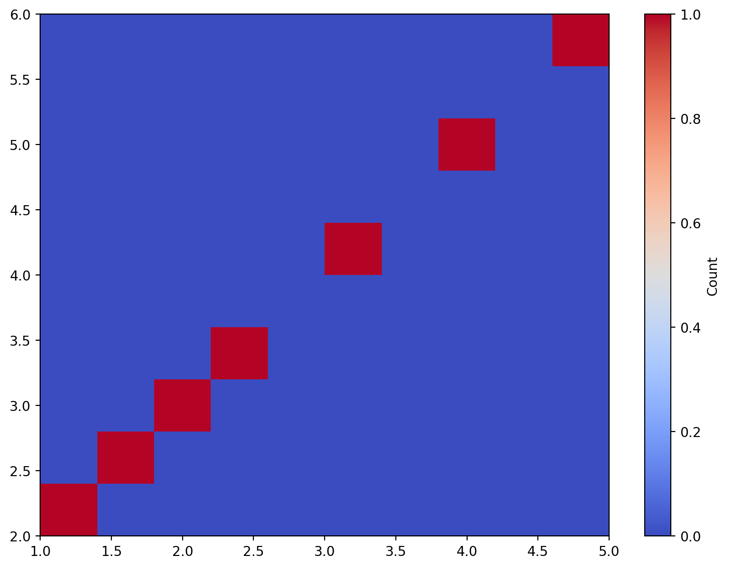
HIST2D
Create a 2D histogram plot from data.
Excel Usage
=HIST2D(data, title, xlabel, ylabel, histtwod_cmap, bins, colorbar)data(list[list], required): Input data (X, Y).title(str, optional, default: null): Chart title.xlabel(str, optional, default: null): Label for X-axis.ylabel(str, optional, default: null): Label for Y-axis.histtwod_cmap(str, optional, default: “coolwarm”): Color map for bins.bins(int, optional, default: 10): Number of bins.colorbar(str, optional, default: “true”): Show colorbar.
Returns (object): Matplotlib Figure object (standard Python) or base64 encoded PNG string (Pyodide).
Example 1: Basic 2D histogram
Inputs:
| data | |
|---|---|
| 1 | 2 |
| 2 | 3 |
| 3 | 4 |
| 4 | 5 |
| 5 | 6 |
| 1.5 | 2.5 |
| 2.5 | 3.5 |
Excel formula:
=HIST2D({1,2;2,3;3,4;4,5;5,6;1.5,2.5;2.5,3.5})Expected output:
"chart"
Example 2: 2D histogram with custom labels and Reds colormap
Inputs:
| data | title | xlabel | ylabel | histtwod_cmap | |
|---|---|---|---|---|---|
| 1 | 2 | Test Hist2D | X | Y | Reds |
| 2 | 3 | ||||
| 3 | 4 | ||||
| 4 | 5 | ||||
| 5 | 6 |
Excel formula:
=HIST2D({1,2;2,3;3,4;4,5;5,6}, "Test Hist2D", "X", "Y", "Reds")Expected output:
"chart"
Example 3: 2D histogram with fewer bins
Inputs:
| data | bins | |
|---|---|---|
| 1 | 2 | 5 |
| 2 | 3 | |
| 3 | 4 | |
| 4 | 5 | |
| 5 | 6 | |
| 1.5 | 2.5 | |
| 2.5 | 3.5 | |
| 3.5 | 4.5 |
Excel formula:
=HIST2D({1,2;2,3;3,4;4,5;5,6;1.5,2.5;2.5,3.5;3.5,4.5}, 5)Expected output:
"chart"
Example 4: 2D histogram without colorbar
Inputs:
| data | colorbar | |
|---|---|---|
| 1 | 2 | false |
| 2 | 3 | |
| 3 | 4 | |
| 4 | 5 | |
| 5 | 6 |
Excel formula:
=HIST2D({1,2;2,3;3,4;4,5;5,6}, "false")Expected output:
"chart"
Python Code
Show Code
import sys
import matplotlib
IS_PYODIDE = sys.platform == "emscripten"
if IS_PYODIDE:
    matplotlib.use('Agg')
import matplotlib.pyplot as plt
import io
import base64
import numpy as np

def hist2d(data, title=None, xlabel=None, ylabel=None, histtwod_cmap='coolwarm', bins=10, colorbar='true'):
    """
    Create a 2D histogram plot from data.

    See: https://matplotlib.org/stable/api/_as_gen/matplotlib.pyplot.hist2d.html

    This example function is provided as-is without any representation of accuracy.

    Args:
        data (list[list]): Input data (X, Y).
        title (str, optional): Chart title. Default is None.
        xlabel (str, optional): Label for X-axis. Default is None.
        ylabel (str, optional): Label for Y-axis. Default is None.
        histtwod_cmap (str, optional): Color map for bins. Valid options: Coolwarm, Viridis, Blues, Reds. Default is 'coolwarm'.
        bins (int, optional): Number of bins. Default is 10.
        colorbar (str, optional): Show colorbar. Valid options: True, False. Default is 'true'.

    Returns:
        object: Matplotlib Figure object (standard Python) or base64 encoded PNG string (Pyodide).
    """
    def to2d(x):
        return [[x]] if not isinstance(x, list) else x

    def str_to_bool(s):
        return s.lower() == "true" if isinstance(s, str) else bool(s)

    try:
        data = to2d(data)

        if not isinstance(data, list) or not all(isinstance(row, list) for row in data):
            return "Error: Invalid input - data must be a 2D list"

        # Extract X and Y columns
        x_data = []
        y_data = []

        for row in data:
            if len(row) >= 2:
                try:
                    x_data.append(float(row[0]))
                    y_data.append(float(row[1]))
                except (TypeError, ValueError):
                    continue

        if not x_data or not y_data:
            return "Error: Data must have at least 2 columns with numeric values"

        # Create plot
        fig, ax = plt.subplots(figsize=(8, 6))

        # Plot 2D histogram
        h = ax.hist2d(x_data, y_data, bins=bins, cmap=histtwod_cmap)

        if str_to_bool(colorbar):
            plt.colorbar(h[3], ax=ax, label='Count')

        if title:
            ax.set_title(title)
        if xlabel:
            ax.set_xlabel(xlabel)
        if ylabel:
            ax.set_ylabel(ylabel)

        plt.tight_layout()

        # Return based on platform
        if IS_PYODIDE:
            buf = io.BytesIO()
            plt.savefig(buf, format='png', dpi=100, bbox_inches='tight')
            buf.seek(0)
            img_base64 = base64.b64encode(buf.read()).decode('utf-8')
            plt.close(fig)
            return f"data:image/png;base64,{img_base64}"
        else:
            return fig
    except Exception as e:
        return f"Error: {str(e)}"
Online Calculator
Input data (X, Y).
Chart title.
Label for X-axis.
Label for Y-axis.
Color map for bins.
Number of bins.
Show colorbar.
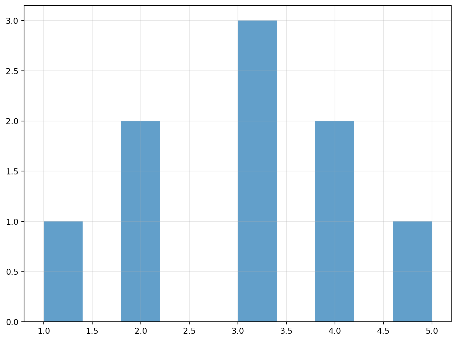
HISTOGRAM
Create a frequency distribution histogram from data.
Excel Usage
=HISTOGRAM(data, title, xlabel, ylabel, stat_color, bins, density, cumulative, grid, legend)data(list[list], required): Input data.title(str, optional, default: null): Chart title.xlabel(str, optional, default: null): Label for X-axis.ylabel(str, optional, default: null): Label for Y-axis.stat_color(str, optional, default: null): Bar color.bins(int, optional, default: 10): Number of bins.density(str, optional, default: “false”): Probability density.cumulative(str, optional, default: “false”): Cumulative distribution.grid(str, optional, default: “true”): Show grid lines.legend(str, optional, default: “false”): Show legend.
Returns (object): Matplotlib Figure object (standard Python) or base64 encoded PNG string (Pyodide).
Example 1: Basic histogram with single column
Inputs:
| data |
|---|
| 1 |
| 2 |
| 2 |
| 3 |
| 3 |
| 3 |
| 4 |
| 4 |
| 5 |
Excel formula:
=HISTOGRAM({1;2;2;3;3;3;4;4;5})Expected output:
"chart"
Example 2: Histogram with multiple columns
Inputs:
| data | |
|---|---|
| 1 | 10 |
| 2 | 20 |
| 3 | 30 |
| 4 | 40 |
| 5 | 50 |
Excel formula:
=HISTOGRAM({1,10;2,20;3,30;4,40;5,50})Expected output:
"chart"
Example 3: Histogram with custom labels and bins
Inputs:
| data | title | xlabel | ylabel | bins |
|---|---|---|---|---|
| 1.5 | Test Histogram | Value | Frequency | 5 |
| 2.3 | ||||
| 3.1 | ||||
| 4.8 | ||||
| 5.2 | ||||
| 6.7 | ||||
| 7.1 |
Excel formula:
=HISTOGRAM({1.5;2.3;3.1;4.8;5.2;6.7;7.1}, "Test Histogram", "Value", "Frequency", 5)Expected output:
"chart"
Example 4: Density and cumulative histogram
Inputs:
| data | density | cumulative |
|---|---|---|
| 1 | true | true |
| 2 | ||
| 3 | ||
| 4 | ||
| 5 | ||
| 6 | ||
| 7 | ||
| 8 | ||
| 9 | ||
| 10 |
Excel formula:
=HISTOGRAM({1;2;3;4;5;6;7;8;9;10}, "true", "true")Expected output:
"chart"
Python Code
Show Code
import sys
import matplotlib
IS_PYODIDE = sys.platform == "emscripten"
if IS_PYODIDE:
    matplotlib.use('Agg')
import matplotlib.pyplot as plt
import io
import base64
import numpy as np

def histogram(data, title=None, xlabel=None, ylabel=None, stat_color=None, bins=10, density='false', cumulative='false', grid='true', legend='false'):
    """
    Create a frequency distribution histogram from data.

    See: https://matplotlib.org/stable/api/_as_gen/matplotlib.pyplot.hist.html

    This example function is provided as-is without any representation of accuracy.

    Args:
        data (list[list]): Input data.
        title (str, optional): Chart title. Default is None.
        xlabel (str, optional): Label for X-axis. Default is None.
        ylabel (str, optional): Label for Y-axis. Default is None.
        stat_color (str, optional): Bar color. Valid options: Blue, Green, Red, Cyan, Magenta, Yellow, Black, White. Default is None.
        bins (int, optional): Number of bins. Default is 10.
        density (str, optional): Probability density. Valid options: True, False. Default is 'false'.
        cumulative (str, optional): Cumulative distribution. Valid options: True, False. Default is 'false'.
        grid (str, optional): Show grid lines. Valid options: True, False. Default is 'true'.
        legend (str, optional): Show legend. Valid options: True, False. Default is 'false'.

    Returns:
        object: Matplotlib Figure object (standard Python) or base64 encoded PNG string (Pyodide).
    """
    def to2d(x):
        return [[x]] if not isinstance(x, list) else x

    def str_to_bool(s):
        return s.lower() == "true" if isinstance(s, str) else bool(s)

    try:
        data = to2d(data)

        if not isinstance(data, list) or not all(isinstance(row, list) for row in data):
            return "Error: Invalid input - data must be a 2D list"

        # Extract numeric columns
        cols = []
        max_rows = max(len(row) for row in data) if data else 0

        for col_idx in range(max_rows):
            col_data = []
            for row in data:
                if col_idx < len(row):
                    val = row[col_idx]
                    try:
                        col_data.append(float(val))
                    except (TypeError, ValueError):
                        continue
            if col_data:
                cols.append(col_data)

        if not cols:
            return "Error: No valid numeric data found"

        # Create plot
        fig, ax = plt.subplots(figsize=(8, 6))

        # Plot histogram for each column
        for i, col in enumerate(cols):
            color = stat_color if stat_color else None
            ax.hist(col, bins=bins, density=str_to_bool(density),
                   cumulative=str_to_bool(cumulative), alpha=0.7,
                   color=color, label=f'Column {i+1}' if len(cols) > 1 else None)

        if title:
            ax.set_title(title)
        if xlabel:
            ax.set_xlabel(xlabel)
        if ylabel:
            ax.set_ylabel(ylabel)

        if str_to_bool(grid):
            ax.grid(True, alpha=0.3)

        if str_to_bool(legend) and len(cols) > 1:
            ax.legend()

        plt.tight_layout()

        # Return based on platform
        if IS_PYODIDE:
            buf = io.BytesIO()
            plt.savefig(buf, format='png', dpi=100, bbox_inches='tight')
            buf.seek(0)
            img_base64 = base64.b64encode(buf.read()).decode('utf-8')
            plt.close(fig)
            return f"data:image/png;base64,{img_base64}"
        else:
            return fig
    except Exception as e:
        return f"Error: {str(e)}"
Online Calculator
Input data.
Chart title.
Label for X-axis.
Label for Y-axis.
Bar color.
Number of bins.
Probability density.
Cumulative distribution.
Show grid lines.
Show legend.
VIOLIN
Create a violin plot from data.
Excel Usage
=VIOLIN(data, title, xlabel, ylabel, stat_color, vert, medians, grid)data(list[list], required): Input data.title(str, optional, default: null): Chart title.xlabel(str, optional, default: null): Label for X-axis.ylabel(str, optional, default: null): Label for Y-axis.stat_color(str, optional, default: null): Violin color.vert(str, optional, default: “true”): Orientation (‘true’ for vertical, ‘false’ for horizontal).medians(str, optional, default: “true”): Show medians.grid(str, optional, default: “true”): Show grid lines.
Returns (object): Matplotlib Figure object (standard Python) or base64 encoded PNG string (Pyodide).
Example 1: Violin plot with single distribution
Inputs:
| data |
|---|
| 1 |
| 2 |
| 3 |
| 4 |
| 5 |
| 6 |
| 7 |
| 8 |
| 9 |
| 10 |
Excel formula:
=VIOLIN({1;2;3;4;5;6;7;8;9;10})Expected output:
"chart"
Example 2: Violin plot with multiple distributions
Inputs:
| data | ||
|---|---|---|
| 1 | 10 | 100 |
| 2 | 20 | 200 |
| 3 | 30 | 300 |
| 4 | 40 | 400 |
| 5 | 50 | 500 |
Excel formula:
=VIOLIN({1,10,100;2,20,200;3,30,300;4,40,400;5,50,500})Expected output:
"chart"
Example 3: Horizontal violin plot with labels
Inputs:
| data | vert | title | xlabel | ylabel |
|---|---|---|---|---|
| 1 | false | Test Violin | Value | Group |
| 2 | ||||
| 3 | ||||
| 4 | ||||
| 5 | ||||
| 6 | ||||
| 7 |
Excel formula:
=VIOLIN({1;2;3;4;5;6;7}, "false", "Test Violin", "Value", "Group")Expected output:
"chart"
Example 4: Violin plot without medians
Inputs:
| data | medians |
|---|---|
| 1 | false |
| 2 | |
| 3 | |
| 4 | |
| 5 |
Excel formula:
=VIOLIN({1;2;3;4;5}, "false")Expected output:
"chart"
Python Code
Show Code
import sys
import matplotlib
IS_PYODIDE = sys.platform == "emscripten"
if IS_PYODIDE:
    matplotlib.use('Agg')
import matplotlib.pyplot as plt
import io
import base64
import numpy as np

def violin(data, title=None, xlabel=None, ylabel=None, stat_color=None, vert='true', medians='true', grid='true'):
    """
    Create a violin plot from data.

    See: https://matplotlib.org/stable/api/_as_gen/matplotlib.pyplot.violinplot.html

    This example function is provided as-is without any representation of accuracy.

    Args:
        data (list[list]): Input data.
        title (str, optional): Chart title. Default is None.
        xlabel (str, optional): Label for X-axis. Default is None.
        ylabel (str, optional): Label for Y-axis. Default is None.
        stat_color (str, optional): Violin color. Valid options: Blue, Green, Red, Cyan, Magenta, Yellow, Black, White. Default is None.
        vert (str, optional): Orientation ('true' for vertical, 'false' for horizontal). Valid options: True, False. Default is 'true'.
        medians (str, optional): Show medians. Valid options: True, False. Default is 'true'.
        grid (str, optional): Show grid lines. Valid options: True, False. Default is 'true'.

    Returns:
        object: Matplotlib Figure object (standard Python) or base64 encoded PNG string (Pyodide).
    """
    def to2d(x):
        return [[x]] if not isinstance(x, list) else x

    def str_to_bool(s):
        return s.lower() == "true" if isinstance(s, str) else bool(s)

    try:
        data = to2d(data)

        if not isinstance(data, list) or not all(isinstance(row, list) for row in data):
            return "Error: Invalid input - data must be a 2D list"

        # Extract numeric columns
        cols = []
        max_rows = max(len(row) for row in data) if data else 0

        for col_idx in range(max_rows):
            col_data = []
            for row in data:
                if col_idx < len(row):
                    val = row[col_idx]
                    try:
                        col_data.append(float(val))
                    except (TypeError, ValueError):
                        continue
            if col_data:
                cols.append(col_data)

        if not cols:
            return "Error: No valid numeric data found"

        # Create plot
        fig, ax = plt.subplots(figsize=(8, 6))

        # Plot violin
        parts = ax.violinplot(cols, vert=str_to_bool(vert),
                             showmedians=str_to_bool(medians))

        # Set color
        if stat_color:
            for pc in parts['bodies']:
                pc.set_facecolor(stat_color)
                pc.set_alpha(0.7)

        if title:
            ax.set_title(title)
        if xlabel:
            ax.set_xlabel(xlabel)
        if ylabel:
            ax.set_ylabel(ylabel)

        if str_to_bool(grid):
            ax.grid(True, alpha=0.3)

        plt.tight_layout()

        # Return based on platform
        if IS_PYODIDE:
            buf = io.BytesIO()
            plt.savefig(buf, format='png', dpi=100, bbox_inches='tight')
            buf.seek(0)
            img_base64 = base64.b64encode(buf.read()).decode('utf-8')
            plt.close(fig)
            return f"data:image/png;base64,{img_base64}"
        else:
            return fig
    except Exception as e:
        return f"Error: {str(e)}"
Online Calculator
Input data.
Chart title.
Label for X-axis.
Label for Y-axis.
Violin color.
Orientation ('true' for vertical, 'false' for horizontal).
Show medians.
Show grid lines.