Categorical
Overview
Categorical data represents values as named groups, stages, or classes rather than continuous measurements, and it appears in nearly every analytical workflow. Categorical charts turn these labels into structure, making proportions, rankings, and before/after differences easy to interpret. In operations, marketing, product analytics, and quality engineering, these visuals help teams prioritize decisions faster than raw tables. The category focuses on practical chart forms that emphasize composition, ordering, and change.
The unifying ideas are part-to-whole composition, ordered comparison, and delta tracking across labeled groups. Composition views highlight how categories split a total; ordered views reveal rank and long-tail effects; change views show increases, decreases, and net outcomes across steps. Together, these perspectives support exploratory analysis and executive reporting, especially when analysts need to explain both magnitude and direction. Many of these charts also encode business process flow, where category order is as important as value size.
These tools are implemented with Matplotlib, the core plotting library in the Python scientific stack. Matplotlib provides low-level control over marks, axes, color maps, and annotation, which makes it well-suited for specialized business visuals such as funnel, pareto, and waterfall charts. The functions in this category expose those capabilities through spreadsheet-friendly interfaces while returning standard figure objects for Python workflows.
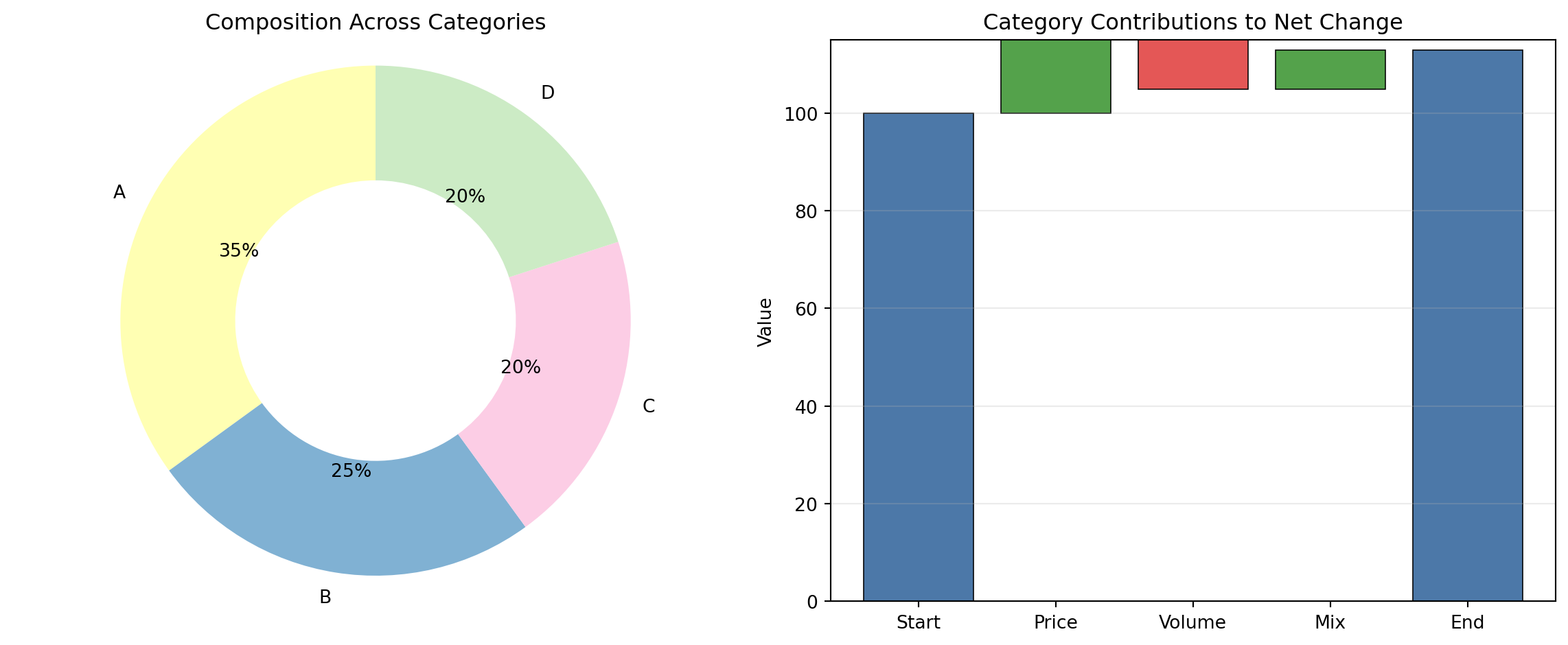
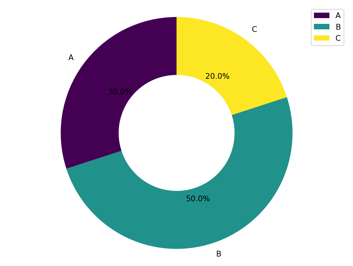
For composition and stage views, DONUT and FUNNEL summarize how totals are distributed across categories or process steps. Donut charts emphasize share of whole with a compact circular form, while funnel charts emphasize ordered drop-off through sequential stages such as awareness-to-conversion pipelines. Used together, they distinguish static composition from directional progression in the same dataset family.
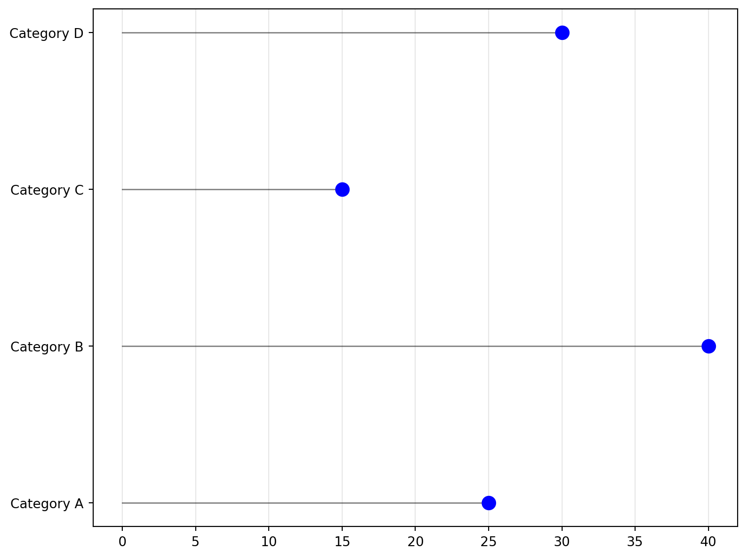
For ranked and pointwise comparisons, DOT_PLOT, STEM, and PARETO_CHART focus attention on ordering and concentration. Dot and stem/lollipop forms reduce chart ink and make individual category values easy to compare, especially when labels are long or categories are numerous. Pareto charts add a cumulative line to sorted bars, helping analysts identify the small subset of categories that explain most outcomes (the common 80/20 diagnostic pattern).
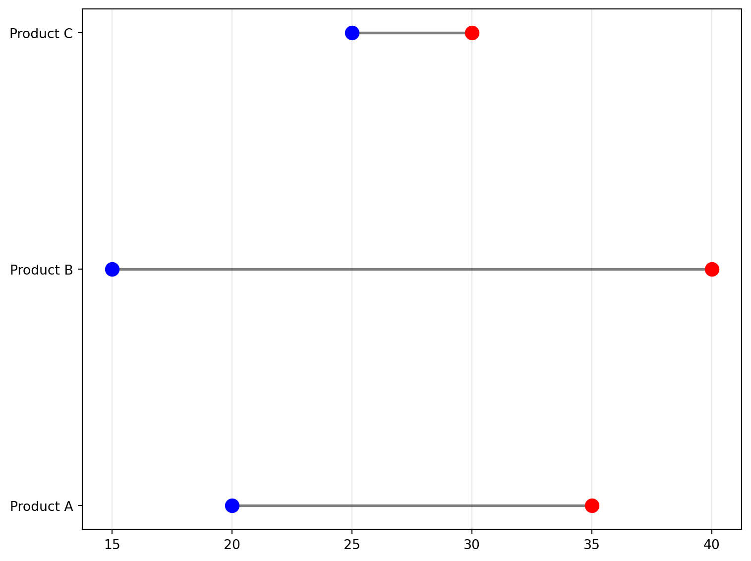
For before/after and contribution analysis, DUMBBELL, SLOPE, and WATERFALL make change explicit. Dumbbell and slope charts connect paired values per category to show direction and magnitude of movement between two states (for example baseline vs current period). Waterfall charts decompose a running total into positive and negative contributions, clarifying how individual components build to a final result. These are especially useful in financial bridge analysis, KPI decomposition, and scenario reviews.
DONUT
Create a donut chart from data.
/tmp/ipykernel_2724349/2324061087.py:67: MatplotlibDeprecationWarning:

The get_cmap function was deprecated in Matplotlib 3.7 and will be removed in 3.11. Use ``matplotlib.colormaps[name]`` or ``matplotlib.colormaps.get_cmap()`` or ``pyplot.get_cmap()`` instead.
Excel Usage
=DONUT(data, title, color_map, hole_size, legend)data(list[list], required): Input data (Labels, Values).title(str, optional, default: null): Chart title.color_map(str, optional, default: “viridis”): Color map for slices.hole_size(float, optional, default: 0.5): Size of the donut hole (0-1).legend(str, optional, default: “true”): Show legend.
Returns (object): Matplotlib Figure object (standard Python) or base64 encoded PNG string (Pyodide).
Example 1: Simple donut chart with 3 categories
Inputs:
| data | |
|---|---|
| A | 30 |
| B | 50 |
| C | 20 |
Excel formula:
=DONUT({"A",30;"B",50;"C",20})Expected output:
"chart"
Example 2: Donut chart with title and legend
Inputs:
| data | title | legend | |
|---|---|---|---|
| Q1 | 100 | Quarterly Sales | true |
| Q2 | 150 | ||
| Q3 | 120 | ||
| Q4 | 180 |
Excel formula:
=DONUT({"Q1",100;"Q2",150;"Q3",120;"Q4",180}, "Quarterly Sales", "true")Expected output:
"chart"
Example 3: Donut with plasma colormap and small hole
Inputs:
| data | color_map | hole_size | |
|---|---|---|---|
| Category A | 25 | plasma | 0.3 |
| Category B | 35 | ||
| Category C | 40 |
Excel formula:
=DONUT({"Category A",25;"Category B",35;"Category C",40}, "plasma", 0.3)Expected output:
"chart"
Example 4: Donut with large center hole
Inputs:
| data | hole_size | |
|---|---|---|
| Item 1 | 60 | 0.7 |
| Item 2 | 40 |
Excel formula:
=DONUT({"Item 1",60;"Item 2",40}, 0.7)Expected output:
"chart"
Python Code
Show Code
import sys
import matplotlib
IS_PYODIDE = sys.platform == "emscripten"
if IS_PYODIDE:
    matplotlib.use('Agg')
import matplotlib.pyplot as plt
import io
import base64
import numpy as np

def donut(data, title=None, color_map='viridis', hole_size=0.5, legend='true'):
    """
    Create a donut chart from data.

    See: https://matplotlib.org/stable/gallery/pie_and_polar_charts/pie_and_donut_labels.html

    This example function is provided as-is without any representation of accuracy.

    Args:
        data (list[list]): Input data (Labels, Values).
        title (str, optional): Chart title. Default is None.
        color_map (str, optional): Color map for slices. Valid options: Viridis, Plasma, Inferno, Magma, Cividis. Default is 'viridis'.
        hole_size (float, optional): Size of the donut hole (0-1). Default is 0.5.
        legend (str, optional): Show legend. Valid options: True, False. Default is 'true'.

    Returns:
        object: Matplotlib Figure object (standard Python) or base64 encoded PNG string (Pyodide).
    """
    def to2d(x):
        return [[x]] if not isinstance(x, list) else x

    try:
        data = to2d(data)

        if not isinstance(data, list) or len(data) < 1:
            return "Error: Data must be a non-empty list"

        # Extract labels and values
        labels = []
        values = []
        for row in data:
            if not isinstance(row, list) or len(row) < 2:
                continue
            try:
                labels.append(str(row[0]))
                values.append(float(row[1]))
            except (ValueError, TypeError):
                continue

        if len(labels) == 0 or len(values) == 0:
            return "Error: No valid data rows found"

        if any(v < 0 for v in values):
            return "Error: Values must be non-negative"

        # Create figure
        fig, ax = plt.subplots(figsize=(8, 6))

        # Create donut chart
        wedges, texts, autotexts = ax.pie(
            values,
            labels=labels,
            autopct='%1.1f%%',
            startangle=90,
            wedgeprops=dict(width=1-hole_size),
            colors=plt.cm.get_cmap(color_map)(np.linspace(0, 1, len(values)))
        )

        # Set title
        if title:
            ax.set_title(title)

        # Handle legend
        if legend == "true":
            ax.legend(labels, loc="best")

        # Equal aspect ratio ensures circular shape
        ax.axis('equal')

        if IS_PYODIDE:
            buf = io.BytesIO()
            plt.savefig(buf, format='png', bbox_inches='tight')
            plt.close(fig)
            buf.seek(0)
            img_base64 = base64.b64encode(buf.read()).decode('utf-8')
            return f"data:image/png;base64,{img_base64}"
        else:
            return fig
    except Exception as e:
        return f"Error: {str(e)}"
Online Calculator
Input data (Labels, Values).
Chart title.
Color map for slices.
Size of the donut hole (0-1).
Show legend.
DOT_PLOT
Create a Cleveland dot plot from data.
Excel Usage
=DOT_PLOT(data, title, xlabel, ylabel, plot_color, marker, legend)data(list[list], required): Input data (Labels, Values).title(str, optional, default: null): Chart title.xlabel(str, optional, default: null): Label for X-axis.ylabel(str, optional, default: null): Label for Y-axis.plot_color(str, optional, default: “blue”): Dot color.marker(str, optional, default: “o”): Marker style.legend(str, optional, default: “false”): Show legend.
Returns (object): Matplotlib Figure object (standard Python) or base64 encoded PNG string (Pyodide).
Example 1: Simple Cleveland dot plot
Inputs:
| data | |
|---|---|
| Category A | 25 |
| Category B | 40 |
| Category C | 15 |
| Category D | 30 |
Excel formula:
=DOT_PLOT({"Category A",25;"Category B",40;"Category C",15;"Category D",30})Expected output:
"chart"
Example 2: Dot plot with custom labels
Inputs:
| data | title | xlabel | ylabel | |
|---|---|---|---|---|
| Item 1 | 10 | Item Comparison | Values | Items |
| Item 2 | 20 | |||
| Item 3 | 15 |
Excel formula:
=DOT_PLOT({"Item 1",10;"Item 2",20;"Item 3",15}, "Item Comparison", "Values", "Items")Expected output:
"chart"
Example 3: Dot plot with square markers
Inputs:
| data | plot_color | marker | |
|---|---|---|---|
| A | 5 | red | s |
| B | 10 | ||
| C | 8 |
Excel formula:
=DOT_PLOT({"A",5;"B",10;"C",8}, "red", "s")Expected output:
"chart"
Example 4: Dot plot with legend and triangle markers
Inputs:
| data | legend | marker | plot_color | |
|---|---|---|---|---|
| Group 1 | 50 | true | ^ | green |
| Group 2 | 75 | |||
| Group 3 | 60 |
Excel formula:
=DOT_PLOT({"Group 1",50;"Group 2",75;"Group 3",60}, "true", "^", "green")Expected output:
"chart"
Python Code
Show Code
import sys
import matplotlib
IS_PYODIDE = sys.platform == "emscripten"
if IS_PYODIDE:
    matplotlib.use('Agg')
import matplotlib.pyplot as plt
import io
import base64
import numpy as np

def dot_plot(data, title=None, xlabel=None, ylabel=None, plot_color='blue', marker='o', legend='false'):
    """
    Create a Cleveland dot plot from data.

    See: https://matplotlib.org/stable/api/_as_gen/matplotlib.axes.Axes.scatter.html

    This example function is provided as-is without any representation of accuracy.

    Args:
        data (list[list]): Input data (Labels, Values).
        title (str, optional): Chart title. Default is None.
        xlabel (str, optional): Label for X-axis. Default is None.
        ylabel (str, optional): Label for Y-axis. Default is None.
        plot_color (str, optional): Dot color. Valid options: Blue, Green, Red, Cyan, Magenta, Yellow, Black, White. Default is 'blue'.
        marker (str, optional): Marker style. Valid options: None, Point, Pixel, Circle, Square, Triangle Down, Triangle Up. Default is 'o'.
        legend (str, optional): Show legend. Valid options: True, False. Default is 'false'.

    Returns:
        object: Matplotlib Figure object (standard Python) or base64 encoded PNG string (Pyodide).
    """
    def to2d(x):
        return [[x]] if not isinstance(x, list) else x

    try:
        data = to2d(data)

        if not isinstance(data, list) or len(data) < 1:
            return "Error: Data must be a non-empty list"

        # Extract labels and values
        labels = []
        values = []
        for row in data:
            if not isinstance(row, list) or len(row) < 2:
                continue
            try:
                labels.append(str(row[0]))
                values.append(float(row[1]))
            except (ValueError, TypeError):
                continue

        if len(labels) == 0 or len(values) == 0:
            return "Error: No valid data rows found"

        # Create figure
        fig, ax = plt.subplots(figsize=(8, 6))

        # Create dot plot (Cleveland style)
        y_pos = np.arange(len(labels))

        # Draw lines from 0 to value
        for i, val in enumerate(values):
            ax.plot([0, val], [i, i], 'k-', linewidth=1, alpha=0.5)

        # Draw dots
        ax.scatter(values, y_pos, color=plot_color, marker=marker, s=100, zorder=3)

        # Set labels
        ax.set_yticks(y_pos)
        ax.set_yticklabels(labels)

        if title:
            ax.set_title(title)
        if xlabel:
            ax.set_xlabel(xlabel)
        if ylabel:
            ax.set_ylabel(ylabel)

        # Handle legend
        if legend == "true":
            ax.legend(['Data'], loc="best")

        ax.grid(axis='x', alpha=0.3)
        plt.tight_layout()

        if IS_PYODIDE:
            buf = io.BytesIO()
            plt.savefig(buf, format='png', bbox_inches='tight')
            plt.close(fig)
            buf.seek(0)
            img_base64 = base64.b64encode(buf.read()).decode('utf-8')
            return f"data:image/png;base64,{img_base64}"
        else:
            return fig
    except Exception as e:
        return f"Error: {str(e)}"
Online Calculator
DUMBBELL
Create a dumbbell plot (range comparison) from data.
Excel Usage
=DUMBBELL(data, title, xlabel, ylabel, color_start, color_end, grid, legend)data(list[list], required): Input data (Labels, Start, End).title(str, optional, default: null): Chart title.xlabel(str, optional, default: null): Label for X-axis.ylabel(str, optional, default: null): Label for Y-axis.color_start(str, optional, default: “blue”): Start color.color_end(str, optional, default: “red”): End color.grid(str, optional, default: “true”): Show grid lines.legend(str, optional, default: “false”): Show legend.
Returns (object): Matplotlib Figure object (standard Python) or base64 encoded PNG string (Pyodide).
Example 1: Simple dumbbell plot
Inputs:
| data | ||
|---|---|---|
| Product A | 20 | 35 |
| Product B | 15 | 40 |
| Product C | 25 | 30 |
Excel formula:
=DUMBBELL({"Product A",20,35;"Product B",15,40;"Product C",25,30})Expected output:
"chart"
Example 2: Dumbbell plot with labels and grid
Inputs:
| data | title | xlabel | ylabel | grid | ||
|---|---|---|---|---|---|---|
| Q1 | 100 | 150 | Quarterly Performance | Sales | Quarter | true |
| Q2 | 120 | 180 | ||||
| Q3 | 110 | 160 |
Excel formula:
=DUMBBELL({"Q1",100,150;"Q2",120,180;"Q3",110,160}, "Quarterly Performance", "Sales", "Quarter", "true")Expected output:
"chart"
Example 3: Dumbbell with custom colors
Inputs:
| data | color_start | color_end | ||
|---|---|---|---|---|
| Before | 10 | 25 | black | orange |
| After | 15 | 30 |
Excel formula:
=DUMBBELL({"Before",10,25;"After",15,30}, "black", "orange")Expected output:
"chart"
Example 4: Dumbbell plot with legend
Inputs:
| data | legend | grid | ||
|---|---|---|---|---|
| Item 1 | 5 | 15 | true | true |
| Item 2 | 8 | 20 | ||
| Item 3 | 12 | 22 |
Excel formula:
=DUMBBELL({"Item 1",5,15;"Item 2",8,20;"Item 3",12,22}, "true", "true")Expected output:
"chart"
Python Code
Show Code
import sys
import matplotlib
IS_PYODIDE = sys.platform == "emscripten"
if IS_PYODIDE:
    matplotlib.use('Agg')
import matplotlib.pyplot as plt
import io
import base64
import numpy as np

def dumbbell(data, title=None, xlabel=None, ylabel=None, color_start='blue', color_end='red', grid='true', legend='false'):
    """
    Create a dumbbell plot (range comparison) from data.

    See: https://matplotlib.org/stable/gallery/lines_bars_and_markers/timeline.html

    This example function is provided as-is without any representation of accuracy.

    Args:
        data (list[list]): Input data (Labels, Start, End).
        title (str, optional): Chart title. Default is None.
        xlabel (str, optional): Label for X-axis. Default is None.
        ylabel (str, optional): Label for Y-axis. Default is None.
        color_start (str, optional): Start color. Valid options: Blue, Black, Green. Default is 'blue'.
        color_end (str, optional): End color. Valid options: Red, Orange, Cyan. Default is 'red'.
        grid (str, optional): Show grid lines. Valid options: True, False. Default is 'true'.
        legend (str, optional): Show legend. Valid options: True, False. Default is 'false'.

    Returns:
        object: Matplotlib Figure object (standard Python) or base64 encoded PNG string (Pyodide).
    """
    def to2d(x):
        return [[x]] if not isinstance(x, list) else x

    try:
        data = to2d(data)

        if not isinstance(data, list) or len(data) < 1:
            return "Error: Data must be a non-empty list"

        # Extract labels, start and end values
        labels = []
        start_vals = []
        end_vals = []
        for row in data:
            if not isinstance(row, list) or len(row) < 3:
                continue
            try:
                labels.append(str(row[0]))
                start_vals.append(float(row[1]))
                end_vals.append(float(row[2]))
            except (ValueError, TypeError):
                continue

        if len(labels) == 0 or len(start_vals) == 0 or len(end_vals) == 0:
            return "Error: No valid data rows found (need 3 columns: Label, Start, End)"

        # Create figure
        fig, ax = plt.subplots(figsize=(8, 6))

        # Create dumbbell plot
        y_pos = np.arange(len(labels))

        # Draw lines connecting start and end
        for i in range(len(labels)):
            ax.plot([start_vals[i], end_vals[i]], [i, i], 'k-', linewidth=2, alpha=0.5)

        # Draw start and end points
        ax.scatter(start_vals, y_pos, color=color_start, s=100, zorder=3, label='Start')
        ax.scatter(end_vals, y_pos, color=color_end, s=100, zorder=3, label='End')

        # Set labels
        ax.set_yticks(y_pos)
        ax.set_yticklabels(labels)

        if title:
            ax.set_title(title)
        if xlabel:
            ax.set_xlabel(xlabel)
        if ylabel:
            ax.set_ylabel(ylabel)

        # Handle grid
        if grid == "true":
            ax.grid(axis='x', alpha=0.3)

        # Handle legend
        if legend == "true":
            ax.legend(loc="best")

        plt.tight_layout()

        if IS_PYODIDE:
            buf = io.BytesIO()
            plt.savefig(buf, format='png', bbox_inches='tight')
            plt.close(fig)
            buf.seek(0)
            img_base64 = base64.b64encode(buf.read()).decode('utf-8')
            return f"data:image/png;base64,{img_base64}"
        else:
            return fig
    except Exception as e:
        return f"Error: {str(e)}"
Online Calculator
Input data (Labels, Start, End).
Chart title.
Label for X-axis.
Label for Y-axis.
Start color.
End color.
Show grid lines.
Show legend.
FUNNEL
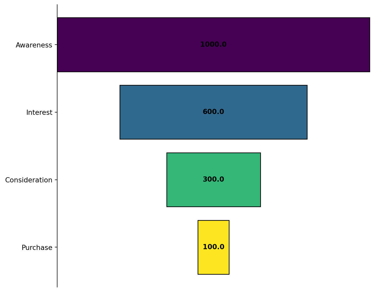
Create a funnel chart for stages in a process.
/tmp/ipykernel_2724349/2025931190.py:62: MatplotlibDeprecationWarning:

The get_cmap function was deprecated in Matplotlib 3.7 and will be removed in 3.11. Use ``matplotlib.colormaps[name]`` or ``matplotlib.colormaps.get_cmap()`` or ``pyplot.get_cmap()`` instead.
Excel Usage
=FUNNEL(data, title, color_map, values, legend)data(list[list], required): Input data (Labels, Values).title(str, optional, default: null): Chart title.color_map(str, optional, default: “viridis”): Color map for stages.values(str, optional, default: “true”): Show numeric values.legend(str, optional, default: “false”): Show legend.
Returns (object): Matplotlib Figure object (standard Python) or base64 encoded PNG string (Pyodide).
Example 1: Simple funnel chart with 4 stages
Inputs:
| data | |
|---|---|
| Awareness | 1000 |
| Interest | 600 |
| Consideration | 300 |
| Purchase | 100 |
Excel formula:
=FUNNEL({"Awareness",1000;"Interest",600;"Consideration",300;"Purchase",100})Expected output:
"chart"
Example 2: Funnel chart with title and values
Inputs:
| data | title | values | |
|---|---|---|---|
| Stage 1 | 500 | Sales Funnel | true |
| Stage 2 | 400 | ||
| Stage 3 | 200 |
Excel formula:
=FUNNEL({"Stage 1",500;"Stage 2",400;"Stage 3",200}, "Sales Funnel", "true")Expected output:
"chart"
Example 3: Funnel with plasma colormap
Inputs:
| data | color_map | |
|---|---|---|
| Top | 800 | plasma |
| Middle | 500 | |
| Bottom | 200 |
Excel formula:
=FUNNEL({"Top",800;"Middle",500;"Bottom",200}, "plasma")Expected output:
"chart"
Example 4: Funnel chart with legend
Inputs:
| data | legend | values | |
|---|---|---|---|
| Lead | 1200 | true | true |
| Qualified | 800 | ||
| Closed | 300 |
Excel formula:
=FUNNEL({"Lead",1200;"Qualified",800;"Closed",300}, "true", "true")Expected output:
"chart"
Python Code
Show Code
import sys
import matplotlib
IS_PYODIDE = sys.platform == "emscripten"
if IS_PYODIDE:
    matplotlib.use('Agg')
import matplotlib.pyplot as plt
import io
import base64
import numpy as np

def funnel(data, title=None, color_map='viridis', values='true', legend='false'):
    """
    Create a funnel chart for stages in a process.

    See: https://matplotlib.org/stable/gallery/lines_bars_and_markers/barh.html

    This example function is provided as-is without any representation of accuracy.

    Args:
        data (list[list]): Input data (Labels, Values).
        title (str, optional): Chart title. Default is None.
        color_map (str, optional): Color map for stages. Valid options: Viridis, Plasma, Inferno, Magma, Cividis. Default is 'viridis'.
        values (str, optional): Show numeric values. Valid options: True, False. Default is 'true'.
        legend (str, optional): Show legend. Valid options: True, False. Default is 'false'.

    Returns:
        object: Matplotlib Figure object (standard Python) or base64 encoded PNG string (Pyodide).
    """
    def to2d(x):
        return [[x]] if not isinstance(x, list) else x

    try:
        data = to2d(data)

        if not isinstance(data, list) or len(data) < 1:
            return "Error: Data must be a non-empty list"

        # Extract labels and values
        labels = []
        vals = []
        for row in data:
            if not isinstance(row, list) or len(row) < 2:
                continue
            try:
                labels.append(str(row[0]))
                vals.append(float(row[1]))
            except (ValueError, TypeError):
                continue

        if len(labels) == 0 or len(vals) == 0:
            return "Error: No valid data rows found"

        if any(v < 0 for v in vals):
            return "Error: Values must be non-negative"

        # Create figure
        fig, ax = plt.subplots(figsize=(8, 6))

        # Create funnel using horizontal bars centered
        y_pos = np.arange(len(labels))
        colors_list = plt.cm.get_cmap(color_map)(np.linspace(0, 1, len(vals)))

        # Center the bars
        max_val = max(vals) if vals else 1
        left_edges = [(max_val - v) / 2 for v in vals]

        bars = ax.barh(y_pos, vals, left=left_edges, color=colors_list, edgecolor='black')

        # Add value labels if requested
        if values == "true":
            for i, (bar, val) in enumerate(zip(bars, vals)):
                ax.text(max_val / 2, i, f'{val}', ha='center', va='center', fontweight='bold')

        # Set labels
        ax.set_yticks(y_pos)
        ax.set_yticklabels(labels)
        ax.invert_yaxis()  # Top to bottom

        if title:
            ax.set_title(title)

        # Handle legend
        if legend == "true":
            ax.legend(labels, loc="best")

        # Remove x-axis for cleaner look
        ax.set_xticks([])
        ax.spines['top'].set_visible(False)
        ax.spines['right'].set_visible(False)
        ax.spines['bottom'].set_visible(False)

        plt.tight_layout()

        if IS_PYODIDE:
            buf = io.BytesIO()
            plt.savefig(buf, format='png', bbox_inches='tight')
            plt.close(fig)
            buf.seek(0)
            img_base64 = base64.b64encode(buf.read()).decode('utf-8')
            return f"data:image/png;base64,{img_base64}"
        else:
            return fig
    except Exception as e:
        return f"Error: {str(e)}"
Online Calculator
Input data (Labels, Values).
Chart title.
Color map for stages.
Show numeric values.
Show legend.
PARETO_CHART
Create a Pareto chart (bar chart + cumulative line).
Excel Usage
=PARETO_CHART(data, title, xlabel, ylabel, color_bar, color_line, legend)data(list[list], required): Input data (Labels, Values).title(str, optional, default: null): Chart title.xlabel(str, optional, default: null): Label for X-axis.ylabel(str, optional, default: null): Label for Y-axis.color_bar(str, optional, default: “blue”): Bar color.color_line(str, optional, default: “red”): Line color.legend(str, optional, default: “false”): Show legend.
Returns (object): Matplotlib Figure object (standard Python) or base64 encoded PNG string (Pyodide).
Example 1: Simple Pareto chart
Inputs:
| data | |
|---|---|
| Defect A | 50 |
| Defect B | 30 |
| Defect C | 15 |
| Defect D | 5 |
Excel formula:
=PARETO_CHART({"Defect A",50;"Defect B",30;"Defect C",15;"Defect D",5})Expected output:
"chart"
Example 2: Pareto chart with custom labels
Inputs:
| data | title | xlabel | ylabel | |
|---|---|---|---|---|
| Issue 1 | 100 | Defect Analysis | Defect Type | Count |
| Issue 2 | 80 | |||
| Issue 3 | 40 | |||
| Issue 4 | 20 |
Excel formula:
=PARETO_CHART({"Issue 1",100;"Issue 2",80;"Issue 3",40;"Issue 4",20}, "Defect Analysis", "Defect Type", "Count")Expected output:
"chart"
Example 3: Pareto with custom colors
Inputs:
| data | color_bar | color_line | |
|---|---|---|---|
| Cat A | 70 | green | yellow |
| Cat B | 50 | ||
| Cat C | 30 |
Excel formula:
=PARETO_CHART({"Cat A",70;"Cat B",50;"Cat C",30}, "green", "yellow")Expected output:
"chart"
Example 4: Pareto chart with legend
Inputs:
| data | legend | |
|---|---|---|
| Problem 1 | 200 | true |
| Problem 2 | 150 | |
| Problem 3 | 100 | |
| Problem 4 | 50 |
Excel formula:
=PARETO_CHART({"Problem 1",200;"Problem 2",150;"Problem 3",100;"Problem 4",50}, "true")Expected output:
"chart"
Python Code
Show Code
import sys
import matplotlib
IS_PYODIDE = sys.platform == "emscripten"
if IS_PYODIDE:
    matplotlib.use('Agg')
import matplotlib.pyplot as plt
import io
import base64
import numpy as np
from matplotlib.patches import Patch
from matplotlib.lines import Line2D

def pareto_chart(data, title=None, xlabel=None, ylabel=None, color_bar='blue', color_line='red', legend='false'):
    """
    Create a Pareto chart (bar chart + cumulative line).

    See: https://matplotlib.org/stable/gallery/showcase/pareto_chart.html

    This example function is provided as-is without any representation of accuracy.

    Args:
        data (list[list]): Input data (Labels, Values).
        title (str, optional): Chart title. Default is None.
        xlabel (str, optional): Label for X-axis. Default is None.
        ylabel (str, optional): Label for Y-axis. Default is None.
        color_bar (str, optional): Bar color. Valid options: Blue, Green, Cyan. Default is 'blue'.
        color_line (str, optional): Line color. Valid options: Red, Yellow, Magenta. Default is 'red'.
        legend (str, optional): Show legend. Valid options: True, False. Default is 'false'.

    Returns:
        object: Matplotlib Figure object (standard Python) or base64 encoded PNG string (Pyodide).
    """
    def to2d(x):
        return [[x]] if not isinstance(x, list) else x

    try:
        data = to2d(data)

        if not isinstance(data, list) or len(data) < 1:
            return "Error: Data must be a non-empty list"

        # Extract labels and values
        labels = []
        values = []
        for row in data:
            if not isinstance(row, list) or len(row) < 2:
                continue
            try:
                labels.append(str(row[0]))
                values.append(float(row[1]))
            except (ValueError, TypeError):
                continue

        if len(labels) == 0 or len(values) == 0:
            return "Error: No valid data rows found"

        if any(v < 0 for v in values):
            return "Error: Values must be non-negative"

        # Sort by values descending
        sorted_pairs = sorted(zip(values, labels), reverse=True)
        values = [p[0] for p in sorted_pairs]
        labels = [p[1] for p in sorted_pairs]

        # Calculate cumulative percentage
        total = sum(values)
        if total == 0:
            return "Error: Total value is zero"

        cumulative = np.cumsum(values)
        cumulative_percent = cumulative / total * 100

        # Create figure with two y-axes
        fig, ax1 = plt.subplots(figsize=(10, 6))

        # Bar chart
        x_pos = np.arange(len(labels))
        ax1.bar(x_pos, values, color=color_bar, alpha=0.7, edgecolor='black')
        ax1.set_xlabel(xlabel if xlabel else 'Categories')
        ax1.set_ylabel(ylabel if ylabel else 'Frequency', color=color_bar)
        ax1.tick_params(axis='y', labelcolor=color_bar)
        ax1.set_xticks(x_pos)
        ax1.set_xticklabels(labels, rotation=45, ha='right')

        # Line chart for cumulative percentage
        ax2 = ax1.twinx()
        ax2.plot(x_pos, cumulative_percent, color=color_line, marker='o', linewidth=2)
        ax2.set_ylabel('Cumulative Percentage (%)', color=color_line)
        ax2.tick_params(axis='y', labelcolor=color_line)
        ax2.set_ylim([0, 105])
        ax2.axhline(y=80, color='gray', linestyle='--', linewidth=1)

        if title:
            ax1.set_title(title)

        # Handle legend
        if legend == "true":
            legend_elements = [
                Patch(facecolor=color_bar, label='Frequency'),
                Line2D([0], [0], color=color_line, marker='o', label='Cumulative %')
            ]
            ax1.legend(handles=legend_elements, loc="upper left")

        plt.tight_layout()

        if IS_PYODIDE:
            buf = io.BytesIO()
            plt.savefig(buf, format='png', bbox_inches='tight')
            plt.close(fig)
            buf.seek(0)
            img_base64 = base64.b64encode(buf.read()).decode('utf-8')
            return f"data:image/png;base64,{img_base64}"
        else:
            return fig
    except Exception as e:
        return f"Error: {str(e)}"
Online Calculator
Input data (Labels, Values).
Chart title.
Label for X-axis.
Label for Y-axis.
Bar color.
Line color.
Show legend.
SLOPE
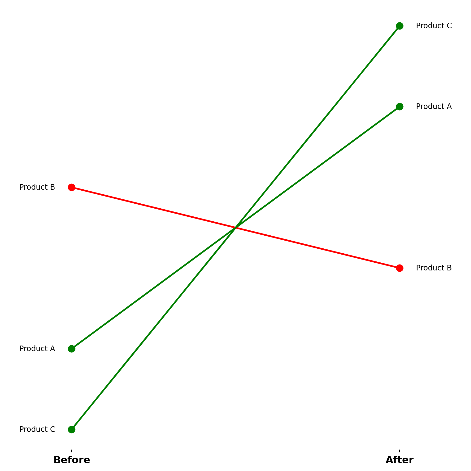
Create a slope chart for comparing paired changes across categories.
Excel Usage
=SLOPE(data, labels, title, color_up, color_down, legend)data(list[list], required): Input data (Labels, Point1, Point2).labels(list[list], required): Labels for the two points.title(str, optional, default: null): Chart title.color_up(str, optional, default: “green”): Increase color.color_down(str, optional, default: “red”): Decrease color.legend(str, optional, default: “false”): Show legend.
Returns (object): Matplotlib Figure object (standard Python) or base64 encoded PNG string (Pyodide).
Example 1: Simple slope chart
Inputs:
| data | labels | |||
|---|---|---|---|---|
| Product A | 20 | 35 | Before | After |
| Product B | 30 | 25 | ||
| Product C | 15 | 40 |
Excel formula:
=SLOPE({"Product A",20,35;"Product B",30,25;"Product C",15,40}, {"Before","After"})Expected output:
"chart"
Example 2: Slope chart with title
Inputs:
| data | labels | title | |||
|---|---|---|---|---|---|
| Team A | 100 | 150 | Q1 | Q2 | Quarterly Comparison |
| Team B | 120 | 110 | |||
| Team C | 90 | 140 |
Excel formula:
=SLOPE({"Team A",100,150;"Team B",120,110;"Team C",90,140}, {"Q1","Q2"}, "Quarterly Comparison")Expected output:
"chart"
Example 3: Slope chart with custom colors
Inputs:
| data | labels | color_up | color_down | |||
|---|---|---|---|---|---|---|
| Cat 1 | 50 | 80 | Start | End | blue | orange |
| Cat 2 | 70 | 60 | ||||
| Cat 3 | 40 | 90 |
Excel formula:
=SLOPE({"Cat 1",50,80;"Cat 2",70,60;"Cat 3",40,90}, {"Start","End"}, "blue", "orange")Expected output:
"chart"
Example 4: Slope chart with legend
Inputs:
| data | labels | legend | |||
|---|---|---|---|---|---|
| Item 1 | 10 | 20 | 2023 | 2024 | true |
| Item 2 | 25 | 15 | |||
| Item 3 | 30 | 35 |
Excel formula:
=SLOPE({"Item 1",10,20;"Item 2",25,15;"Item 3",30,35}, {2023,2024}, "true")Expected output:
"chart"
Python Code
Show Code
import sys
import matplotlib
IS_PYODIDE = sys.platform == "emscripten"
if IS_PYODIDE:
    matplotlib.use('Agg')
import matplotlib.pyplot as plt
import io
import base64
import numpy as np
from matplotlib.lines import Line2D

def slope(data, labels, title=None, color_up='green', color_down='red', legend='false'):
    """
    Create a slope chart for comparing paired changes across categories.

    See: https://matplotlib.org/stable/gallery/lines_bars_and_markers/slope_chart.html

    This example function is provided as-is without any representation of accuracy.

    Args:
        data (list[list]): Input data (Labels, Point1, Point2).
        labels (list[list]): Labels for the two points.
        title (str, optional): Chart title. Default is None.
        color_up (str, optional): Increase color. Valid options: Green, Blue. Default is 'green'.
        color_down (str, optional): Decrease color. Valid options: Red, Orange. Default is 'red'.
        legend (str, optional): Show legend. Valid options: True, False. Default is 'false'.

    Returns:
        object: Matplotlib Figure object (standard Python) or base64 encoded PNG string (Pyodide).
    """
    def to2d(x):
        return [[x]] if not isinstance(x, list) else x

    try:
        data = to2d(data)
        labels_2d = to2d(labels)

        if not isinstance(data, list) or len(data) < 1:
            return "Error: Data must be a non-empty list"

        # Extract category labels and point values
        categories = []
        point_one = []
        point_two = []
        for row in data:
            if not isinstance(row, list) or len(row) < 3:
                continue
            try:
                categories.append(str(row[0]))
                point_one.append(float(row[1]))
                point_two.append(float(row[2]))
            except (ValueError, TypeError):
                continue

        if len(categories) == 0 or len(point_one) == 0 or len(point_two) == 0:
            return "Error: No valid data rows found (need 3 columns: Label, Point1, Point2)"

        # Extract point labels
        point_labels = ['Point 1', 'Point 2']
        if isinstance(labels_2d, list) and len(labels_2d) > 0:
            if isinstance(labels_2d[0], list) and len(labels_2d[0]) >= 2:
                point_labels = [str(labels_2d[0][0]), str(labels_2d[0][1])]
            elif len(labels_2d) >= 2:
                point_labels = [str(labels_2d[0]), str(labels_2d[1])]

        # Create figure
        fig, ax = plt.subplots(figsize=(8, 8))

        # Draw slopes
        for i in range(len(categories)):
            # Determine color based on slope direction
            if point_two[i] > point_one[i]:
                color = color_up
            elif point_two[i] < point_one[i]:
                color = color_down
            else:
                color = 'gray'

            # Draw line
            ax.plot([0, 1], [point_one[i], point_two[i]], '-o', color=color, linewidth=2, markersize=8)

            # Add category labels
            ax.text(-0.05, point_one[i], categories[i], ha='right', va='center', fontsize=9)
            ax.text(1.05, point_two[i], categories[i], ha='left', va='center', fontsize=9)

        # Set x-axis labels
        ax.set_xticks([0, 1])
        ax.set_xticklabels(point_labels, fontsize=12, fontweight='bold')
        ax.set_xlim(-0.2, 1.2)

        # Remove y-axis
        ax.set_yticks([])

        if title:
            ax.set_title(title)

        # Handle legend
        if legend == "true":
            legend_elements = [
                Line2D([0], [0], color=color_up, linewidth=2, label='Increase'),
                Line2D([0], [0], color=color_down, linewidth=2, label='Decrease')
            ]
            ax.legend(handles=legend_elements, loc="best")

        # Clean up spines
        ax.spines['top'].set_visible(False)
        ax.spines['right'].set_visible(False)
        ax.spines['left'].set_visible(False)
        ax.spines['bottom'].set_visible(False)

        plt.tight_layout()

        if IS_PYODIDE:
            buf = io.BytesIO()
            plt.savefig(buf, format='png', bbox_inches='tight')
            plt.close(fig)
            buf.seek(0)
            img_base64 = base64.b64encode(buf.read()).decode('utf-8')
            return f"data:image/png;base64,{img_base64}"
        else:
            return fig
    except Exception as e:
        return f"Error: {str(e)}"
Online Calculator
Input data (Labels, Point1, Point2).
Labels for the two points.
Chart title.
Increase color.
Decrease color.
Show legend.
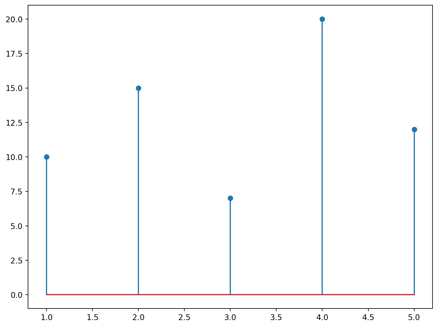
STEM
Create a stem/lollipop plot from data.
Excel Usage
=STEM(data, title, xlabel, ylabel, plot_color, stem_orientation, bottom, legend)data(list[list], required): Input data.title(str, optional, default: null): Chart title.xlabel(str, optional, default: null): Label for X-axis.ylabel(str, optional, default: null): Label for Y-axis.plot_color(str, optional, default: null): Stem color.stem_orientation(str, optional, default: “v”): Orientation (‘v’ or ‘h’).bottom(float, optional, default: 0): Baseline position.legend(str, optional, default: “false”): Show legend.
Returns (object): Matplotlib Figure object (standard Python) or base64 encoded PNG string (Pyodide).
Example 1: Simple vertical stem plot
Inputs:
| data | |
|---|---|
| 1 | 10 |
| 2 | 15 |
| 3 | 7 |
| 4 | 20 |
| 5 | 12 |
Excel formula:
=STEM({1,10;2,15;3,7;4,20;5,12})Expected output:
"chart"
Example 2: Horizontal stem plot with labels
Inputs:
| data | stem_orientation | title | xlabel | ylabel | |
|---|---|---|---|---|---|
| 1 | 5 | h | Horizontal Stem | Values | Categories |
| 2 | 8 | ||||
| 3 | 3 | ||||
| 4 | 12 |
Excel formula:
=STEM({1,5;2,8;3,3;4,12}, "h", "Horizontal Stem", "Values", "Categories")Expected output:
"chart"
Example 3: Colored stem plot with custom baseline
Inputs:
| data | plot_color | bottom | |
|---|---|---|---|
| 1 | -2 | red | 0 |
| 2 | 3 | ||
| 3 | -1 | ||
| 4 | 5 |
Excel formula:
=STEM({1,-2;2,3;3,-1;4,5}, "red", 0)Expected output:
"chart"
Example 4: Stem plot with legend
Inputs:
| data | legend | plot_color | |
|---|---|---|---|
| 0 | 0 | true | green |
| 1 | 1 | ||
| 2 | 4 | ||
| 3 | 9 |
Excel formula:
=STEM({0,0;1,1;2,4;3,9}, "true", "green")Expected output:
"chart"
Python Code
Show Code
import sys
import matplotlib
IS_PYODIDE = sys.platform == "emscripten"
if IS_PYODIDE:
    matplotlib.use('Agg')
import matplotlib.pyplot as plt
import io
import base64
import numpy as np

def stem(data, title=None, xlabel=None, ylabel=None, plot_color=None, stem_orientation='v', bottom=0, legend='false'):
    """
    Create a stem/lollipop plot from data.

    See: https://matplotlib.org/stable/api/_as_gen/matplotlib.pyplot.stem.html

    This example function is provided as-is without any representation of accuracy.

    Args:
        data (list[list]): Input data.
        title (str, optional): Chart title. Default is None.
        xlabel (str, optional): Label for X-axis. Default is None.
        ylabel (str, optional): Label for Y-axis. Default is None.
        plot_color (str, optional): Stem color. Valid options: Blue, Green, Red, Cyan, Magenta, Yellow, Black, White. Default is None.
        stem_orientation (str, optional): Orientation ('v' or 'h'). Valid options: Vertical, Horizontal. Default is 'v'.
        bottom (float, optional): Baseline position. Default is 0.
        legend (str, optional): Show legend. Valid options: True, False. Default is 'false'.

    Returns:
        object: Matplotlib Figure object (standard Python) or base64 encoded PNG string (Pyodide).
    """
    def to2d(x):
        return [[x]] if not isinstance(x, list) else x

    try:
        data = to2d(data)

        if not isinstance(data, list) or len(data) < 1:
            return "Error: Data must be a non-empty list"

        # Extract x and y values
        x_vals = []
        y_vals = []
        for row in data:
            if not isinstance(row, list) or len(row) < 2:
                continue
            try:
                x_vals.append(float(row[0]))
                y_vals.append(float(row[1]))
            except (ValueError, TypeError):
                continue

        if len(x_vals) == 0 or len(y_vals) == 0:
            return "Error: No valid data rows found"

        # Create figure
        fig, ax = plt.subplots(figsize=(8, 6))

        # Create stem plot
        if stem_orientation == "v":
            markerline, stemlines, baseline = ax.stem(x_vals, y_vals, bottom=bottom)
        else:  # horizontal
            markerline, stemlines, baseline = ax.stem(y_vals, x_vals, bottom=bottom, orientation='horizontal')

        # Set color if specified
        if plot_color:
            markerline.set_color(plot_color)
            stemlines.set_color(plot_color)

        # Set labels
        if title:
            ax.set_title(title)
        if xlabel:
            ax.set_xlabel(xlabel)
        if ylabel:
            ax.set_ylabel(ylabel)

        # Handle legend
        if legend == "true":
            ax.legend(['Data'], loc="best")

        plt.tight_layout()

        if IS_PYODIDE:
            buf = io.BytesIO()
            plt.savefig(buf, format='png', bbox_inches='tight')
            plt.close(fig)
            buf.seek(0)
            img_base64 = base64.b64encode(buf.read()).decode('utf-8')
            return f"data:image/png;base64,{img_base64}"
        else:
            return fig
    except Exception as e:
        return f"Error: {str(e)}"
Online Calculator
Input data.
Chart title.
Label for X-axis.
Label for Y-axis.
Stem color.
Orientation ('v' or 'h').
Baseline position.
Show legend.
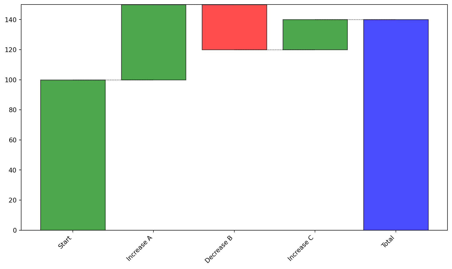
WATERFALL
Create a waterfall chart (change analysis) from data.
Excel Usage
=WATERFALL(data, title, xlabel, ylabel, color_up, color_down, color_total, legend)data(list[list], required): Input data (Labels, Changes).title(str, optional, default: null): Chart title.xlabel(str, optional, default: null): Label for X-axis.ylabel(str, optional, default: null): Label for Y-axis.color_up(str, optional, default: “green”): Positive color.color_down(str, optional, default: “red”): Negative color.color_total(str, optional, default: “blue”): Total color.legend(str, optional, default: “false”): Show legend.
Returns (object): Matplotlib Figure object (standard Python) or base64 encoded PNG string (Pyodide).
Example 1: Simple waterfall chart with mixed changes
Inputs:
| data | |
|---|---|
| Start | 100 |
| Increase A | 50 |
| Decrease B | -30 |
| Increase C | 20 |
Excel formula:
=WATERFALL({"Start",100;"Increase A",50;"Decrease B",-30;"Increase C",20})Expected output:
"chart"
Example 2: Waterfall chart with labels
Inputs:
| data | title | xlabel | ylabel | |
|---|---|---|---|---|
| Q1 | 1000 | Quarterly Performance | Quarter | Revenue |
| Q2 | 200 | |||
| Q3 | -150 | |||
| Q4 | 300 |
Excel formula:
=WATERFALL({"Q1",1000;"Q2",200;"Q3",-150;"Q4",300}, "Quarterly Performance", "Quarter", "Revenue")Expected output:
"chart"
Example 3: Waterfall with custom colors
Inputs:
| data | color_up | color_down | color_total | |
|---|---|---|---|---|
| Initial | 500 | blue | orange | black |
| Add | 100 | |||
| Subtract | -50 |
Excel formula:
=WATERFALL({"Initial",500;"Add",100;"Subtract",-50}, "blue", "orange", "black")Expected output:
"chart"
Example 4: Waterfall chart with legend
Inputs:
| data | legend | |
|---|---|---|
| Base | 1000 | true |
| Gain 1 | 250 | |
| Loss 1 | -100 | |
| Gain 2 | 150 |
Excel formula:
=WATERFALL({"Base",1000;"Gain 1",250;"Loss 1",-100;"Gain 2",150}, "true")Expected output:
"chart"
Python Code
Show Code
import sys
import matplotlib
IS_PYODIDE = sys.platform == "emscripten"
if IS_PYODIDE:
    matplotlib.use('Agg')
import matplotlib.pyplot as plt
import io
import base64
import numpy as np
from matplotlib.patches import Patch

def waterfall(data, title=None, xlabel=None, ylabel=None, color_up='green', color_down='red', color_total='blue', legend='false'):
    """
    Create a waterfall chart (change analysis) from data.

    See: https://matplotlib.org/stable/gallery/lines_bars_and_markers/bar_label_demo.html

    This example function is provided as-is without any representation of accuracy.

    Args:
        data (list[list]): Input data (Labels, Changes).
        title (str, optional): Chart title. Default is None.
        xlabel (str, optional): Label for X-axis. Default is None.
        ylabel (str, optional): Label for Y-axis. Default is None.
        color_up (str, optional): Positive color. Valid options: Green, Blue. Default is 'green'.
        color_down (str, optional): Negative color. Valid options: Red, Orange. Default is 'red'.
        color_total (str, optional): Total color. Valid options: Blue, Black. Default is 'blue'.
        legend (str, optional): Show legend. Valid options: True, False. Default is 'false'.

    Returns:
        object: Matplotlib Figure object (standard Python) or base64 encoded PNG string (Pyodide).
    """
    def to2d(x):
        return [[x]] if not isinstance(x, list) else x

    try:
        data = to2d(data)

        if not isinstance(data, list) or len(data) < 1:
            return "Error: Data must be a non-empty list"

        # Extract labels and values
        labels = []
        values = []
        for row in data:
            if not isinstance(row, list) or len(row) < 2:
                continue
            try:
                labels.append(str(row[0]))
                values.append(float(row[1]))
            except (ValueError, TypeError):
                continue

        if len(labels) == 0 or len(values) == 0:
            return "Error: No valid data rows found"

        # Calculate cumulative values and positions
        cumulative = [0]
        for val in values:
            cumulative.append(cumulative[-1] + val)

        # Create figure
        fig, ax = plt.subplots(figsize=(10, 6))

        # Prepare bars
        x_pos = np.arange(len(labels) + 1)
        colors = []
        bottoms = []
        heights = []

        for i, val in enumerate(values):
            bottoms.append(cumulative[i])
            heights.append(val)
            if val > 0:
                colors.append(color_up)
            elif val < 0:
                colors.append(color_down)
            else:
                colors.append(color_total)

        # Add total bar
        labels.append('Total')
        bottoms.append(0)
        heights.append(cumulative[-1])
        colors.append(color_total)

        # Create bars
        bars = ax.bar(x_pos, heights, bottom=bottoms, color=colors, alpha=0.7, edgecolor='black')

        # Add connecting lines
        for i in range(len(cumulative) - 1):
            ax.plot([i, i+1], [cumulative[i+1], cumulative[i+1]], 'k--', linewidth=0.5)

        # Set labels
        ax.set_xticks(x_pos)
        ax.set_xticklabels(labels, rotation=45, ha='right')

        if title:
            ax.set_title(title)
        if xlabel:
            ax.set_xlabel(xlabel)
        if ylabel:
            ax.set_ylabel(ylabel)

        # Handle legend
        if legend == "true":
            legend_elements = [
                Patch(facecolor=color_up, label='Increase'),
                Patch(facecolor=color_down, label='Decrease'),
                Patch(facecolor=color_total, label='Total')
            ]
            ax.legend(handles=legend_elements, loc="best")

        ax.axhline(y=0, color='black', linewidth=0.8)
        plt.tight_layout()

        if IS_PYODIDE:
            buf = io.BytesIO()
            plt.savefig(buf, format='png', bbox_inches='tight')
            plt.close(fig)
            buf.seek(0)
            img_base64 = base64.b64encode(buf.read()).decode('utf-8')
            return f"data:image/png;base64,{img_base64}"
        else:
            return fig
    except Exception as e:
        return f"Error: {str(e)}"
Online Calculator
Input data (Labels, Changes).
Chart title.
Label for X-axis.
Label for Y-axis.
Positive color.
Negative color.
Total color.
Show legend.