Matrix
Overview
Heat maps are a core technique for visualizing matrix-structured data, where each cell value is encoded as color intensity. In exploratory analysis, they reveal structure that raw tables often hide: clusters, gradients, symmetry, and anomalies across rows and columns. Matrix visualization is especially valuable in correlation analysis, feature engineering, quality control, and scientific measurement workflows where many pairwise relationships must be interpreted quickly. These charts help analysts move from individual values to global patterns.
Core Concepts: Matrix charts in this category rely on color encoding, ordering, and masking. Color translates numeric magnitude into perceptual contrast, so colormap choice affects interpretability. Ordering rows and columns can expose latent block structure, while triangular masking removes redundant information in symmetric matrices. For correlation-focused views, values are bounded in [-1, 1], and the Pearson coefficient is commonly defined as r_{xy}=\frac{\operatorname{cov}(x,y)}{\sigma_x\sigma_y} to quantify linear association.
Implementation: These tools are implemented primarily with Matplotlib for rendering and annotation, with clustering support from SciPy hierarchical clustering where reordering is required. Matplotlib provides the image and colormap primitives used by matrix plots, while SciPy supplies linkage and dendrogram routines that reorder similar rows and columns to make structure visible.
General Matrix Views: HEATMAP is the baseline tool for plotting any numeric 2D array as a color-coded grid, with optional axis labels, in-cell values, and colorbar controls. It is typically used for KPI dashboards, confusion matrices, and dense measurement tables where exact numbers and broad trends both matter. TRIANGULAR_HEATMAP specializes this view by showing only the lower or upper triangle, which is ideal for symmetric matrices where half the cells are duplicates. In practice, analysts use the triangular form to reduce clutter and emphasize unique pairwise relationships.
Relationship and Structure Discovery: CORRELATION computes and visualizes a correlation matrix so users can assess positive, negative, and near-zero relationships among variables in one view. This is useful in feature screening, multicollinearity checks, and exploratory statistics before modeling. CLUSTER_MAP extends matrix visualization with hierarchical clustering and dendrograms, reordering rows and columns so similar patterns align spatially. Together, these two tools move analysis from “how strong are pairwise relationships?” to “which variables or observations behave similarly as groups?”
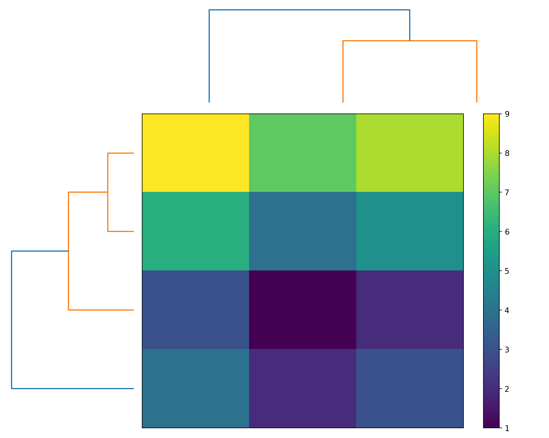
CLUSTER_MAP
Create a hierarchically-clustered heatmap.
Excel Usage
=CLUSTER_MAP(data, title, color_map, colorbar)data(list[list], required): Input matrix data.title(str, optional, default: null): Chart title.color_map(str, optional, default: “viridis”): Color map.colorbar(str, optional, default: “true”): Show colorbar.
Returns (object): Matplotlib Figure object (standard Python) or base64 encoded PNG string (Pyodide).
Example 1: Basic clustered heatmap
Inputs:
| data | ||
|---|---|---|
| 1 | 2 | 3 |
| 4 | 5 | 6 |
| 7 | 8 | 9 |
| 2 | 3 | 4 |
Excel formula:
=CLUSTER_MAP({1,2,3;4,5,6;7,8,9;2,3,4})Expected output:
"chart"
Example 2: Cluster map with title
Inputs:
| data | title | ||
|---|---|---|---|
| 1 | 2 | 3 | My Cluster Map |
| 4 | 5 | 6 | |
| 7 | 8 | 9 | |
| 10 | 11 | 12 |
Excel formula:
=CLUSTER_MAP({1,2,3;4,5,6;7,8,9;10,11,12}, "My Cluster Map")Expected output:
"chart"
Example 3: Cluster map with plasma colormap
Inputs:
| data | color_map | ||
|---|---|---|---|
| 1 | 5 | 3 | plasma |
| 4 | 2 | 6 | |
| 7 | 9 | 8 | |
| 2 | 4 | 1 |
Excel formula:
=CLUSTER_MAP({1,5,3;4,2,6;7,9,8;2,4,1}, "plasma")Expected output:
"chart"
Example 4: Cluster map without colorbar
Inputs:
| data | colorbar | |
|---|---|---|
| 1 | 2 | false |
| 3 | 4 | |
| 5 | 6 |
Excel formula:
=CLUSTER_MAP({1,2;3,4;5,6}, "false")Expected output:
"chart"
Python Code
Show Code
import sys
import matplotlib
IS_PYODIDE = sys.platform == "emscripten"
if IS_PYODIDE:
    matplotlib.use('Agg')
import matplotlib.pyplot as plt
import io
import base64
import numpy as np
from scipy.cluster.hierarchy import dendrogram, linkage

def cluster_map(data, title=None, color_map='viridis', colorbar='true'):
    """
    Create a hierarchically-clustered heatmap.

    See: https://matplotlib.org/stable/api/_as_gen/matplotlib.pyplot.imshow.html

    This example function is provided as-is without any representation of accuracy.

    Args:
        data (list[list]): Input matrix data.
        title (str, optional): Chart title. Default is None.
        color_map (str, optional): Color map. Valid options: Viridis, Plasma, Inferno, Magma, Cividis. Default is 'viridis'.
        colorbar (str, optional): Show colorbar. Valid options: True, False. Default is 'true'.

    Returns:
        object: Matplotlib Figure object (standard Python) or base64 encoded PNG string (Pyodide).
    """
    def to2d(x):
        return [[x]] if not isinstance(x, list) else x

    try:
        data = to2d(data)

        if not isinstance(data, list) or not all(isinstance(row, list) for row in data):
            return "Error: Invalid input - data must be a 2D list"

        # Convert to numpy array
        try:
            arr = np.array(data, dtype=float)
        except (ValueError, TypeError) as e:
            return f"Error: Could not convert data to numeric array: {str(e)}"

        if arr.ndim != 2:
            return "Error: Data must be a 2D array"

        if arr.size == 0:
            return "Error: Data array is empty"

        if arr.shape[0] < 2:
            return "Error: Need at least 2 rows for clustering"

        # Perform hierarchical clustering
        try:
            # Cluster rows
            row_linkage = linkage(arr, method='average')
            row_order = dendrogram(row_linkage, no_plot=True)['leaves']

            # Cluster columns
            col_linkage = linkage(arr.T, method='average')
            col_order = dendrogram(col_linkage, no_plot=True)['leaves']

            # Reorder data
            arr_clustered = arr[row_order, :][:, col_order]
        except Exception as e:
            return f"Error: Clustering failed: {str(e)}"

        # Create figure with subplots for dendrograms and heatmap
        fig = plt.figure(figsize=(10, 8))

        # Dendrogram for rows (left)
        ax_row = plt.subplot2grid((4, 4), (1, 0), rowspan=3)
        row_dend = dendrogram(row_linkage, orientation='left', no_labels=True)
        ax_row.set_xticks([])
        ax_row.set_yticks([])
        ax_row.axis('off')

        # Dendrogram for columns (top)
        ax_col = plt.subplot2grid((4, 4), (0, 1), colspan=3)
        col_dend = dendrogram(col_linkage, no_labels=True)
        ax_col.set_xticks([])
        ax_col.set_yticks([])
        ax_col.axis('off')

        # Heatmap (main)
        ax_heatmap = plt.subplot2grid((4, 4), (1, 1), rowspan=3, colspan=3)
        im = ax_heatmap.imshow(arr_clustered, cmap=color_map, aspect='auto')
        ax_heatmap.set_xticks([])
        ax_heatmap.set_yticks([])

        # Add colorbar if requested
        show_colorbar = colorbar.lower() == "true"
        if show_colorbar:
            plt.colorbar(im, ax=ax_heatmap)

        # Set title
        if title:
            fig.suptitle(title, y=0.98)

        plt.tight_layout()

        # Return based on environment
        if IS_PYODIDE:
            buf = io.BytesIO()
            plt.savefig(buf, format='png', dpi=100, bbox_inches='tight')
            buf.seek(0)
            img_base64 = base64.b64encode(buf.read()).decode('utf-8')
            plt.close(fig)
            return f"data:image/png;base64,{img_base64}"
        else:
            return fig
    except Exception as e:
        return f"Error: {str(e)}"
Online Calculator
Input matrix data.
Chart title.
Color map.
Show colorbar.
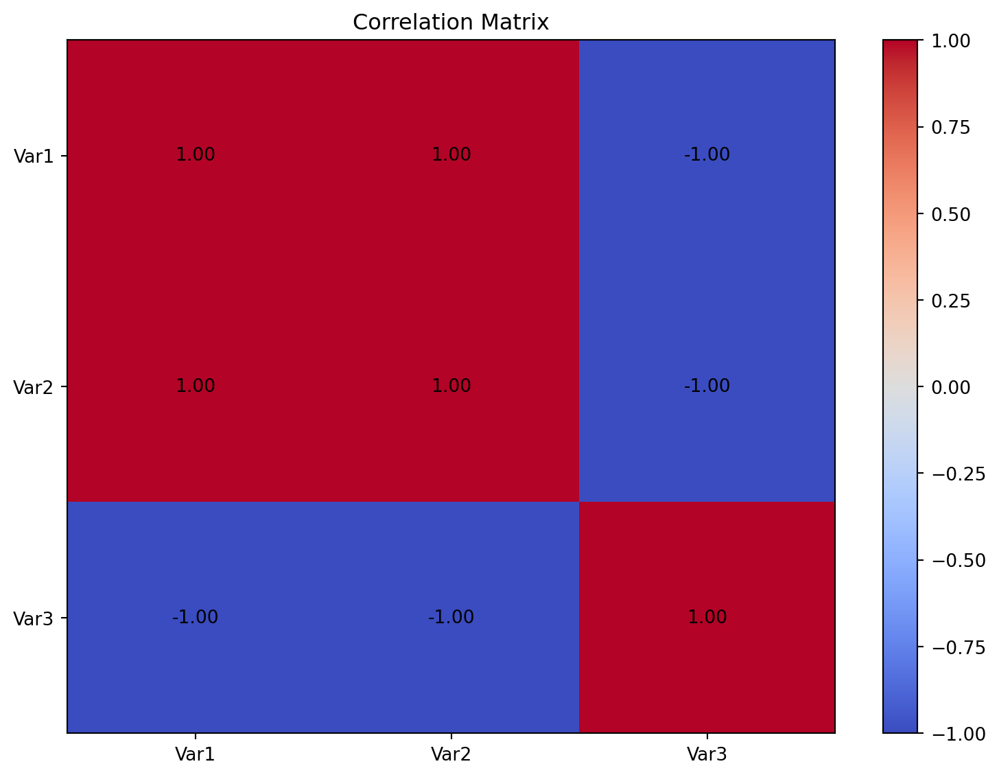
CORRELATION
Create a correlation matrix heatmap from data.
Excel Usage
=CORRELATION(data, title, corr_colors, values, colorbar)data(list[list], required): Input variables.title(str, optional, default: null): Chart title.corr_colors(str, optional, default: “coolwarm”): Color map.values(str, optional, default: “true”): Show values.colorbar(str, optional, default: “true”): Show colorbar.
Returns (object): Matplotlib Figure object (standard Python) or base64 encoded PNG string (Pyodide).
Example 1: Correlation matrix from 3 variables
Inputs:
| data | ||||
|---|---|---|---|---|
| 1 | 2 | 3 | 4 | 5 |
| 2 | 4 | 6 | 8 | 10 |
| 5 | 4 | 3 | 2 | 1 |
Excel formula:
=CORRELATION({1,2,3,4,5;2,4,6,8,10;5,4,3,2,1})Expected output:
"chart"
Example 2: Correlation matrix with custom title
Inputs:
| data | title | ||
|---|---|---|---|
| 1 | 2 | 3 | My Correlation |
| 4 | 5 | 6 | |
| 7 | 8 | 9 |
Excel formula:
=CORRELATION({1,2,3;4,5,6;7,8,9}, "My Correlation")Expected output:
"chart"
Example 3: Correlation with Blues colormap
Inputs:
| data | corr_colors | ||
|---|---|---|---|
| 1 | 2 | 3 | Blues |
| 2 | 3 | 4 |
Excel formula:
=CORRELATION({1,2,3;2,3,4}, "Blues")Expected output:
"chart"
Example 4: Correlation showing values
Inputs:
| data | values | |||
|---|---|---|---|---|
| 1 | 2 | 3 | 4 | true |
| 5 | 6 | 7 | 8 |
Excel formula:
=CORRELATION({1,2,3,4;5,6,7,8}, "true")Expected output:
"chart"
Python Code
Show Code
import sys
import matplotlib
IS_PYODIDE = sys.platform == "emscripten"
if IS_PYODIDE:
    matplotlib.use('Agg')
import matplotlib.pyplot as plt
import io
import base64
import numpy as np

def correlation(data, title=None, corr_colors='coolwarm', values='true', colorbar='true'):
    """
    Create a correlation matrix heatmap from data.

    See: https://matplotlib.org/stable/gallery/images_contours_and_fields/image_annotated_heatmap.html

    This example function is provided as-is without any representation of accuracy.

    Args:
        data (list[list]): Input variables.
        title (str, optional): Chart title. Default is None.
        corr_colors (str, optional): Color map. Valid options: Coolwarm, Viridis, Blues, Reds. Default is 'coolwarm'.
        values (str, optional): Show values. Valid options: True, False. Default is 'true'.
        colorbar (str, optional): Show colorbar. Valid options: True, False. Default is 'true'.

    Returns:
        object: Matplotlib Figure object (standard Python) or base64 encoded PNG string (Pyodide).
    """
    def to2d(x):
        return [[x]] if not isinstance(x, list) else x

    try:
        data = to2d(data)

        if not isinstance(data, list) or not all(isinstance(row, list) for row in data):
            return "Error: Invalid input - data must be a 2D list"

        # Convert to numpy array
        try:
            arr = np.array(data, dtype=float)
        except (ValueError, TypeError) as e:
            return f"Error: Could not convert data to numeric array: {str(e)}"

        if arr.ndim != 2:
            return "Error: Data must be a 2D array"

        if arr.size == 0:
            return "Error: Data array is empty"

        # Transpose to get variables in columns
        if arr.shape[0] > arr.shape[1]:
            arr = arr.T

        # Calculate correlation matrix
        try:
            corr_matrix = np.corrcoef(arr)
        except Exception as e:
            return f"Error: Could not calculate correlation matrix: {str(e)}"

        if corr_matrix.ndim == 0:
            # Single variable case
            corr_matrix = np.array([[1.0]])

        # Create figure
        fig, ax = plt.subplots(figsize=(8, 6))

        # Create heatmap
        im = ax.imshow(corr_matrix, cmap=corr_colors, aspect='auto', vmin=-1, vmax=1)

        # Add colorbar if requested
        show_colorbar = colorbar.lower() == "true"
        if show_colorbar:
            plt.colorbar(im, ax=ax)

        # Add values if requested
        show_values = values.lower() == "true"
        if show_values:
            for i in range(corr_matrix.shape[0]):
                for j in range(corr_matrix.shape[1]):
                    text = ax.text(j, i, f'{corr_matrix[i, j]:.2f}',
                                 ha="center", va="center", color="black")

        # Set labels
        if title:
            ax.set_title(title)
        else:
            ax.set_title("Correlation Matrix")

        # Set ticks
        n = corr_matrix.shape[0]
        ax.set_xticks(range(n))
        ax.set_yticks(range(n))
        ax.set_xticklabels([f"Var{i+1}" for i in range(n)])
        ax.set_yticklabels([f"Var{i+1}" for i in range(n)])

        plt.tight_layout()

        # Return based on environment
        if IS_PYODIDE:
            buf = io.BytesIO()
            plt.savefig(buf, format='png', dpi=100, bbox_inches='tight')
            buf.seek(0)
            img_base64 = base64.b64encode(buf.read()).decode('utf-8')
            plt.close(fig)
            return f"data:image/png;base64,{img_base64}"
        else:
            return fig
    except Exception as e:
        return f"Error: {str(e)}"
Online Calculator
Input variables.
Chart title.
Color map.
Show values.
Show colorbar.
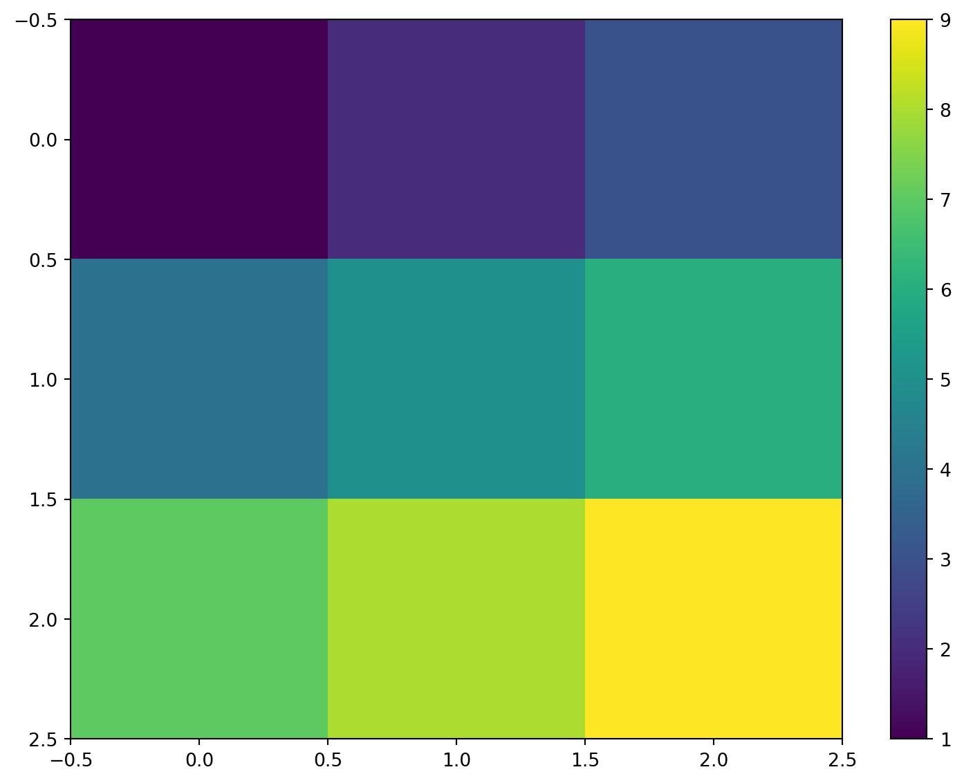
HEATMAP
Create a heatmap from a matrix of data.
Excel Usage
=HEATMAP(data, title, xlabel, ylabel, color_map, values, colorbar)data(list[list], required): Input matrix data.title(str, optional, default: null): Chart title.xlabel(str, optional, default: null): Label for X-axis.ylabel(str, optional, default: null): Label for Y-axis.color_map(str, optional, default: “viridis”): Color map.values(str, optional, default: “false”): Show values.colorbar(str, optional, default: “true”): Show colorbar.
Returns (object): Matplotlib Figure object (standard Python) or base64 encoded PNG string (Pyodide).
Example 1: Basic 3x3 heatmap
Inputs:
| data | ||
|---|---|---|
| 1 | 2 | 3 |
| 4 | 5 | 6 |
| 7 | 8 | 9 |
Excel formula:
=HEATMAP({1,2,3;4,5,6;7,8,9})Expected output:
"chart"
Example 2: Heatmap with title and labels
Inputs:
| data | title | xlabel | ylabel | |
|---|---|---|---|---|
| 1 | 2 | My Heatmap | X | Y |
| 3 | 4 |
Excel formula:
=HEATMAP({1,2;3,4}, "My Heatmap", "X", "Y")Expected output:
"chart"
Example 3: Heatmap with plasma colormap
Inputs:
| data | color_map | ||
|---|---|---|---|
| 1 | 2 | 3 | plasma |
| 4 | 5 | 6 |
Excel formula:
=HEATMAP({1,2,3;4,5,6}, "plasma")Expected output:
"chart"
Example 4: Heatmap showing values
Inputs:
| data | values | |
|---|---|---|
| 1.5 | 2.5 | true |
| 3.5 | 4.5 |
Excel formula:
=HEATMAP({1.5,2.5;3.5,4.5}, "true")Expected output:
"chart"
Python Code
Show Code
import sys
import matplotlib
IS_PYODIDE = sys.platform == "emscripten"
if IS_PYODIDE:
    matplotlib.use('Agg')
import matplotlib.pyplot as plt
import io
import base64
import numpy as np

def heatmap(data, title=None, xlabel=None, ylabel=None, color_map='viridis', values='false', colorbar='true'):
    """
    Create a heatmap from a matrix of data.

    See: https://matplotlib.org/stable/api/_as_gen/matplotlib.pyplot.imshow.html

    This example function is provided as-is without any representation of accuracy.

    Args:
        data (list[list]): Input matrix data.
        title (str, optional): Chart title. Default is None.
        xlabel (str, optional): Label for X-axis. Default is None.
        ylabel (str, optional): Label for Y-axis. Default is None.
        color_map (str, optional): Color map. Valid options: Viridis, Plasma, Inferno, Magma, Cividis. Default is 'viridis'.
        values (str, optional): Show values. Valid options: True, False. Default is 'false'.
        colorbar (str, optional): Show colorbar. Valid options: True, False. Default is 'true'.

    Returns:
        object: Matplotlib Figure object (standard Python) or base64 encoded PNG string (Pyodide).
    """
    def to2d(x):
        return [[x]] if not isinstance(x, list) else x

    try:
        data = to2d(data)

        if not isinstance(data, list) or not all(isinstance(row, list) for row in data):
            return "Error: Invalid input - data must be a 2D list"

        # Convert to numpy array
        try:
            arr = np.array(data, dtype=float)
        except (ValueError, TypeError) as e:
            return f"Error: Could not convert data to numeric array: {str(e)}"

        if arr.ndim != 2:
            return "Error: Data must be a 2D array"

        if arr.size == 0:
            return "Error: Data array is empty"

        # Create figure
        fig, ax = plt.subplots(figsize=(8, 6))

        # Create heatmap
        im = ax.imshow(arr, cmap=color_map, aspect='auto')

        # Add colorbar if requested
        show_colorbar = colorbar.lower() == "true"
        if show_colorbar:
            plt.colorbar(im, ax=ax)

        # Add values if requested
        show_values = values.lower() == "true"
        if show_values:
            for i in range(arr.shape[0]):
                for j in range(arr.shape[1]):
                    text = ax.text(j, i, f'{arr[i, j]:.2f}',
                                 ha="center", va="center", color="white")

        # Set labels
        if title:
            ax.set_title(title)
        if xlabel:
            ax.set_xlabel(xlabel)
        if ylabel:
            ax.set_ylabel(ylabel)

        plt.tight_layout()

        # Return based on environment
        if IS_PYODIDE:
            buf = io.BytesIO()
            plt.savefig(buf, format='png', dpi=100, bbox_inches='tight')
            buf.seek(0)
            img_base64 = base64.b64encode(buf.read()).decode('utf-8')
            plt.close(fig)
            return f"data:image/png;base64,{img_base64}"
        else:
            return fig
    except Exception as e:
        return f"Error: {str(e)}"
Online Calculator
Input matrix data.
Chart title.
Label for X-axis.
Label for Y-axis.
Color map.
Show values.
Show colorbar.
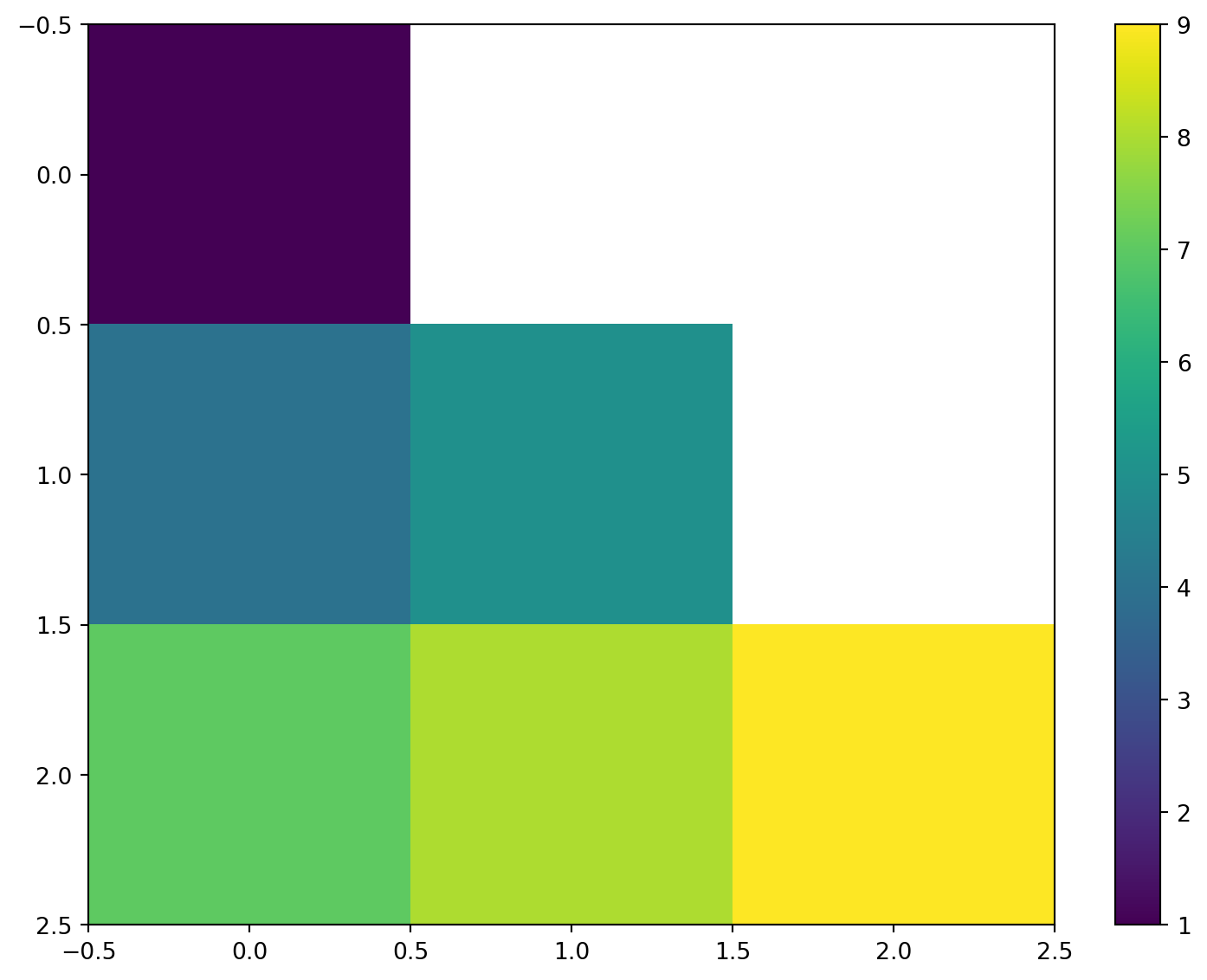
TRIANGULAR_HEATMAP
Create a lower or upper triangular heatmap.
Excel Usage
=TRIANGULAR_HEATMAP(data, title, color_map, triangle, values, colorbar)data(list[list], required): Input matrix data.title(str, optional, default: null): Chart title.color_map(str, optional, default: “viridis”): Color map.triangle(str, optional, default: “lower”): Triangle part (‘lower’, ‘upper’).values(str, optional, default: “false”): Show values.colorbar(str, optional, default: “true”): Show colorbar.
Returns (object): Matplotlib Figure object (standard Python) or base64 encoded PNG string (Pyodide).
Example 1: Lower triangular heatmap
Inputs:
| data | triangle | ||
|---|---|---|---|
| 1 | 2 | 3 | lower |
| 4 | 5 | 6 | |
| 7 | 8 | 9 |
Excel formula:
=TRIANGULAR_HEATMAP({1,2,3;4,5,6;7,8,9}, "lower")Expected output:
"chart"
Example 2: Upper triangular heatmap
Inputs:
| data | triangle | ||
|---|---|---|---|
| 1 | 2 | 3 | upper |
| 4 | 5 | 6 | |
| 7 | 8 | 9 |
Excel formula:
=TRIANGULAR_HEATMAP({1,2,3;4,5,6;7,8,9}, "upper")Expected output:
"chart"
Example 3: Triangular heatmap with title
Inputs:
| data | title | triangle | |
|---|---|---|---|
| 1 | 2 | My Triangle | lower |
| 3 | 4 |
Excel formula:
=TRIANGULAR_HEATMAP({1,2;3,4}, "My Triangle", "lower")Expected output:
"chart"
Example 4: Triangular heatmap showing values
Inputs:
| data | triangle | values | ||
|---|---|---|---|---|
| 1.5 | 2.5 | 3.5 | lower | true |
| 4.5 | 5.5 | 6.5 | ||
| 7.5 | 8.5 | 9.5 |
Excel formula:
=TRIANGULAR_HEATMAP({1.5,2.5,3.5;4.5,5.5,6.5;7.5,8.5,9.5}, "lower", "true")Expected output:
"chart"
Python Code
Show Code
import sys
import matplotlib
IS_PYODIDE = sys.platform == "emscripten"
if IS_PYODIDE:
    matplotlib.use('Agg')
import matplotlib.pyplot as plt
import io
import base64
import numpy as np

def triangular_heatmap(data, title=None, color_map='viridis', triangle='lower', values='false', colorbar='true'):
    """
    Create a lower or upper triangular heatmap.

    See: https://matplotlib.org/stable/api/_as_gen/matplotlib.pyplot.imshow.html

    This example function is provided as-is without any representation of accuracy.

    Args:
        data (list[list]): Input matrix data.
        title (str, optional): Chart title. Default is None.
        color_map (str, optional): Color map. Valid options: Viridis, Plasma, Inferno, Magma, Cividis. Default is 'viridis'.
        triangle (str, optional): Triangle part ('lower', 'upper'). Valid options: Lower, Upper. Default is 'lower'.
        values (str, optional): Show values. Valid options: True, False. Default is 'false'.
        colorbar (str, optional): Show colorbar. Valid options: True, False. Default is 'true'.

    Returns:
        object: Matplotlib Figure object (standard Python) or base64 encoded PNG string (Pyodide).
    """
    def to2d(x):
        return [[x]] if not isinstance(x, list) else x

    try:
        data = to2d(data)

        if not isinstance(data, list) or not all(isinstance(row, list) for row in data):
            return "Error: Invalid input - data must be a 2D list"

        # Convert to numpy array
        try:
            arr = np.array(data, dtype=float)
        except (ValueError, TypeError) as e:
            return f"Error: Could not convert data to numeric array: {str(e)}"

        if arr.ndim != 2:
            return "Error: Data must be a 2D array"

        if arr.size == 0:
            return "Error: Data array is empty"

        # Create mask for triangular display
        mask = np.zeros_like(arr, dtype=bool)
        if triangle.lower() == "lower":
            # Mask upper triangle
            mask = np.triu(np.ones_like(arr, dtype=bool), k=1)
        elif triangle.lower() == "upper":
            # Mask lower triangle
            mask = np.tril(np.ones_like(arr, dtype=bool), k=-1)
        else:
            return f"Error: Invalid triangle parameter '{triangle}'. Must be 'lower' or 'upper'"

        # Apply mask by setting to NaN
        arr_masked = arr.copy()
        arr_masked[mask] = np.nan

        # Create figure
        fig, ax = plt.subplots(figsize=(8, 6))

        # Create heatmap
        im = ax.imshow(arr_masked, cmap=color_map, aspect='auto')

        # Add colorbar if requested
        show_colorbar = colorbar.lower() == "true"
        if show_colorbar:
            plt.colorbar(im, ax=ax)

        # Add values if requested
        show_values = values.lower() == "true"
        if show_values:
            for i in range(arr.shape[0]):
                for j in range(arr.shape[1]):
                    if not mask[i, j]:
                        text = ax.text(j, i, f'{arr[i, j]:.2f}',
                                     ha="center", va="center", color="white")

        # Set labels
        if title:
            ax.set_title(title)

        plt.tight_layout()

        # Return based on environment
        if IS_PYODIDE:
            buf = io.BytesIO()
            plt.savefig(buf, format='png', dpi=100, bbox_inches='tight')
            buf.seek(0)
            img_base64 = base64.b64encode(buf.read()).decode('utf-8')
            plt.close(fig)
            return f"data:image/png;base64,{img_base64}"
        else:
            return fig
    except Exception as e:
        return f"Error: {str(e)}"
Online Calculator
Input matrix data.
Chart title.
Color map.
Triangle part ('lower', 'upper').
Show values.
Show colorbar.